PerfVis+: From Timestamps to Insight through Integration of Visual and Statistical Analysis

Adv. Sci. Technol. Eng. Syst. J. 10(6), 77–87 (2025);
 DOI: 10.25046/aj100607
Complex networked systems provide a cornucopia of network statistics, many of which relate to the temporal behaviour of subsystems, devices, or even individual protocol layers. Different and flexible visualizations can play a crucial role in discovering and making patterns, relations, and trends tangible. We developed PerfVis, a tool that visualizes timestamp data to aid in detecting patterns and changes in the data. Although its measurement capabilities are designed for network transmission measurements, we believe that its analysis part can also be used for other research fields. This paper extends PerfVis from a visualization tool focused on a single type of plot to a comprehensive analyser for timestamp data. It is suitable for evaluating complex systems and analysing protocols. In particular, we integrate statistical output, customizable sending patterns, and inclusion of external data sources, broadening PerfVis’s applicability in research and operations. Case studies highlight the benefits these extensions bring and how the tool can help analyse the system behaviour of a real 5G network and the protocol behaviour of the Two-Way Active Measurement Protocol, another established network measurement tool.
1. Introduction
Effective analysis tools accelerate research and development cycles by providing examination from different perspectives. Especially, proper visualizations of data help humans quickly recognise patterns, anomalies, and correlations, and grasp the underlying trends and relationships within the data. PerfVis1 has been developed as a visualization tool for timing information, initially presented in the 1st International Workshop on Empirical Network Measurements and Methodologies (ENMETH’25) at the 22nd IEEE Consumer Communications & Networking Conference (CCNC) in 2025 [1]. This paper extends this work and presents new features for the tool, supported by case studies from network transmission analysis.
Most network measurement tools primarily provide numerical statistics and lack capabilities to present data visually in a customisable manner, limiting detailed analysis and interpretation. As a visualization tool, PerfVis provides animations of an intuitive 2D timeline visualization presenting timing data. The following recapit- ulates the visualization idea behind this 2D timeline visualization.
The visualization is based on timestamps and utilises some periodicity i to construct the visual representation. The fundamental visualization concept sorts all timestamps along a timeline (Fig. 1a), segments this timeline (Fig. 1b), and arranges these segments in two dimensions as consecutive rows within images (Fig. 1c). Playing these images in sequence forms a video. The dimensions of each image are determined by the time span of a single row trow and the number of rows per image nrows.
To exploit the full potential of the visualization, it is beneficial to assign a row duration trow to the dominant periodicity, which could correspond to the sending schedule interval or to another periodicity introduced by the underlying system. As PerfVis, by default, uses the sending schedule interval i, the dominant periodicity can be expressed as trow = ipr · i, where ipr is the intervals per row, which relates the schedule interval to the dominant periodicity. For short measurements the number of rows nrows can be chosen to fit the full measurement in one 2D timeline visualization, for longer measurements with live visualization it is beneficial to choose it for a comfortable viewing frame rate, otherwise it can be chosen freely according to preference or support of highlighting of evolvements in the measurement.
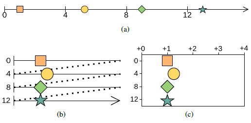
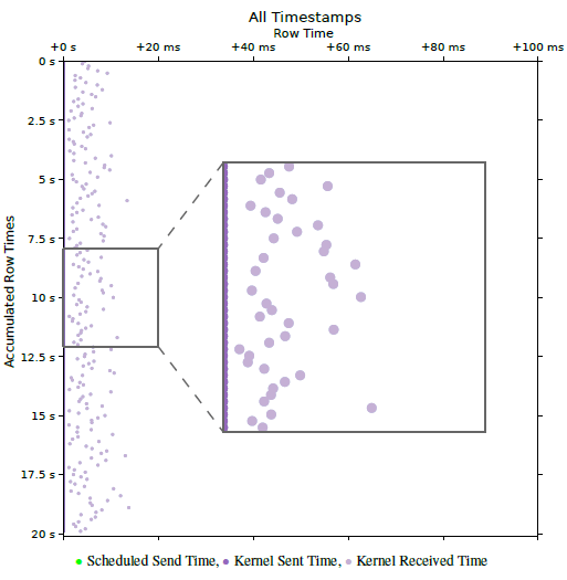
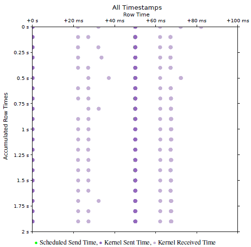
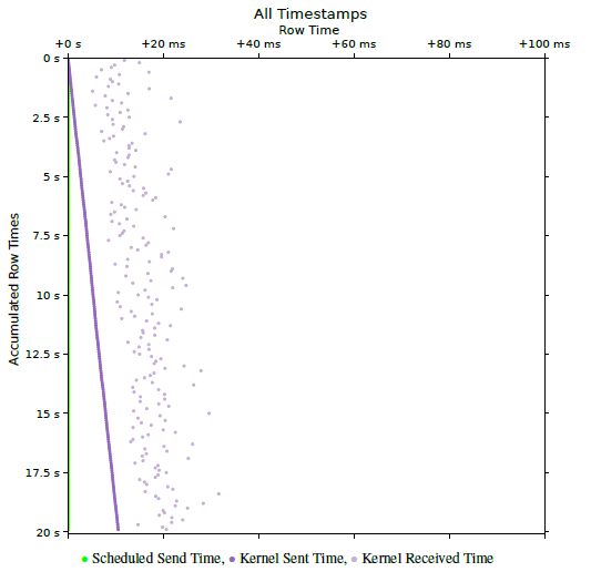
Fig. 2 shows an example of a PerfVis 2D timeline visualization of a network transmission measurement with timestamps collected at the sender and receiver sides. The row time is chosen to be equal to the packet interval of the measurement, which is 100 ms. As the sending timestamps closely adhere to the proposed sending sched- ule, they lie on a vertical line at the very left of the plot and cover up the green scheduled send timestamps. The receiving timestamps, however, are influenced by the delay and jitter of the transmission scatter to the right of the sending timestamps. Very beneficial for interpretability is the fact that the packet interval and correspondingly the row time are much larger than the actual delay between the sending and receiving timestamps. This means that all timestamps belonging to a single measurement packet fall into the same row, and no timestamps from other packets appear in that row. It should be noted that this assumption breaks when timestamps from the sending and receiving sides are taken from unsynchronised clocks.
The strength of the PerfVis 2D timeline visualization lies in its ability to exploit periodicity, making it easy to identify deviations from this periodicity visually. However, PerfVis does not care where this periodicity originates. It might originate from the sending pattern, but it might also stem from an underlying system, such as the fixed time structure of a 5G system. PerfVis distinguishes itself from the most commonly used network measurement tools, such as Ping or the Two-Way Active Measurement Protocol, by considering individual timestamps directly, rather than relying solely on aggregated metrics like delay. This granular approach enables detailed visualization and analysis of the temporal behaviour of net- work events, enhancing insight into network performance beyond conventional summary statistics.
Nevertheless, while having a view of the individual timestamps is important, retaining the statistics remains essential. This is already demonstrated with the example in Fig. 2, where knowing the delay is an important ingredient for interpreting the visualization. There- fore, PerfVis has been extended with an additional analysis module. The statistics module now complements the existing visualization module, which produces the aforementioned visualization. The summary statistics of delay and jitter metrics generated by the statistics module independently provide valuable qualitative and quantitative insights for assessment, reporting, and comparison. However, when combined with the visualization module, these statistics enable even more profound understanding by allowing users to explore data comprehensively and adding information beyond the limits of the visualization. The statistics module is the key stepping stone to gaining more profound insights.
To summarise, PerfVis introduces a novel analysis capability by directly considering individual timestamps of events and flexi- bly visualising them, in contrast to established tools such as Ping, TWAMP, and OWAMP, which report aggregated metrics like RTT, one-way delay, and jitter and thereby constrain the observable phenomena. The 2D timeline visualization innovatively combines linear and circular timeline layouts, preserving the ability to judge absolute time while emphasising periodic structures that become immediately visible as geometric shapes. This periodic folding of time enables a unique multi-scale perspective that supports concurrent inspection of behaviour over multiple orders of magnitude, from fine-grained jitter up to long-term trends. The extended statistics module further strengthens the approach by providing established delay and jitter statistics that enrich the visualization with quantitative context, forming an analysis loop in which statistics guide how to configure and inspect the visualization. At the same time, visually discovered patterns can be quantified and validated within the same tool, thus enabling advanced diagnostic tasks that are impractical with existing tools, such as visually locating rare effects tied to specific phases of a periodic schedule and immediately assessing their quantitative impact on delay and jitter. Further, PerfVis has been extended for more flexibility in three other aspects: (1) It provides scripts to include timestamp data from specific external timestamp sources to be integrated into the PerfVis analysis modules. This allows for new viewing points, and the scripts serve as examples for including even more sources. (2) The PerfVis measurement modules support more flexible and customisable sending patterns for their network transmission measurements. Given the diversity of application transmission patterns, accurately modelling sending patterns in measurement tools is critical when examining specific network behaviours of traffic. (3) The PerfVis visualizer module has been equipped with the ability to align timestamps in the visualization to focus the analysis on relations between timestamps that belong together. Taken together, these properties make PerfVis not just another latency-plotting tool but a flexible and extensible analysis environment that delivers insights into timing behaviour and periodic structures that prior network measurement tools cannot.
2. Related Work
A rich variety of research exists on tools and methodologies for measuring network transmissions. Ping is probably the most established and fundamental network diagnostic tool, measuring round-trip time to provide baseline latency and packet loss metrics and is widely used for network performance assessment. Although it has been around for a long time, it is still widely used, not only for debugging but also for latency measurement purposes, e.g. in [2]. Other established measurement protocols, such as the Two-Way Active Measurement Protocol (TWAMP) [3], provide round-trip time (RTT) metrics, while the One-Way Active Measurement Protocol (OWAMP) [4] focuses on one-way latency measurements. These protocols serve as foundational latency measurement tools but do not inherently support comprehensive visualization or multipoint timing analysis, which are required for in-depth analysis of complex modern networks. The insights from longitudinal 5G performance studies [5] motivate our approach and raise awareness that the methodology and tool for measurement itself have a significant impact on the measurement result.
Moreover, with some of the new generation networks being time-slotted systems, there are even more challenges for network measurements to gain a comprehensive understanding of their behaviour [6]. Although dedicated measurement equipment and tools are available for some technologies, such as 5G, they are often too expensive for small labs or have limited and non-extensible visualization and analysis capabilities. PerfVis provides an open-source implementation and includes the inclusion of external data captured by tools existing at the lab or other open-source tools, e.g., packet captures that contain timestamp information.
Increasing the number of measurement points along a transmission path enables finer-grained latency and jitter characterization [7, 8], supporting cross-layer analyses that are essential for modern heterogeneous networks. Our tool’s measurement does not capture more than one interface and not more than two layers of timestamps, but our extension integrates these ideas by enabling the ingestion of external data for analysis, thus allowing for both multi-layer and multi-point views. Hardware-based fine-grained timestamping solutions, such as P4STA [9], could complement visualization tools by improving the accuracy of timestamp capture, thereby providing a more precise foundation for analysis.
The extension of flexible sending patterns also for measurement tools is not solely motivated by static effects like buffers or scheduling algorithms that show different performance for distinct traffic patterns, but also by the fact that the implementation of fulfilling quality of service requirements is becoming more dynamic when conducted with the help of traffic classification [10, 11].
Visualization of timing data has been explored extensively in various domains. Foundational concepts in Visualization of Time-Oriented Data [12] emphasise the importance of multi-scale temporal perspectives and dynamic event representation. These principles are extended in our work to enable intuitive visualization, which can be categorised as a combination of linear and cyclic timeline arrangements, and the animation embeds the time aspect into the physical time as an additional dimension. Effective visualization of network timings facilitates more efficient analysis by leveraging human pattern recognition capabilities [13], enabling rapid identification of anomalies and correlation of temporal behaviours across protocol layers. Different visualizations for timing and latencies are imaginable. For timing and timestamps, timelines are a straight- forward approach also used for PerfVis and examined in [14]. For latencies, PerfVis relies on a combination of conservative plots. An interesting approach, utilising heatmaps, is presented in [15]. Live visualization and interaction further aid exploration of complex timing relations, as demonstrated in prior work [16, 12].
The metrics used by our statistics module are basic delay and jitter metrics. RFC 7679 [17] introduces the one-way delay metric with general issues regarding time and corresponding definitions of clock uncertainties. RFC 5481 [18] defines the packet delay variation metrics, and the jitter metric used is defined in RFC 3550 [19]. While [20] argues that aggregate metrics in a coarser resolution might be sufficient for an ISP, deep inspection of single traces requires a more fine-grained approach.
3. Tool Extensions
PerfVis is designed as a flexible and extensible platform for providing intuitive visual and, by now, also statistical insights into timing structures. By supporting the visualization of timestamps, delays, and jitter, PerfVis enables comprehensive analysis. Coming from the field of network measurements, PerfVis provides means to capture network transmission measurements across protocol layers, but the visualization can also be fed with other timestamp data. Before detailing the extensions to the PerfVis modules, the following sub- section recaps the data that PerfVis works with and introduces the additional data sources that can be included.
3.1. External Timestamp Sources
3.1.1. Timestamp Data
PerfVis uses timestamps to create its visualization and statistics. In principle, timestamps can originate from different layers and devices and may have distinct timing references. More timestamps collected along the packet’s path provide a more comprehensive view of its network transmission in terms of timing. Timestamps should be consistent so that computing differences between them is valid. To calculate delay and jitter metrics, at least two timestamps, thus a pair, per packet have to be available. Nevertheless, the base data remains the individual timestamps, not the aggregated metrics.
PerfVis measurements record timestamps from both the sending and receiving ends of transmissions, thus collecting pairs of times- tamps. The PerfVis visualization and statistics capabilities currently operate on a set of up to three pairs of timestamps. Provided that all timestamps are mutually consistent, external timestamps can be used freely, either alone or alongside natively captured ones. When this requirement cannot be guaranteed, subsets of timestamps that fulfil the consistency criterion may be used for separate visualization.
3.1.2. Integration Concept
External timestamp sources enable the analysis of PerfVis measure- ments from a different perspective, such as different nodes than the end nodes that run the PerfVis sender and receiver. Timestamp sources might be intermediate nodes on the transmission path that create packet captures; thus, with one measurement, different sections of the path can be investigated. In case measurements from a different network layer are available from an external tool, these could enable further cross-layer diagnosis. Another, maybe even more interesting, external timestamp source is traffic from a different network measurement tool or application.
The investigation of external timestamp sources with the PerfVis analysis modules relies on transforming the external data into a format that they can process. To support this integration, external data must have a periodic structure to exploit the PerfVis visualizer’s potential fully and contain identifiable pairs of related timestamps, typically identified by sequence numbers, to calculate the statistics.
3.1.3. Integration Implementation
The PerfVis analysis modules read timestamps from NPZ files, which are simply NumPy2 structured arrays saved using the corresponding save function. This means that simple Python scripts that arrange external data as NumPy structured arrays and save them for PerfVis are sufficient to integrate external timestamp sources. The structure that the arrays need to have can be derived from the PerfVis implementation and the example conversion scripts provided.
At the time of writing, two transformation scripts are provided. The first transforms PCAP files from PerfVis measurements into input files for the visualizer. The packet capture that produces the PCAP file can originate from any intermediate node along the path of the PerfVis measurement. The capture does not have to contain all timestamps that form the timestamp pairs; it can also contain only one set of timestamps to be finally combined with the original
TWAMP reflector. These are two examples, but also other external data, possibly not even stemming from network measurements, can be transformed similarly.
3.2. PerfVis Modules
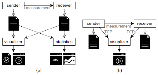
PerfVis is implemented in Python and is organised into modular components supporting multiple operational modes. The measurement modules, sender and receiver, are responsible for collecting timestamps through one-way network transmissions. The analysis modules include the visualizer and the statistics module. PerfVis supports both intermittent measurement mode (Fig. 3a) and live measurement mode (Fig. 3b), enabling a range of experimental and analytical workflows. The module updates were implemented as part of a Bachelor thesis, demonstrating PerfVis’s extensibility for research projects3.
3.2.1. Sending Schedules in Measurement Modules
The sender and receiver modules send measurement packets according to some predefined schedule and record timestamps for each packet at their side. The most straightforward schedule is the periodic sending pattern, which uniformly spaces packets by a configured interval, as demonstrated in the WiFi example in Fig. 2. It is important to note that executing a schedule should not depend on the processing time. Thus, events should be triggered by a clock, not just by the time between events, as this will nearly always accumulate errors and cause increasing deviation from the schedule. The PerfVis sender module has been extended to provide a broader range of predefined schedules for transmitting measurement packets. Because the 2D timeline visualization in PerfVis relies on periodicity to develop its full potential, all supported sending patterns are repeated periodically. The new sending schedules allow the adaptation of sending patterns to simulate application traffic or test network behaviour under different burst sizes within a single measurement. The following introduces the new sending patterns and illustrates each with an example.
0.1 ms. The sending pattern systematically sweeps 100 points in a row, which makes it evident that the receiving side timestamps, accumulating into vertical lines, clearly show the influence of the underlying 5G link with its 10 ms frame structure.
Modified periodic schedule The simple periodic sending pattern can be modified by adding linearly increasing or random temporal shifts within the configured packet interval. The linear shifting implementation is motivated by the need to emulate precise schedules with small packet intervals (e.g., Figure 8 in [1]) that may otherwise overwhelm network paths or packet capture capabilities. Linear shifts allow hitting specific schedule points at larger intervals, by-passing these problems. Random shifts might be helpful if random behaviour is to be tested or structures are not yet fully known.
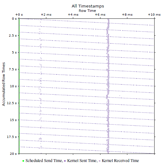
Fig. 4 shows an example where sending timestamps are linearly shifted by 0.1 ms per 10 ms interval. The display of scheduled send times in green at the very left of the plot does not account for the shift but only the interval. The actual send times, however, are shifted and thus appear as tilted lines. The actual shift can also be derived from the angle of the tilt. A new tilted line starts every 1 s, which can be seen on the y-ordinate. With the packet interval of 10 ms, this leads to 100 measurement packets per second and as the shift ranges over the 10 ms on the y-ordinate in that time of 1 s, the shift can be calculated as the range devided by the number of measurement points, which results in \(\frac{10\,\mathrm{ms}}{100} = 0.1\,\mathrm{ms}\). Due to the 5G TDD pattern, packet reception clusters into two occasions every 10 ms, appearing as two vertical lines in the visualization.
Bursty schedule Bursty sending patterns alter the simple periodic pattern by transmitting different numbers of packets in the configured interval. It is implemented by accepting arrays indicating packet counts for succeeding intervals, including the possibility of 0 packets in an interval. With this, quite complex sending patterns can be realised.
Fig. 5 illustrates a burst pattern with two bursts every 50 ms over the same 5G link as the measurement for Fig. 4. The first burst contains 5 packets and appears at the left of the plot, the second burst contains 20 packets and appears in the middle of the plot. With this, the network behaviour under bursts can be tested. In this example, the 5G network uses two transmission opportunities to transmit the 5 packet burst, but also requires only two transmission opportunities for the 20 packet burst, as indicated by the two points at which the receive timestamps accumulate after each burst transmission. To extract this conclusion from Fig. 5, the maximum delay being less than 50 ms is required as additional information. Actually, it is 37.1050 ms here, which can be extracted from the statistics module introduced in Section 3.2.3.
3.2.2. Alignment in the Visualizer Module
The task of the visualizer module is to create animations or videos of the 2D timeline visualization following the visualization concept illustrated in Fig. 1c. The visualizer module has been extended by an alignment functionality that enables artificially shifting some timestamps to a fixed schedule. If different timestamps have been collected for each packet, a single collection point is chosen for alignment. The timestamps from this chosen collection point then determine the shift for all timestamps of the corresponding packet, ensuring that the relations between timestamps for one packet re- main unchanged after the alignment. Alignment helps in judging relations between timestamps and is showcased in Section 4.2.
3.2.3. Statistics Module
Although visualization of timestamps provides valuable insights, combining statistics with the visualization empowers users to move beyond pattern recognition and gain even deeper insights. The capability of providing statistical output also makes PerfVis suitable for a broader range of use cases, including protocol evaluation, performance comparisons, and operational troubleshooting. The statistics output allows PerfVis to be used as a simple alternative to other statistical analysis tools, but offers the option to visualize results, e.g., in cases of unexpected statistical values. The statistics output further provides a quantitative basis for result reporting and enables objective comparisons both across different measurements and between distinct measurement tools.
The new PerfVis statistics module calculates key metrics for each packet, namely delay, packet delay variation, inter-packet delay variation, and jitter. The calculation is based on a pair of timestamps for each packet and yields a stream of values that can be further processed. For a measurement, multiple streams can be calculated for different metrics and different pairs of timestamps, if more than one pair is available.
The statistics module provides two options for processing streams: printing a numerical summary of streams to the command line or presenting a stream graphically in a plot showing the metrics’ progression over the course of the measurement and the distribution. At the time of writing, statistics output is not implemented for the live visualization of ongoing measurements, but only for completed measurements. The following provides a brief introduction to the metrics and the module’s two outputs, each with an example.
Metrics As expected, the delay is the time between two timestamps. In our case, most of the time, that will be the time it takes for a transmission to travel between the sending and receiving nodes on the same network layer. When t1 and t2 are the first and second timestamps captured for a packet, then the delay is the difference between these two timestamps.
D = t2 − t1
For further analysis, the delay is not restricted to the timestamps on the sending and receiving sides at the same layer. However, it can also be any combination of two timestamps for a packet, thus providing insight into processing delays from one network layer to another, as long as respective timestamps are available.
The packet delay variation (PDV) is a measure of how much the delay differs from a reference delay Dref .
PDV(i) = D(i) − Dref
Usually, the reference delay is chosen as the minimum delay that occurs in a measurement Dref = Dmin as defined in [18]. This is also the default case for PerfVis, although the reference delay can be set differently if desired.
The inter-packet delay variation (IPDV) is a measure of the dif- ference between the delay of a packet and the delay of the previous packet in a sequence.
IPDV(i) = D(i) − D(i − 1)
As noted in [18], the mean should usually be zero, but could deviate from zero in case of delay change over time or clock drift in case timestamps stem from different system clocks.
Different formulas are specified under the jitter term; we are using the definition of the Real-time Transport Protocol (RTP) [19].
J(i) = α · |IPDV(i)| + (1 − α) · J(i − 1)
The RTP RFC sets \(\alpha = \frac{1}{16}\) PerfVis also uses this as a default, but allows customisation of both α and the jitter value to start with for the first packet.
Commanline Statistics Summary To summarise a set of statis- tics streams for a measurement, a set of the following functions can be chosen: min, max, mean, median, 95th percentile, 99th percentile, standard deviation, span, and last value, and the results are printed to the command line in a table.
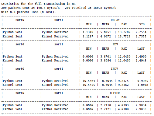
Commandline Output 1 shows the statistics of the Wi-Fi example from Fig. 2. In addition to the statistics for the kernel layer, it lists the statistics for the Python application layer that are not visible in Fig. 2 because the kernel layer timestamps occlude the application layer timestamps, as their time difference is too small to be visible.
Statistics Plots The statistics plots that visualize a single stream of a specific metric. These plots can provide further insights into development over time or distribution. Apart from the value plot in the centre, a histogram on the right illustrates the distribution, and boxplots at the bottom give insight into how the distribution changes over time.
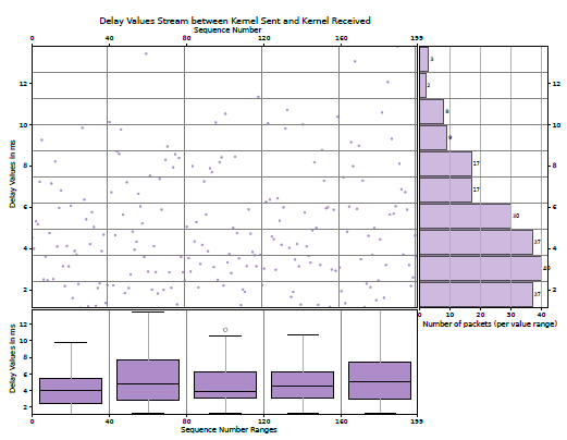
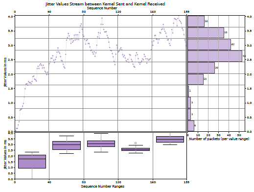
The centre plots report the values of the metric over the sequence number of the packets, which usually increases over the course of the measurement and thus corresponds to the course of time. As this scatter plot can be challenging to grasp, summaries for bins in both ordinates are provided, making it more accessible.
Boxplots on the bottom complement the course of time on the x-axis. The boxes themselves provide the 25th and 75th percentiles, and the line in the middle is the median. The whiskers are based on the 1.5 interquartile range, and circles denote outliers.
The bar chart on the right gives the number of values that fall into the specific bin on the y-axis. This provides some more information about the distribution of the metric.
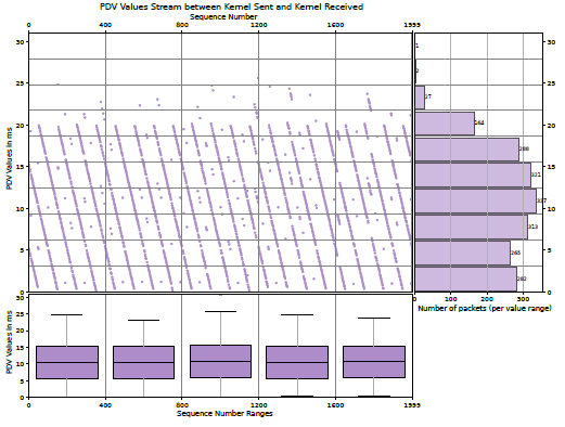
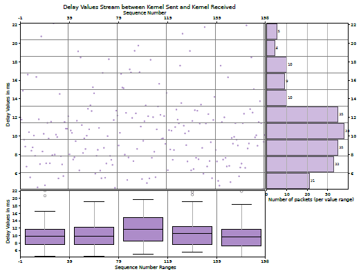
The Figs. 6 and 7 show the kernel layer delay and jitter plots of the Wi-Fi example, respectively, corresponding to Fig. 2 and Commandline Output 1. The boxplots in Fig. 7 show that the jitter first has to approach some meaningful value from the starting value of 0. While the statistics in Commandline Output 1 indicate that the kernel delay mean is approximately 5 ms, the bar chart in Fig. 6 shows that the bin centred around 3 ms contains the most delay values.
4. Case Studies
The following two use cases highlight how the presented extensions can provide further insights into network or protocol behaviour. The first case sheds light on 5G scheduling and utilises the statistics output and plots in combination with the PerfVis 2D timeline visualization. The second case illustrates some key characteristics of the TWAMP protocol and demonstrates the inclusion of TWAMP data into PerfVis, highlighting the applications of the visualization alignment and the usage of summary statistics.
4.1. 5G Scheduling
The measurement over a 5G link presented in Fig. 4, combined with the statistics output and plots, provides additional insights. The 5G system underlying the 5G measurements in this paper is a 5G campus network that consists of a dedicated hardware radio access network and a research and development core in software, developed in Europe. The 5G link in this measurement is configured with a 7:3 dual period TDD slot pattern ’DDDSUDDSUU’ of downlink slots ’D’, uplink slots ’U’ and special slots ’S’. The special slots contain another 10 downlink OFDM symbols, 2 guard period OFDM symbols and 2 uplink OFDM symbols in that order. The TDD slot pattern is repeated twice in a 10 ms 5G frame, which leads to 4 sections in a 5G frame where uplink is possible. When reviewing Fig. 4 with this knowledge that the measurement is performed in the uplink direction, it is surprising that only two of the uplink sections available in a 10 ms 5G frame are used, and one of them even quite rarely. When opting for low network delays, this PerfVis measurement clearly shows that the 5G system does not operate ideally to accomplish low delays.
With the statistical information, even more insights into the scheduling of the 5G system can be gained. The PerfVis 2D time-line visualization does not give information about the delay. The statistics commandline output provides a minimum of 1.3164 ms, a mean of 11.8884 ms and a maximum of 32.3745 ms. With the maximum delay, it can be inferred that the packets are transmitted within the first 3 5G frames after their transmission, and an IPDV mean of 0 indicates that the delay is not generally increasing or decreasing over time.
Having a closer look into the PerfVis PDV plot in Fig. 8, and assuming that the minimal delay in the measurement is roughly the minimum delay that can be acheived over the 5G link in this configuration, it becomes clear that the vast majority of packets is transmitted in the following 2 5G frames after sending, as their delay differes up to 20 ms from the minimal delay. The PDV values exhibit a structure of descending lines, which aligns with the fact that a shifting sending pattern is employed (see Fig. 4).
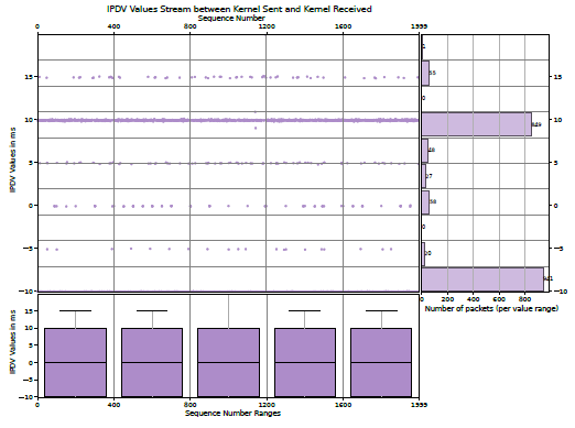
The PerfVis IPDV plot in Fig. 9, however, reveals another interesting insight. The IPDV values are mainly 10 ms and −10 ms and only very rarely 0 ms. This means that packets that follow each other are nearly never transmitted in the same 5G frame, but rather alternately in the next or the second next 5G frame. This unexpected scheduling behaviour is an interesting subject for further research.
4.2.TWAMP Measurement
This example demonstrates the use of TWAMP measurement packet capture to provide PerfVis visualizations and statistics, which requires an external timestamp source. The Two-Way Active Measurement Protocol (TWAMP) [3] is an open protocol for round-trip network measurements. The measurement is conducted between two hosts, with one assigned the role of the session sender and the other assigned the role of the session reflector. TWAMP builds on the One-Way Active Measurement Protocol (OWAMP) [4] but offers to account for processing delays at the session reflector. The configuration of the TWAMP measurement presented here is as closely comparable to the PerfVis measurement in the Section 3.2.3. This means that it is configured with a packet interval of 100 ms and is conducted over the same WIFI link with one contending device. When comparing the PerfVis visualization of the PerfVis measurement in Fig. 2 with the PerfVis visualization of the TWAMP measurement in Fig. 10, it is evident that the TWAMP measurement shows a drift for the sending timestamps already. The artificial scheduled send times are just an assumption due to the configuration of a 100 ms interval for the TWAMP measurement. The reason is that TWAMP does not adhere to a fixed schedule and presumably does not account for its own computation time at the session sender. The TWAMP RFC even mentions that the packet timing is not important: “Since the send schedule is not communicated to the Session-Reflector, there is no need for a standardised computation of packet timing” [3]. With time-slotted systems like 5G in mind, a fixed sending schedule, however, makes it much easier to investigate system effects in a controlled manner.
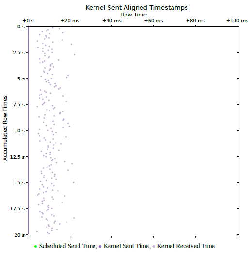
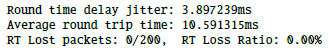
From Fig. 10 it is also easy to see that the drift is roughly 10.5 ms over the course of the measurement, and it is easy to calculate that it shifts about 50 µs for each of the 200 packets. In fact, it is not observable through the delay and jitter metrics that the measurement does not adhere to a fixed schedule, as these metrics are independent of the specific sending time (see Fig. 11). Also, the mean of the IPDV is roughly 0. A non-zero mean of the IPDV could indicate shifts in the delay but not in the sending pattern.
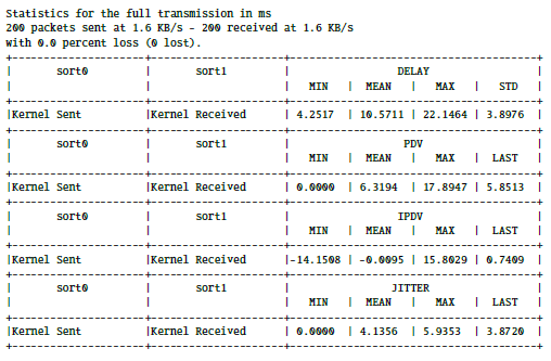
If the external tool, whose data is used for PerfVis, also provides statistical output, PerfVis can be used to provide additional metrics and to cross-check the statistical values with each other. The out-put from TWAMP itself (see Commandline Output 2) shows very similar values for delay and jitter compared to the PerfVis statistics output ( Commandline Output 3). Slight differences exist between them due to the different origins of the timestamps, specifically from the TWAMP application and the kernel-layer packet capture used for the PerfVis statistics.
In this example, where the TWAMP measurement shows a drift in the PerfVis 2D Timeline visualization, the new alignment functionality can help in judging delays and comparing them to results without drifts. Fig. 12 shows the aligned version of Fig. 10. The alignment shifted all send timestamps to the supposed send times of the artificial schedule. With this alignment, the relationship between the timestamp pairs is more obvious and can be compared to Fig. 2, which contains the PerfVis measurement, which adheres to a fixed sending schedule on its own. Due to TWAMP being a two-way measurement protocol, the delays between send and receive events in Fig. 10 are further apart than in Fig. 2 with the PerfVis one-way measurement.
4.3. Reproducability Details
To facilitate reproduction of the measurements presented in this paper, the following details specify the hardware, software, and measurement setup used in our case studies.
The measurement setup comprises a server, called LabServer, connected to a 5G router that acts as a client for 5G or Wi-Fi. For 5G measurements, the 5G router connects through the 5G RAN to the 5G Core running on a server, called CoreServer, which is connected back to the LabServer via Ethernet. For Wi-Fi measurements, the 5G router instead connects to another Wi-Fi router connected to the LabServer via Ethernet. For Wi-Fi contention, a laptop also connects to the Wi-Fi router and generates traffic by executing Iperf3. The measurement commands are executed in two separate LXC containers on the LabServer for the PerfVis sender and receiver or the TWAMP client and reflector. This way, the two containers share the same hardware clock, and clock synchronisation is not an issue. All measurement commands, raw NPZ files, and PCAP captures, as well as 5G and Wi-Fi link configuration details, are available in the PerfVis Git Repository.4
Table 1: Reproducibility Hardware and Software Specifications
Component Specification/Details
Hardware
LabServer CPU AMD Ryzen 9 9950X; 60GiB RAM;
2 Ethernet on ASUS ProArt B650-Creator; Proxmox version 8.4.14 (running kernel: 6.8.12-10-pve)
LXC Containers Ubuntu 24.04.3 LTS (GNU/Linux
6.8.12-10-pve x86 64); 4 CPUs; 2GiB RAM
5G Router Milesight UR75-504AE-P-W2 V1.2; Firmware 78.0.0.4
5G RAN Huawei BBU5900; Huawei RRU5836E 5G Core Fraunhofer Fokus Open5GCore; deployed
in LXC containers
CoreServer DELL PowerEdge R640Intel Xeon Gold
6246; 46GiB RAM; Intel Network Adapter X710-DA4; Proxmox version 8.4.14 (running kernel: 6.8.12-10-pve)
Wi-Fi Router D-Link DIR-X1560
Laptop Lenovo L13 Yoga; MediaTek MT7921 Wireless Network Adapter; Manjaro Linux (kernel 6.6.107-1-MANJARO)
Software
Python version 3.12.3
PerfVis Git tag ’astesj25’
TWAMP implementation by Emma Mirica5(adapted
for additional commandline output)
TShark version 4.2.2
Iperf3 version 3.19.1
5. Conclusion
With its visualization, PerfVis provides means to view timestamp data in new ways, and the extensions presented in this paper make it a dynamic tool for experimental network analysis or protocol evaluation. Scripts for incorporating data from external timestamp sources into the visualization offer new perspectives. The enhanced visualization gives more degrees of freedom in customising the visual representation, and the new statistics module closes the gap to traditional tools that primarily provide output in numbers. The case studies demonstrated that combining PerfVis 2D Timeline visualisation with statistics as summaries and graphs can provide deep insights into otherwise hidden structures.
We plan to develop the tool further, adding more options on how the animation or video fills up frames with data, e.g. a sliding mode that we might associate with other monitoring tasks, as well as usability in terms of user interface and interactivity and supporting a more modular approach for including a larger number of timestamps from multiple layers and sources at the same time.
PerfVis, with its underlying visualization and analysis ideas, provides help and inspiration for network engineers and researchers to deep dive into specific network behaviours. The analysis part is also open for timing data from other areas not related to transmission network analysis.
Conflict of Interest The authors declare no conflict of interest.
Acknowledgment We thank our students Felix Weber and Julius Herrmann for their contributions and inspiring discussions. The 5G Campus Network has been financed by Saarland State Major Instrumentation (Art. 143c GG).
- M. B¨ohmer, T. Herfet, “PerfVis: Visualization of Timings in Network Transmission,” in 2025 IEEE 22nd Consumer Communications & Networking Conference (CCNC), 1–6, IEEE, 2025, doi:10.1109/ccnc54725.2025.10976200.
- A. Bhat, V. Ganatra, A. Shaha, B. Chandrasekaran, V. Naik, “On the Constancy of Latency at the Internet’s Edge,” in 2025 9th Network Traffic Measurement and Analysis Conference (TMA), 1–10, IEEE, 2025, doi:10.23919/tma66427.2025.11096966.
- K. Hedayat, R. Krzanowski, A. Morton, K. Yum, J. Babiarz, “A Two-Way Active Measurement Protocol (TWAMP),” RFC 5357, RFC Editor, 2008, doi:10.17487/RFC5357.
- S. Shalunov, B. Teitelbaum, A. Karp, J. Boote, M. Zekauskas, “A One-way Active Measurement Protocol (OWAMP),” RFC 4656, RFC Editor, 2006, doi:10.17487/rfc4656.
- O. Basit, I. Khan, M. Ghoshal, Y. C. Hu, D. Koutsonikolas, “5G Metamorphosis: A Longitudinal Study of 5G Performance from the Beginning,” in Proceedings of the 2025 ACM Internet Measurement Conference, 17–31, ACM, 2025, doi:10.1145/3730567.3732914.
- J. Fabini, M. Abmayer, “Delay Measurement Methodology Revisited: Time-Slotted Randomness Cancellation,” IEEE Transactions on Instrumentation and Measurement, 62(10), 2013, doi:10.1109/tim.2013.2263914.
- P. Orosz, T. Skopko, J. Imrek, “A NetFPGA-based network monitoring system with multi-layer timestamping: Rnetprobe,” in 2012 15th International Telecommunications Network Strategy and Planning Symposium (NETWORKS), IEEE, 2012, doi:10.1109/netwks.2012.6381709.
- S. Reif, A. Schmidt, T. H¨onig, T. Herfet, W. Schr¨oder-Preikschat, “XLAP: A systems approach for cross-layer profiling and latency analysis for cyber-physical networks,” ACM SIGBED Review, 15(3), 19–24, 2018, doi:10.1145/3267419.3267422.
- R. Kundel, F. Siegmund, J. Blendin, A. Rizk, B. Koldehofe, “P4STA: High performance packet timestamping with programmable packet processors,” in NOMS 2020-2020 IEEE/IFIP Network Operations and Management Symposium, IEEE, 2020, doi:10.1109/NOMS47738.2020.9110290.
- M. A. Aleisa, “Traffic classification in SDN-based IoT network using two-level fused network with self-adaptive manta ray foraging,” Scientific Reports, 15(1), 2025, doi:10.1038/s41598-024-84775-5.
- A. Azab, M. Khasawneh, S. Alrabaee, K.-K. R. Choo, M. Sarsour, “Network traffic classification: Techniques, datasets, and challenges,” Digital Communications and Networks, 10(3), 676–692, 2024, doi:10.1016/j.dcan.2022.09.009.
- W. Aigner, S. Miksch, H. Schumann, C. Tominski, Visualization of timeoriented data, Springer London, 2023, doi:10.1007/978-1-4471-7527-8.
- A. Protopsaltis, P. Sarigiannidis, D. Margounakis, A. Lytos, “Data visualization in internet of things: tools, methodologies, and challenges,” in Proceedings of the 15th International Conference on Availability, Reliability and Security, ARES 2020, ACM, 2020, doi:10.1145/3407023.3409228.
- S. Di Bartolomeo, A. Pandey, A. Leventidis, D. Saffo, U. H. Syeda, E. Carstensdottir, M. Seif El-Nasr, M. A. Borkin, C. Dunne, “Evaluating the Effect of Timeline Shape on Visualization Task Performance,” in Proceedings of the 2020 CHI Conference on Human Factors in Computing Systems, CHI ’20, ACM, 2020, doi:10.1145/3313831.3376237.
- B. Gregg, “Visualizing system latency,” Communications of the ACM, 53(7), 48–54, 2010, doi:10.1145/1785414.1785435.
- Z. Liu, J. Heer, “The Effects of Interactive Latency on Exploratory Visual Analysis,” IEEE Transactions on Visualization and Computer Graphics, 20(12), 2122–2131, 2014, doi:10.1109/tvcg.2014.2346452.
- G. Almes, S. Kalidindi, M. Zekauskas, “A One-Way Delay Metric for IP Performance Metrics (IPPM),” RFC 7679, RFC Editor, 2016, doi:10.17487/rfc7679.
- A. Morton, B. Claise, “Packet Delay Variation Applicability Statement,” RFC 5481, RFC Editor, 2009, doi:10.17487/rfc5481.
- H. Schulzrinne, S. Casner, R. Frederick, V. Jacobson, “RTP: A Transport Protocol for Real-Time Applications,” RFC 3550, RFC Editor, 2003, doi:10.17487/rfc3550.
- S. Sundberg, A. Brunstrom, S. Ferlin-Reiter, T. Høiland-Jørgensen, R. Chac´on, “Measuring Network Latency from a Wireless ISP: Variations Within and Across Subnets,” in Proceedings of the 2024 ACM on Internet Measurement Conference, IMC ’24, 29–43, ACM, 2024, doi:10.1145/3646547.3688438.
No related articles were found.