An Empirical Study of Icon Recognition in a Virtual Gallery Interface

Adv. Sci. Technol. Eng. Syst. J. 3(6), 289–313 (2018);
 DOI: 10.25046/aj030637
This paper reports on an empirical study (an extension of a pilot study) that analyses the design of icons in a German 3-D virtual art gallery interface. It evaluates the extent to which a sample of typical computer users from a range of ages, educational attainments and employments can interpret the meaning of icons from the virtual interface taken ‘out of context’ and ‘in context’. The study assessed a sample of 21 icons representing the ‘action’, ‘information’ and ‘navigation’ functions of the virtual interface using a new Icon Recognition Testing method (IRT) developed by the researchers from existing usability test methods. The Icon Recognition Rate (IRR) of the icons was calculated and they were classified as ‘identifiable’, ‘mediocre’ or ‘vague’ in a novel and useful classification system. The IRT results show that the IRR of almost a quarter of the icons was below the ‘identifiable’ standard, which could seriously compromise the usability of a virtual interface. A comparison is made, using textual and thematic analysis, between the participants’ understanding of the icons’ meaning in and out of context and of the effect of positioning icons in relation to their virtual surroundings and of grouping them in tool bars. From the findings of the study, conclusions are drawn, and recommendations are made for economical icon redesign and replacement. It is suggested in the conclusions that further research is needed into how designers’ conceptual models can be better matched to users’ mental models in the design of virtual interfaces by bringing user profiles into the study.
1. Introduction
This paper is an extension of a pilot study by Ashe et al. [1] into the effectiveness of icon design in a virtual gallery interface that was presented in the e-Tourism stream of the International Conference in Information Management at Oxford University in May 2018 (ICIM2018). Experience with that pilot study and feedback from reviewers informed a fuller research project, which forms the extended work in this paper. The second part of the research project used a larger, more representative sample of participants, took account of the context within which the icons are understood and added textual and thematic analysis to the research. The present paper therefore contains more detail about the research methodology and the data analysis and its results, which will allow the research to be replicated. The pilot study examined a sample of virtual tours of museums and galleries, including the Smithsonian Natural History Museum in Washington, D.C. [2], the Louvre in Paris [3], Oxford University Museum of Natural History [4] and the portal Virtual Tours [5,] that currently includes more than 300 ‘Museums, exhibits, points of special interest and real-time journeys’ [6]. The study showed that icons are an important part of this generation of virtual interfaces as the main way of performing interactive tasks such as navigation, initiating actions and obtaining information [7]. The virtual interface itself is a complex sign system [8] containing components (e.g. buttons, icons and scroll bars) through which the user interacts with the system [9]. The icons can be symbols, images or pictures [10] that communicate meaning [8] without textual description [11-12].
This provides icon-based interfaces with the potential to overcome language barriers [10, 13], which can be important in an international context such as a cultural attraction. Icons used as shortcuts to a function (e.g. a printing icon in a word processing package) should provide the user with a memory aid to increase his or her ability to recall and to recognize the intended function without needing further instructions [14-15]. Successful recognition depends on the user’s familiarity with that type of interface and experience of using that icon [1] and greater familiarity and experience should therefore allow a more abstract (i.e. less concrete) icon to be used in the design of the interface.
Gatsou [15] cites the work of Nadin [16], who uses a calculator icon to demonstrate the principles of concreteness and abstraction, as shown in Figure 1.
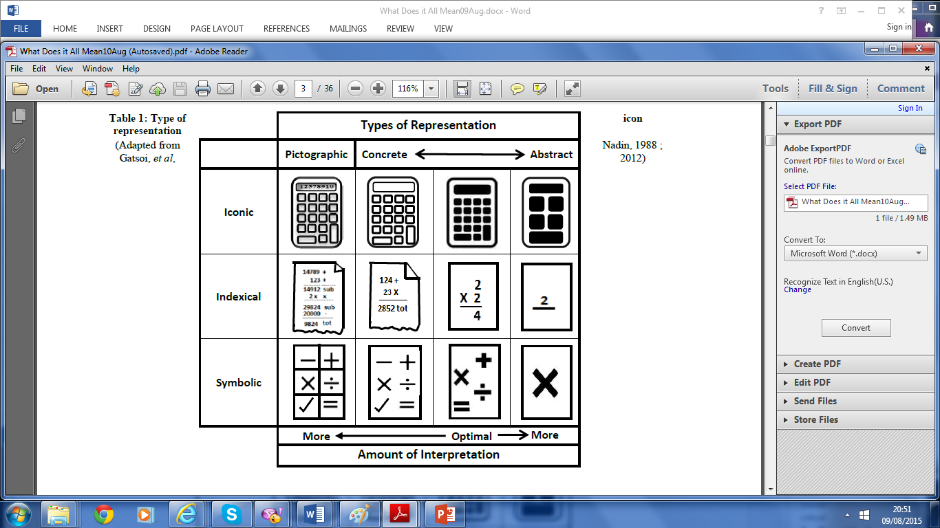 Figure 1: Types of icon representation
Adapted from Nadin [16] and Gatsou, et al., [15]
Scalisi [17] suggests that users need an initial period of learning the interface to understand the icons through ‘visual codification’. This may come easily with an office package that is used every day but may not be possible with a rarely-used interface such as a virtual gallery [1]. Icons may resemble to a greater or lesser extent the objects or functions that they represent [17] and the closeness of this relationship is the ‘semantic distance’, which is “important in determining the success of icon usability” [18].
Arnheim [19] discusses the relationship between ‘concreteness and abstraction’ stating that, “Images can serve as pictures or as symbols; they can also be used as mere signs”, implying that increased user familiarity can allow an icon to be simplified yet still allow the user to understand it. The pilot study supported this view, suggesting that the closer the semantic distance, the more likely the users were to understand the icon’s function and meaning. Conversely, the more abstract the icon (i.e. the greater its semantic distance) the more generally useful it could be in a variety of contexts, although correct recognition of the icon’s meaning could be more difficult in a specific case.
For example, the icon for printing a document could be a photograph of the actual printer to which the file could be sent. That would promote easy recognition and could be useful, for instance to locate the correct printer in a room, but would involve having a different icon for every available model of printer. This would make it difficult for users to learn the general meaning of the ‘printer’ icon in other instances and applications.
2. Icon Usability
The pilot study [1] reviewed the literature on icon usability testing and took the definition of Ferreira et al. [20] who cite the work of Barr, et al. [14] stating that an icon is successful, “…if the interpretant of the user [i.e. the user’s understanding] matches the object that the designer had intended with that sign, and [it is] unsuccessful otherwise” [20, p 2]. In other words, a recognizable (i.e. ‘identifiable’) icon should be easy to interpret and be unambiguous in order for it to succeed. This formed the baseline ‘measure of success’ used in the pilot study.
A range of different icon usability testing methods were reviewed in the pilot study, such as Icon Understandability Testing [21], [12], Test with Comparison [13], Matching Method [22], Icon Intuitiveness Testing [23] and Standard Usability Icon Testing [23]. From this review the Icon Intuitiveness Test (IIT) was selected for the study. The method was felt to be the most suitable as it seeks to find out how well users interpret and recognize icons using their existing insight and experience. Nielsen and Sano [23] describe a paper-based IIT as used by Sun Microsystems. Ferreira et al. [20] used a paper-based IIT and Foster [24] suggests that the IIT can be administered on a computer or on paper. Bhutar et al. [13] conducted a similar ‘test without context’ using an MS PowerPoint® presentation and paper-based questionnaires.
3. Pilot Study
Extending a previous study by Bhutan et al. [13], the modified IIT used in the pilot study adhered to the following guidelines:
- With one exception (i.e. Icon 1) the icons did not have text labels attached [23, 25] so their effectiveness relied entirely on their functioning as signs;
- The icons were not displayed in the actual interface (i.e. they were taken out of context), so the participants had no external visual cues to their meaning;
- Only one icon was made visible at a time so participants had no clues to their meaning from their sequence or by association.
Previous studies by Ferreira et al. [20] had used the standard ISO 9186:2001 benchmark [26] of 66% for successful icon recognition. Gatsou et al. [15] adopted the more stringent standard ISO 3864:1984 [27] which has a slightly higher benchmark, in which a success rate above 66.7 % was considered as ‘good’ and below that as ‘low’. A similar scale by Howell & Fuchs [28], was adapted for use in the pilot study. With this scale, icons achieving 60% Icon Recognition Rate (IRR) or above are classed as ‘identifiable’, whereas icons scoring less than that are ‘unsuccessful’ in conveying their meaning.
The adaptation for the pilot study further divided these ‘unsuccessful’ icons into ‘mediocre’ (30% – 59% IRR) and ‘vague’ (0% – 29% IRR) as shown in Table 1.
Table 1: Icon Recognition Rates and Classifications
| Icon recognition rate (IRR) classification | |
| IRR (%) | Classification |
| 60 – 100 | Identifiable |
| 30 – 59 | Mediocre |
| 0 – 29 | Vague |
The research required as a subject an advanced interface containing icons that are capable of a number of different interpretations and which carry out defined functions. A virtual art gallery was felt to meet these requirements and a search on the World Wide Web identified more than 100 possible candidates. A German 3-D virtual art gallery was eventually selected for the test, as it was felt to be representative of its type [1]. For ethical reasons the site is referred to as ‘Artweb.com’. The test examined the users’ understanding of the icons when taken ‘out of context’ (i.e. without reference to their use in the actual interface).
3.1. Icon Intuitiveness Test
All 21 icons used in the pilot study IIT were selected from the ‘Artweb.com’ virtual art gallery interface [1], which is close to the recommended number of 20 used in a previous study by Nielsen and Sano [23]. These icons were taken at random either individually or from grouped toolbars from various parts of the interface. The icons were designed for various basic interface functions (i.e. carrying out navigation, initiating an action and obtaining information) and are depicted in Table 2, labelled according to their function or purpose.
Table 2: The 21 Icons Evaluated in the Tests
| Images of 21 evaluation icons | ||||||||
| 1 | 2 | 3 | 4 | |||||
| Action | Action | Information | Navigation | |||||
| 5 | 6 | 7 | 8 |
|
||||
| Information | Action | Action | Navigation | |||||
| 9 | 10 | 11 | 12 |
|
||||
| Navigation | Action | Action | Action | |||||
| 13 | 14 |
|
15 | 16 | ||||
| Action | Navigation | Navigation | Information | |||||
| 17 | 18 | 19 | 20 | |||||
| Information | Action | Navigation | Navigation | |||||
| 21 | ||||||||
| Navigation | ||||||||
3.2. Test Sample
Five users consented to take part in the pilot study [1] to evaluate icons by participating in the IIT of icons displayed ‘out of context’. The choice of a small sample size in this type of research was based on the studies of icon usability by Nielsen and Sano [23] to collect rich data. The pilot sample included one female and four males – a ratio that is proportionate to the gender balance of the organization in which the tests were conducted. All the participants fell within the age range 20 – 29 years and all had good eyesight and no obvious disabilities.
None of the participants had previously used the ‘Artweb.com’ virtual art gallery, although 80% had experience of using another virtual tour and had used other 3-D virtual worlds. All the participants had more than ten years’ experience of using personal computers and most of the participants fell within the range of 10 to 14 years’ experience, as shown in Table 3. This may be because most of the participants in the study were university students undertaking a technology-related degree course.
Table 3: Experience of Using Computers in Years
| Years’ experience of using a personal computer | |
| Range of experience | No. of users |
| 0 – 4 years | 0 |
| 5 – 9 years | 0 |
| 10 -14 years | 4 |
| 15 -19 years | 1 |
| 20 -25 years | 0 |
Most of the subjects fell into the range of 30 – 44 hours of weekly computer use, with one subject exceeding 60 hours, as shown in Table 4.
Table 4: Computer Use per Week in Hours
| Hours of computer use per week | |
| Range of No. of hours | No. of users |
| 65 | 0 |
| 15 – 29 | 0 |
| 30 – 44 | 4 |
| 45 – 59 | 0 |
| 60 + | 1 |
3.3. Test Procedure
The IIT in the pilot study used a variety of the commonly-used ‘card sorting’ technique [29]. The participants were provided with brief details of the test scenario as in previous studies of this type [30]. The test administrator then conducted the IIT with the participants individually, each session lasting approximately forty-five minutes [1]. This procedure was repeated and the participant’s interpretation of the icons’ meaning or function was noted until all 21 cards had been displayed. An overall results table was produced by calculating the IRR expressed as a percentage for each of the icons using the formula:
| (No. of correct responses / No. of participants) x 100 = Icon Recognition Rate %.
|
3.4. Results for Icons ’Out of Context’
The IIT results for all 21 icons tested ‘out of context’ were placed into the chosen icon classification (i.e. ‘identifiable’, ‘mediocre’ and ‘vague’) based on the participants correctly interpreting their meanings or functions. In the pilot test, fifteen icons (i.e. 71.4% of the set of 21 icons) were classed as ‘identifiable’, one was classed as ‘mediocre’ (i.e. 4.8% of the set) and five were classed as ‘vague’ (i.e. 23.8%). This high proportion of ‘identifiable’ icons could suggest that the designs were generally successful in this interface. However, the meaning of 28.6% of the icons (i.e. the ‘mediocre’ and ‘vague’ classes) was misinterpreted or confused, which could seriously compromise the usability of the interface in practice. For the purposes of the pilot study [1] a ‘traffic light’ system was used to indicate the icons’ classification according to their IRR score, from best to worst, (i.e. green applies to ‘identifiable’ icons, amber to ‘mediocre’ icons and red to ‘vague’ icons) as in Table 5.
Table 5: Classification of Icons by IRR Score
| Classification of icons as identifiable, mediocre or vague | |||||
| No. | Image | Meaning | Score | % | Class |
| 1 | Start Virtual Tour | 5/5 | 100.0 | Ident. | |
| 2 | Previous tour position, pause tour, next position. | 5/5 | 100.0 | Ident. | |
| 3 | Exhibition information | 5/5 | 100.0 | Ident. | |
| 8 | Previous artwork to the left | 5/5 | 100.0 | Ident. | |
| 10 | Play animation button to circle artwork | 5/5 | 100.0 | Ident. | |
| 11 | Pause animation button to circle artwork. | 5/5 | 100.0 | Ident. | |
| 13 | Pan and zoom image. | 5/5 | 100.0 | Ident. | |
| 16 | Information on artwork. | 5/5 | 100.0 | Ident. | |
| 17 | Contact the exhibitor (by email). | 5/5 | 100.0 | Ident. | |
| 19 | Navigation arrow buttons | 5/5 | 100.0 | Ident. | |
| 5 | Help information for navigation. | 4/5 | 80.0 | Ident. | |
| 14 | Next artwork to the right | 4/5 | 80.0 | Ident. | |
| 6 | Full screen of virtual exhibition. | 3/5 | 60.0 | Ident. | |
| 7 | Return to screen to window size. | 3/5 | 60.0 | Ident. | |
| 18 | Close window button. | 3/5 | 60.0 | Ident. | |
| 12 | Slider to zoom in & out of image. | 2/5 | 40.0 | Med. | |
| 9 | Rotate left (anti-clockwise) | 1/5 | 20.0 | Vague | |
| 15 | Rotate right (clockwise). | 1/5 | 20.0 | Vague | |
| 20 | Fast jump to location. | 1/5 | 20.0 | Vague | |
| 21 | Jump to next room. | 1/5 | 20.0 | Vague | |
| 4 | Back to start point of virtual art exhibition. | 0/5 | 0.0 | Vague | |
3.5. Findings from the Pilot Study
The pilot study [1] showed that ‘universal’ icons from applications with which participants were already familiar were easily recognized. Icons that resembled those used in other interfaces and packages, but which had different functions, were confusing to the respondents and did not match their expectations. It was concluded from the pilot study [1] that icons that closely resemble their intended function and therefore do not require prior learning or experience achieve a higher IRR score. The pilot study also showed that icons taken out of context or which have been encountered previously in another context can be confusing to the user. This appears to depend on the user’s experience, knowledge and familiarity with that type of interface.
Some icons in the interface appeared to be common to most applications (e.g. the ‘question mark’ suggests a general help function) but were used in this case for an unusual purpose (i.e. specific navigation help) contrary to the user’s expectations. Therefore, adding more visual detail to the icons to make them more concrete [19] may help users by reducing their ambiguity. However, it may take longer initially for the users to process the icon’s meaning cognitively [16]. In fact, the pilot study suggests that designers’ adaptation of the same icon for different purposes appears to be creating misinterpretation. There are also other factors which may influence icon recognition, including the icons’ grouping in tool bars, their location on the screen, their function, distinctiveness, color and boldness.
3.6. Implications of the Pilot Study
The purpose of a pilot study is to provide pointers and guidelines so that further research can be carried out more effectively. The pilot study found that although most of the icons tested (15/21 or 71.4%) are ‘identifiable’, a significant proportion of them are not functioning effectively (see Table 5). Of the icons tested ‘out of context’ 28.6% (6/21) failed to meet the adopted level of identifiability, which is lower than the ISO standard for signs in general. Of these ‘unsuccessful’ icons, one was classed as ‘mediocre’ (scoring 40% IRR) and 23.8% of the total (5/21) were in the lowest ‘vague’ class, having an IRR of 20% or lower. The meaning of one icon was not recognized by any of the participants (scoring 0% IRR). If these findings are extended to virtual interfaces in general, this lack of recognition could have serious consequences for the effectiveness of icon-driven virtual interfaces in terms of usability, the quality of the users’ experience and their satisfaction. It was therefore decided to explore the possibility of extending the research.
Reflection by the researchers and feedback from reviewers offered the following insights into ways in which the pilot study could be extended:
- The small sample size (five participants) inhibited the data analysis. A larger test sample would improve the statistical validity of the recognition test and make it more representative of the real users of a virtual interface. However, the larger sample could make it more difficult to capture the same ‘richness’ in the data. Nielsen and Sano [23], who devised the tests, justify the use of a sample of five for this reason. In fact, the small sample size means that some values were so marginal that one correct or incorrect interpretation of the icon could increase or decrease the IRR by as much as 20%.
- All the participants were expert computer users, and all had used virtual tour software. This may not be representative of the typical users of a virtual gallery. Similarly, the age range of the participants could be expanded to be more representative of such users. In the pilot study all the participants were in the 20 to 29 age group. A similar study by Gatsou et al. [15] that included participants from 20 to 79 suggests that icon recognition declines consistently with age. It would be interesting to test this. The extended research using the same icons should therefore include novice users and older users, which would provide an interesting comparison of the way in which experts and novices and different age groups interpret icon types.
- The test ‘out of context’ was felt to be a fair assessment of the ability of an icon to convey its meaning, but also to be unrealistic as a test of its success ‘in action’. Further tests should therefore be carried out to assess the users’ understanding of the meaning and purpose of the same icons when placed in context, which was felt to be a more realistic evaluation of their function in an interface through environmental clues and positioning. The extended research therefore includes more detailed tests of icons and records more data about the ways in which users understand and interpret icons both in and out of context.
- Little was recorded in the pilot study [1] about the factors which may affect individual participants’ performance in the test. The findings suggest that a user’s personal profile, including factors such as prior knowledge and experience and cognition and learning style, can affect the usability of the interface as well as the degree of ‘immersion’. The extended study therefore includes some of these factors and examines them as influences on icon recognition success.
4. The Extended Study
The testing method used in the pilot study [1] was developed from Icon Intuitiveness Testing by Nielsen and Sano [23]. The study indicated that an IIT is a useful tool for assessing how accurately an icon expresses its intended meaning. However, it was felt that the extended study should provide richer data through which the icons could be evaluated in more depth. Experience of the IIT in practice suggested that improvements could be made. The testing method used therefore draws to some extent on all the other methods explored in the pilot study [1] but is adapted for the extended study. The chosen testing method is therefore termed Icon Recognition Testing (IRT) to avoid confusing it with other testing methods.
4.1. Choice of Subject
It was decided that the extended IRT required as a subject an advanced virtual interface with icons having the following features:
- The icons should be capable of different interpretations in and out of context and be used to carry out a range of functions. Ideally these should include 3D navigation and ‘jumping’ from one location to another, obtaining information about the interface and exhibits and performing action functions such ‘zooming’ and rotation. They should also initiate sophisticated user-driven interface functions such as screen and window manipulation.
- The icons should be capable of being tested ‘out of context’ and ‘in context’ by using small icon cards and still ‘screen shots’ from the virtual art gallery interface. It was not intended that a fully functional interface should be used, as this may suggest the function of the icons too readily to the participants in the study.
- Some of the icons should be grouped in tool bars as well as being displayed individually and some should only appear when they are usable (i.e. ‘toggled’).
- The icons are used for the basic activities that a visitor would carry out in a ‘real’ art gallery (e.g. navigation around the exhibits and obtaining information about the gallery and artworks) as well as virtual ‘action’ functions (e.g. closing a ‘pop-up’ menu).
After a selection process failed to identify a superior candidate site, it was decided to use the desktop version of the same German 3-D virtual art gallery (i.e. ‘Artweb.com’) that had been used for the pilot study. The website is a more ‘traditional’ type of virtual gallery, using a selection of different styles of room layout based on ‘real’ art gallery architectural plans. It uses an interactive virtual environment, in which users can navigate through a 3-D space using a mouse and keyboard to access an array of icons to carry out tasks using buttons, cursor pointers and interface metaphors.
This website may be less immersive than some that use high-end interactive technology (e.g. VR headsets, helmets and gloves) but it includes a larger selection of icon types and functions [31]. This makes it more useful for an icon recognition test than some of the later generation of virtual tour interfaces that rely on techniques such as ‘swiping’ for some of their navigation actions.
It is important to state that the extended study is not a critical test of this specific site, but a general test of the extent to which certain icons convey meaning and of the usability of this generation of virtual gallery sites of which it is typical. The rationale behind the IRT was to gain an insight into how participants from different backgrounds with varying levels of experience and alternative perspectives would perceive the meaning of the icons. Also, it was intended to see if there is a difference in IRR score between the icons seen ‘out of context’ and ‘in context’. In this study, an icon is taken to be ‘in context’ if two factors apply:
- There are visual cues in the virtual environment to aid the user in understanding the meaning and/or function of the icons including landmarks, points of reference (e.g. non-interactive objects), contours and boundaries (e.g. walls and doorways), routes around landmarks (e.g. pathways) and room layouts of exhibits [32].
- Control tool bars are used, with a hierarchical structure, having icons grouped according to their purpose, which change according to the virtual ‘position’ of the user in the interface or the function being requested.
Although the tests identified in the literature review examined similar aspects of icon understandability [15,21,12] as far as the researchers can ascertain no test has examined the same properties of icon design using the same measures of icon recognition. This extended study is therefore an original contribution to the field of icon design as well as to the construction of virtual interfaces. One implicit purpose of the study is to understand how misconceptions arise and to derive recommendations or guidelines for a more effective way of designing icons, allowing virtual interfaces to be developed that enhance ease of use and improve the quality of the user’s experience.
4.2. Test methodology
The complete IRT used in the extended study consists of two recognition tests and two questionnaires, one administered before the tests and one after both tests had taken place, as follows:
- A pre-test questionnaire, which contained 13 basic questions to record the participants’ demographic data and level of experience of computing in general and virtual interfaces specifically.
- Test One (‘out of context’), in which participants were shown a range of icons from the interface without any visual cues to their function and were asked to interpret the meaning of each icon. They answered in their own words and their responses were recorded in an Icon Recognition Booklet as brief notes by the Test Administrator.
- Test Two (‘in context’), in which the participants revisited the icons but were shown the context of the art gallery and the environment in which the icon would be seen. As with Test One the responses were recorded in the Icon Recognition Booklet. The responses to Tests One and Two were then analyzed for themes and are reported as Thematic Analysis 1 & 2.
- A post-test questionnaire, which contained a series of ‘yes/no’ questions in two sections:
Section 1 (‘out of context’) relating to Test One
Question 1. Were any of the 21 icons easier to recognize when out of context?
Question 2. Were any of the 21 icons harder to recognize when out of context?
Section 2 (‘in context’) relating to Test Two
Question 1. Did viewing any of the 21 icons in context (Test Two) change their meaning from Test One (i.e. out of context)?
Question 2. Are you familiar with any of the 21 icons in other contexts (i.e. software and applications)?
Question 3. Does grouping icons into tool bars make their meaning clearer?
The verbal responses to both sets of questions were recorded verbatim in brief form by the Test Administrator in the Icon Recognition Booklet. The two tests lasted around forty-five minutes to one hour with each participant and the initial tests were completed within a one-week period, followed by a further round of tests with a different sample following comments from a reviewer. Six participants without postgraduate qualifications who were employed in non-computer related work were tested and their results replaced six postgraduate expert participants. The test environment in all cases was a quiet room with adequate lighting, free from distractions. A description of the IRT procedure was read out from a Briefing Instruction Sheet and participants were informed about the test scenario as in previous studies [20], before being asked to complete the consent form and pre-test questionnaire.
4.3. Icon classification
Three categories of icon were identified according to their intended function, such as; initiating action (e.g. zooming in and out, opening and closing a window), obtaining information (e.g. about an exhibit or the gallery itself) and navigating around the gallery (e.g. moving to the left and right, going forward and back). The set of icons contained some ‘familiar’ icons, which resembled those used in other interfaces, as well as some more ‘obscure’ icons, which would be less familiar to the participants. This combination would test whether experienced users could employ existing conventions to aid their recognition and whether misconceptions could arise because of their existing knowledge and familiarity.
4.4. Pre-test questionnaire – participant demographics
All 21 participants in the tests declared themselves to have good eyesight for computer work and all were competent English speakers, although they had different cultures and nationalities. All were regular users of computers for a variety of purposes. The balance of age, gender, education level and employment (including a category for students) in the opinion of the researchers made the sample representative of the probable range of users of a typical virtual art gallery interface. The responses to the demographic questions are described in the following section:
Questions 1 & 2. What is your age group? What is your gender?
The age of the participants was noted, as previous research suggests that the ability to recognize icons declines with age [15] and this was to be tested again. For ethical reasons minors (defined as persons under eighteen) were omitted from the study but apart from that the age range and proportions (from 18 to 69 years) broadly reflect that of visitors to UK galleries in 2016 – 2017 [33]. The gender balance was approximately equal (i.e. 10 males and 11 females) which is also representative of the UK population, as shown in Table 6.
Table 6: Ages and gender of the participant sample
| Participant sample by age range and gender | |||
| Age range | No. of users | Male | Female |
| 18 – 25 years | 6 | 1 | 5 |
| 26 – 33 years | 6 | 5 | 1 |
| 34 – 41 years | 3 | 2 | 1 |
| 42 – 49 years | 2 | 2 | 0 |
| 50 – 59 years | 2 | 0 | 2 |
| 60 – 69 years | 2 | 0 | 2 |
| Totals | 21 | 10 | 11 |
Question 3. What is the highest academic qualification you have obtained?
The participants were asked to declare their highest level of academic qualification (i.e. school certificate, college diploma, bachelor’s degree, master’s degree or doctoral degree) as it was felt that this may have some bearing on their ability to interpret the meaning of the icons. This is depicted as a ‘pie chart’ in Figure 2 with the proportion of participants’ highest level of academic qualification expressed as a number (in brackets) and a percentage. One participant (4.8% of the sample) had only a school level qualification, 38.1% had a college Diploma, 28.6% a Bachelors’ degree, 23.8% a Masters’ degree and 4.8% a Doctoral degree. It is assumed for the purposes of this research that a sample of adults visiting a virtual art gallery will have a similar educational profile.
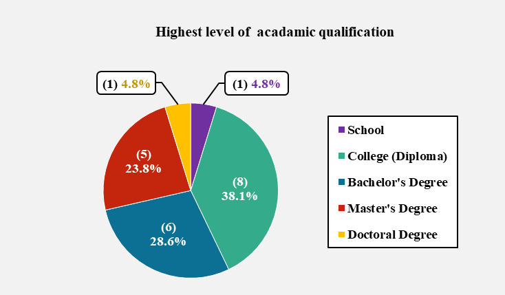 Figure 2: Highest levels of academic qualification
Question 4. If you are a current or a past student, please state your course title and main area of study.
The participants’ relevant areas of study (e.g. Computing or Art and Design) were recorded briefly in ‘free-form’ and were placed into seven categories (as shown in Figure 3) to check whether the subjects studied may have some effect on icon recognition. The largest proportion of participants (28.6%) was in the Computing category, with Art and Design the second largest (19.0%), and Sciences constituting the smallest proportion with 4.8%.
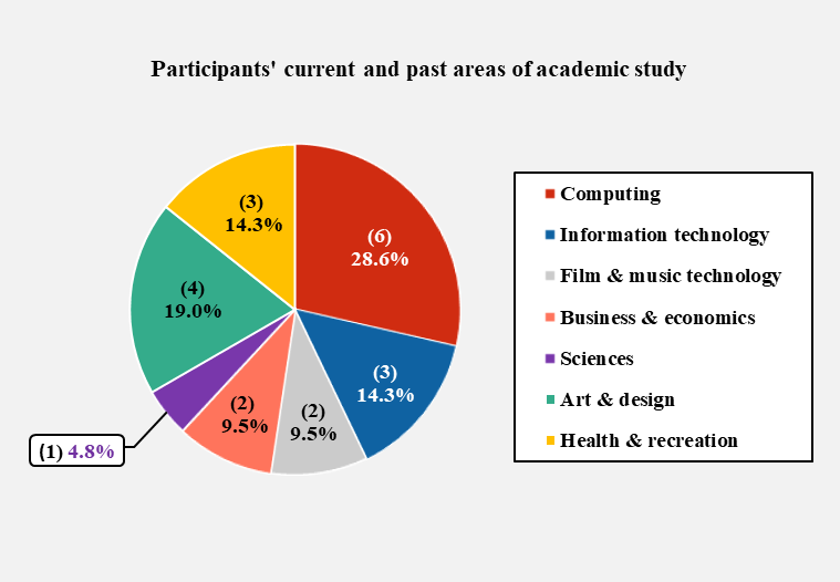 Figure 3: Current and past areas of academic study
Questions 5 & 6. Which category best describes your occupation? If you are employed, please state your job title.
Each participant’s occupational status (i.e. employed, student, retired or home maker) was recorded with the job category where relevant, to find out if there was a correlation between the participant’s employment and his or her ability to interpret icons. It was suspected that certain occupations could develop traits that could affect icon recognition. The primary pie chart on the left of Figure 4 shows the participants’ occupational status expressed as a proportion, number and percentage. It is not known whether this employment profile represents the visitors to an actual virtual gallery, but it represents a cross-section of the population.
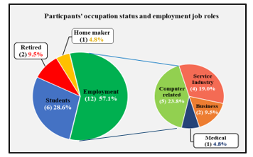 Figure 4: The participants’ occupational status
The largest proportion (57.1%) was in employment, while less than a third (28.6%) were students, two people (9.5%) were retired and one person (4.8%) was a home maker. The ‘employed’ segment was then expanded into a secondary pie chart on the right of Figure 4, which was further divided into job categories, again expressed as a number and percentage. The most common employments were related to the use of computers and the service industries. This implies that less than a quarter of the sample would be regular computer users through their work.
Question 7. Have you ever worked as an icon designer or a webmaster?
It was assumed that either of these roles would provide the job-holder with a distinct advantage in terms of icon recognition both ‘out of context’ and ‘in context’. As the sample used in the IRT was intended to be representative of typical virtual gallery visitors, it may be expected that they would have experience as users, rather than as icon creators or designers, so as not to bias the results. It was found that 9.5% of the participants had this type of experience, which was not felt to be excessive. The analysis would show whether experience of icon or website design improved the respondents’ ability to recognize the icons.
4.5. Participants’ computer experience
Question 8. Typically, how often do you use a computer interface with icons and for what purpose?
It was felt that regular use of icon-driven interfaces may have a bearing on the IRR score, so participants were asked to indicate how frequently they used icon-based interfaces and the purpose for which the computer was used, as shown in Figure 5. All the participants used a computer interface daily for Leisure, Home, Work and Study, which constituted the most frequent purpose (i.e. 61.9% of participants). As most packages (e.g. MS Office ®) are icon-driven, this suggests that all the participants would be competent at icon recognition. It should be noted that the operating systems of many commonly-used mobile devices also use an icon-based interface, including Android® and iPhone® mobile ‘phones. The retired participants (9.5% of the sample) characteristically did not use computers at all for Work or Study, but used them for Home and Leisure.
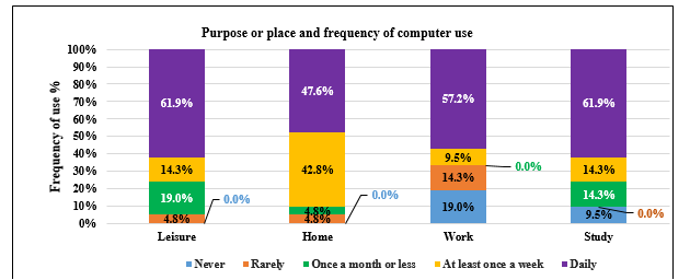 Figure 5: Frequency and purpose of computer use
The responses were given scores of 4 points for daily use, 3 points for use at least once a week, 2 points for at least once a month, 1 point for rarely used and ‘0’ for never used. The point scores for each of the four ‘purposes of use’ categories were accumulated and the totals were ranked in descending order, as shown in Table 7.
Table 7: Users ranked by frequency and purpose of computer use
| Users ranked in order by frequency of computer use | |||||
| Users | Purpose for which computer used | ||||
| Leisure | Home | Work | Study | TOTAL (pts) | |
| U.3 | 4 | 4 | 4 | 4 | 16 |
| U.6 | 4 | 4 | 4 | 4 | 16 |
| U.7 | 4 | 4 | 4 | 4 | 16 |
| U.14 | 4 | 4 | 4 | 4 | 16 |
| U.15 | 4 | 4 | 4 | 4 | 16 |
| U.16 | 4 | 4 | 4 | 4 | 16 |
| U.21 | 4 | 4 | 4 | 4 | 16 |
| U.2 | 4 | 4 | 3 | 4 | 15 |
| U.11 | 4 | 4 | 4 | 3 | 15 |
| U.5 | 4 | 4 | 4 | 2 | 14 |
| U.10 | 4 | 2 | 4 | 4 | 14 |
| U.1 | 2 | 3 | 4 | 4 | 13 |
| U.19 | 2 | 3 | 4 | 4 | 13 |
| U.12 | 4 | 3 | 1 | 4 | 12 |
| U.8 | 3 | 3 | 1 | 4 | 11 |
| U.20 | 2 | 3 | 3 | 3 | 11 |
| U.4 | 4 | 3 | 0 | 2 | 9 |
| U.9 | 3 | 3 | 0 | 3 | 9 |
| U.17 | 2 | 3 | 1 | 2 | 8 |
| U.13 | 3 | 3 | 0 | 0 | 6 |
| U.18 | 1 | 1 | 0 | 0 | 2 |
| TOTAL | 70 | 70 | 57 | 67 | 264 |
The highest total score for all categories was the maximum of 16 points (colored green) for Users 3, 6, 7, 14, 15, 16 and 21. The lowest total score was User 18 with 2 points out of a maximum of 16 points (colored red). The median score was 14 and Users 5 and 10 fell into this range, as highlighted by the bold lines. The joint highest frequency of use of computer interfaces was for Leisure and Home (i.e. scoring 70 points) followed closely by Study (scoring 67 points) while Work scored 57 points. The participants overall scored a total of 264 points (78.6%) out of a possible total of 336 points (100%). This indicates that, depending on the types of applications, programs and browsers used, in general the users tested had a significant exposure to a range of icons.
Question 9. How would you describe your level of computer skills?
The participants were asked to rate qualitatively their own level of computer skill (rather than their quantitative experience of using computers) as the user’s general experience with computers may not necessarily equate with his or her competence in using a virtual interface. The self-described level of computer skill showed that all of the participants had some experience of using computers, 42.9% of the sample describing themselves as ‘advanced’ and equal percentages (28.6%) rating themselves as ‘intermediate’ and ‘basic’ as shown in Figure 6. This can be said to represent a typical range of the computer expertise that would be found in visitors to a virtual gallery.
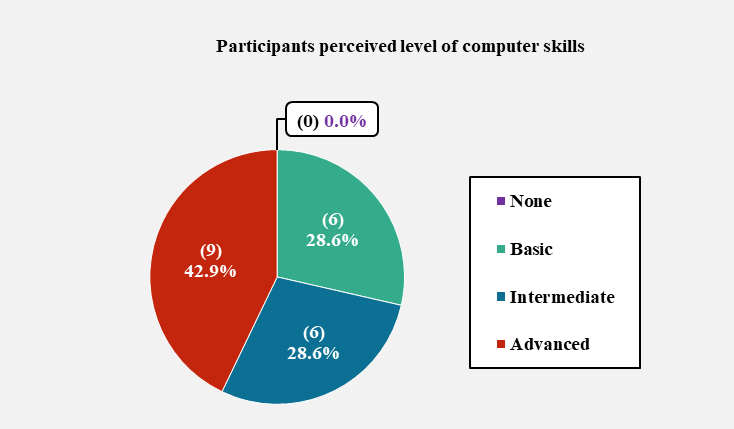 Figure 6: Self-described levels of computer skills
Question 10. Which of the following devices do you use to access the internet?
The participants were asked to indicate which of the ten most common computing devices they used to access the Internet, with the opportunity to record less common devices in free-form as ‘other’. The responses were given scores of ‘1’ for a ticked box or ‘0’ for an unticked box. The scores for the number of devices for each of the 21 users were added and this total score was ranked in descending order as shown in Table 8.
Table 8: Ranked order of participants by the number of hardware devices used
| Users ranked in order by number of hardware devices used | ||||||||||||
| Users | Hardware devices | |||||||||||
| Smart Watch | Smart Phone | PDA | E-reader | Tablet | Notebook | Laptop | Desktop | Games Console | Smart
TV |
Other | TOTAL | |
| U. 6 | 0 | 1 | 1 | 1 | 1 | 1 | 1 | 1 | 1 | 1 | 0 | 9 |
| U.2 | 0 | 1 | 0 | 0 | 1 | 0 | 1 | 1 | 1 | 1 | 0 | 6 |
| U.10 | 0 | 1 | 0 | 0 | 1 | 0 | 1 | 0 | 1 | 1 | 0 | 5 |
| U.11 | 0 | 1 | 0 | 0 | 1 | 0 | 1 | 1 | 1 | 0 | 0 | 5 |
| U.1 | 0 | 1 | 0 | 0 | 0 | 0 | 1 | 1 | 0 | 1 | 0 | 4 |
| U.14 | 0 | 1 | 0 | 1 | 1 | 0 | 1 | 0 | 0 | 0 | 0 | 4 |
| U.16 | 0 | 1 | 0 | 0 | 1 | 0 | 1 | 1 | 0 | 0 | 0 | 4 |
| U.3 | 0 | 0 | 0 | 0 | 1 | 0 | 1 | 1 | 0 | 0 | 0 | 3 |
| U.5 | 0 | 1 | 0 | 0 | 0 | 0 | 1 | 1 | 0 | 0 | 0 | 3 |
| U.7 | 0 | 1 | 0 | 0 | 0 | 0 | 1 | 1 | 0 | 0 | 0 | 3 |
| U.8 | 0 | 1 | 0 | 0 | 1 | 0 | 1 | 0 | 0 | 0 | 0 | 3 |
| U.9 | 0 | 1 | 0 | 0 | 1 | 0 | 1 | 0 | 0 | 0 | 0 | 3 |
| U.12 | 0 | 1 | 0 | 0 | 1 | 0 | 1 | 0 | 0 | 0 | 0 | 3 |
| U.15 | 0 | 1 | 0 | 0 | 1 | 0 | 1 | 0 | 0 | 0 | 0 | 3 |
| U.17 | 0 | 1 | 0 | 0 | 0 | 0 | 1 | 0 | 0 | 1 | 0 | 3 |
| U.20 | 0 | 0 | 0 | 0 | 0 | 0 | 1 | 1 | 0 | 1 | 0 | 3 |
| U.21 | 0 | 1 | 0 | 0 | 1 | 0 | 0 | 1 | 0 | 0 | 0 | 3 |
| U.4 | 0 | 0 | 0 | 1 | 0 | 0 | 1 | 0 | 0 | 0 | 0 | 2 |
| U.13 | 0 | 0 | 0 | 0 | 0 | 0 | 1 | 0 | 0 | 1 | 0 | 2 |
| U.18 | 0 | 0 | 0 | 0 | 0 | 0 | 1 | 0 | 0 | 0 | 0 | 1 |
| U.19 | 0 | 1 | 0 | 0 | 0 | 0 | 0 | 0 | 0 | 0 | 0 | 1 |
| TOTAL | 0 | 16 | 1 | 3 | 12 | 1 | 19 | 10 | 4 | 7 | 0 | 73 |
The participant with the highest score was User 6 with 9/10 devices (colored green) and the joint lowest were Users 18 and 19 with 1/10 devices (colored red). The median score was three devices and Users 3, 5, 7, 8, 9, 12, 15, 17, 20 and 21 fell into this range, as highlighted by the bold lines. In terms of the devices, more participants used laptops (19 users) followed by smartphones (16 users) and tablets (12 users). No-one used the smartwatch and older devices such as PDAs also achieved low numbers (one user). It was noted that ‘smartphone’ interfaces tend to be icon-driven which could affect the results of the IRT. The desktop version of the virtual interface was chosen for the test as it was felt by the researchers that this version was most likely to be used for virtual tours of a gallery or museum due to the size and quality of the monitor. It is unlikely that artwork would be viewed in detail on a smartphone or even a tablet by discerning art lovers.
Question 11: Which of the following types of computer application have you used and how frequently?
The respondents were asked to indicate how frequently they used nine types of computer application, (i.e. regularly, occasionally or never used) to establish their familiarity with different types of interface and their experience of viewing icons in different contexts. The responses were given scores of two points for ‘regular use’, one point for ‘occasional use’ and zero for ‘never used’. The point scores for each of the nine categories were added and this total was ranked in descending order, as in Table 9.
Table 9: Ranked order of participants by the number of computer applications used
| Users ranked in order by number of computer applications used | ||||||||||
| Users | Computer Applications | |||||||||
| Interactive websites | Virtual
Worlds |
Virtual
Tours |
Social Media | Navigation | Web
Browsers |
Media Players | Office Apps | Gaming | TOTAL
(pts) |
|
| U.20 | 0 | 1 | 2 | 2 | 2 | 2 | 2 | 2 | 2 | 16 |
| U.5 | 2 | 1 | 1 | 2 | 1 | 2 | 2 | 2 | 2 | 15 |
| U.6 | 2 | 2 | 1 | 1 | 1 | 2 | 2 | 2 | 2 | 15 |
| U. 2 | 2 | 0 | 1 | 1 | 2 | 2 | 2 | 2 | 2 | 14 |
| U. 3 | 2 | 1 | 1 | 1 | 2 | 2 | 2 | 2 | 1 | 14 |
| U.11 | 1 | 1 | 1 | 2 | 1 | 2 | 2 | 2 | 2 | 14 |
| U. 1 | 1 | 0 | 1 | 2 | 2 | 2 | 2 | 2 | 1 | 13 |
| U.19 | 1 | 1 | 1 | 2 | 1 | 2 | 2 | 2 | 1 | 13 |
| U.21 | 2 | 0 | 1 | 2 | 1 | 2 | 2 | 2 | 1 | 13 |
| U.7 | 2 | 0 | 0 | 2 | 1 | 2 | 2 | 2 | 1 | 12 |
| U.10 | 0 | 0 | 1 | 2 | 2 | 2 | 2 | 2 | 1 | 12 |
| U.15 | 2 | 0 | 0 | 2 | 2 | 2 | 2 | 2 | 0 | 12 |
| U.13 | 1 | 0 | 1 | 2 | 1 | 2 | 2 | 0 | 2 | 11 |
| U.14 | 2 | 0 | 0 | 1 | 1 | 2 | 1 | 2 | 2 | 11 |
| U.16 | 2 | 0 | 1 | 2 | 1 | 2 | 1 | 2 | 0 | 11 |
| U.17 | 1 | 0 | 0 | 2 | 2 | 2 | 2 | 1 | 1 | 11 |
| U.8 | 1 | 0 | 0 | 2 | 1 | 2 | 2 | 1 | 1 | 10 |
| U.9 | 2 | 0 | 0 | 2 | 2 | 2 | 2 | 0 | 0 | 10 |
| U.12 | 2 | 0 | 0 | 2 | 1 | 2 | 2 | 1 | 0 | 10 |
| U.4 | 2 | 0 | 1 | 0 | 0 | 2 | 0 | 0 | 0 | 5 |
| U.18 | 1 | 0 | 0 | 1 | 0 | 1 | 1 | 0 | 0 | 4 |
| TOTAL | 31 | 7 | 14 | 35 | 27 | 41 | 37 | 31 | 23 | 246 |
The highest total score was User 20 with 16 out of a maximum 18 points (colored green) and the lowest score was User 18 with four points out of 18 (colored red). The median score was 12 points and Users 7, 10 and 15 fell into this range, as highlighted by the bold lines. Most users used Web Browsers (scoring 41 points) and Media Player frequently (scoring 37 points) while Virtual Worlds (scoring 7 points) and Virtual Tours (scoring 14 points) were used less frequently. This suggests that the participants would approach the IRT as average users of a virtual interface rather than as experts, which had been identified as a drawback to the pilot study [1]. The researchers noted that the subject interface uses a mixture of icons that would be familiar to the user and ones that had been created specially or adapted that would be unfamiliar.
Question 12: Have you ever been to a public or private art gallery before?
All participants except one had visited a real art gallery before and therefore it was felt that a sufficient number would be familiar with the layout and setting within which the ‘in context’ IRT would take place.
Question 13: Have you ever visited the German ‘Artweb.com’ virtual online art gallery interface before?
None of the participants had visited the virtual gallery site before and so all undertook the tests on an equal footing in this respect. Participants were given the real name of the gallery.
5. Experimental procedure
A stated in Section 4.2 the IRT consisted of two parts. In the first part, the icons were evaluated ‘out of context’. In other words, they were not associated with the interface and there were no contextual clues to their function or purpose. In the second part of the test, the icons’ context was indicated by using still ‘screen shots’ taken from the virtual tour of the gallery, but the interface was not accessed [34]. This would place an emphasis on understanding the icon in its context and would be a fairer test of the icons’ success in communicating its meaning. The experimental procedures for each test are described below:
5.1. Experimental Procedure – Test One
The test used a variant of the ‘card sorting’ technique [29] using icon cards each measuring 28mm by 28mm, depicting images of the icons. An example of the test set-up is shown in Figure 7.
 Figure: 7. Setup for the paper-based IRT
In carrying out Test One the following principles were observed:
- The icons included no text [23,25] except for Icon 1;
- The icons were displayed without reference to the actual interface (to preserve the lack of context).
- Only one icon was made visible to the user at a time to avoid giving clues to its use.
The test administrator shuffled the pack of cards to ensure that the icons were not grouped in any way (e.g. by spatial association) before placing them face down on the table as a pack [35]. The administrator then picked up one card at a time from the top of the pile and showed this card to each participant at approximately the same viewing angle and ‘reading distance’ as it would be in the virtual interface. Each participant was then prompted verbally to attempt a ‘free-form’ or ‘thinking aloud’ interpretation of the meaning of each icon [34] as specified in ISO 9186 [26] and following the pattern set by Duarte [36]:
Question 1. What do you think is the meaning of this icon?
Question 2. What function do you think would occur if you clicked on this icon?
Question 3. Does this icon resemble any sign or symbol you have seen or used before?
The test administrator noted the responses in the appropriate column of the icon recognition booklet verbatim. If a participant was not able to interpret the meaning of the icon within one minute, he or she was encouraged to move on to the next icon card and ‘don’t know’ was recorded. It was felt that if users needed this length of time to interpret the meaning of an icon its use in the interface would be compromised. Participants could provide more than one answer and these were noted for later interpretation. After a response was recorded, the test administrator discarded the icon card onto a separate pile, and the participant was not allowed to revisit any of the icons. This process was repeated for all 21 cards.
5.2. Experimental Procedure – Test Two
In Test Two, the same 21 icons were evaluated again but ‘in context’ (i.e. in their ‘natural surroundings’). The participants were shown ten screenshots from the Artweb.com interface on A4 cultured photographic sheets. These screenshots were still images with no interactive functionality and icons were depicted either individually or grouped in toolbars. The participants were therefore able to use visual clues to derive more understanding and meaning from the icons. No text was included, although Icon 1 contained the English word ‘Tour’. The ten A4-sized screenshots were shuffled to avoid their functionality being revealed by their sequence or by association. The icons to be identified (singly and in groups) were indicated by red rings [34] as shown in Figure 8.
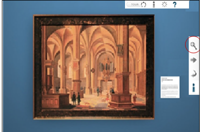 Figure 8: A screenshot of an art exhibit with tool bars
An Icon Reference sheet showing all the numbered icons was available to the participants and the same testing environment was used as for Test One. Each participant was asked what he or she thought the icon meant (as in Test One) and what purpose the icon had. Participants were encouraged to examine the icon’s surroundings for additional clues (i.e. from the gallery room or exhibit) and, where relevant, from other icons that were associated when grouped into tool bars. The test administrator noted the participants’ responses in the icon recognition booklet. After a response was recorded, the administrator discarded the screenshot onto a separate pile, face down to avoid influencing the next choice. At the end of the test the participants could use the Icon Reference Sheet to help them fill in the open-ended questionnaire.
6. Scoring criteria for Tests One and Two
After the IRT sessions, the researchers assessed the participants’ responses according to the following scoring criteria, adapted from a method developed by Rosenbaum and Bugental [37]:
- Completely correct – the participant’s response matches both the object and the function, if not the exact description of the icon’s meaning (scored as +2);
- Partially correct – the participant’s response matches either the object or the function but not both (scored as +1);
- Incorrect – the participant’s response matches neither the object nor the function or the answer is completely different from the intended meaning of the icon (scored as ‘zero’). The following cases were included in this category:
- Respondent gave ‘don’t know’, ‘not sure’ or ‘no idea’;
- No response given;
- Opposite response given to the true meaning of the icon (e.g. in the case of movement or rotation).
| (Actual Score / Maximum Possible Score) x 100
= Icon Recognition Rate %. |
If a participant’s entry was not completely clear, a discussion was undertaken by the researchers to interpret the response [35]. In extreme cases the participant was consulted about the meaning. An overall results table giving the IRR score for each icon (shown in Appendix B) was produced by using the following formula, where the maximum possible score for each icon is 42.
The IRT results for all 21 icons ‘out of context’ and ‘in context’ were separated into classes adapted from a study by Howell and Fuchs [28] with the difference that one class was renamed ‘mediocre’ instead of ‘medium’ as it was felt to be a clearer term. The range boundaries differ from those in ISO 3864-2:2016, [38] which refers to general signs rather than computer icons and rates 66.7% and above as ‘good’.
According to the Howell and Fuchs stereotypy, icons achieving 60% IRR or above are classed as ‘identifiable’, whereas icons scoring less than 60% IRR are felt to be ‘unsuccessful’ in conveying their meaning. The adaptation of this technique that was developed for this research further divides these ‘unsuccessful’ icons into ‘mediocre’ (scoring 30% – 59% IRR) and ‘vague’ (scoring 0% – 29% IRR) as shown in Table 10.
Table 10: Icon Recognition Rate classification
| Icon recognition rate (IRR) classification | |
| IRR (%) | Classification |
| 60 – 100 | Identifiable |
| 30 – 59 | Mediocre |
| 0 – 29 | Vague |
7. Results of Test One – ‘out of context’
The 21 icons used in Test One ‘out of context’ were given an IRR score according to the procedure described above and were classed as ‘identifiable, (60% – 100%), ‘mediocre’ (30% – 59%) or ‘vague’ (0% – 29%) according to the adapted classification system. Where ‘identifiable’ icons also reached the ISO 3864-2:2016 [38] standard of 66.7% for signs, this was also noted in the results table for interest but was not included in the formal classifications.
The textual comments made by the participants were examined to see if they expressed confidence in their interpretation, for instance by giving several alternative answers or by indicating uncertainty in the hesitant way they provided their responses. This was felt to be important in the ‘out of context’ test as the participants had no other clues to guide them, so the form of the icons alone had to indicate their meaning.
7.1. Test One – ‘identifiable’ icon results (60% – 100% IRR)
In total, the ‘out of context’ test produced eight ‘identifiable’ icons (i.e. Icons 1, 2, 8, 10, 11, 13, 14 and 19) which is 38.1% of all the icons evaluated in the IRT, as shown in Table 11. The icons are presented in the table in numerical order with the score out of a maximum total of 42 (i.e. 2 points for an icon that is ‘completely successful’ in conveying its meaning) in the fourth column and the IRR% in the fifth column.
Table 11: ‘Identifiable’ Icons 60% – 100% IRR
| Identifiable icons scoring an IRR 60% -100% range | |||||
| Icon | IRR for IRT | ||||
| No. | Image | Meaning | Score/
Max. score |
IRR % | |
| 1 | Start Virtual Tour | 33/42 | 78.6% | ||
| 2 | Previous tour position, pause tour, next tour position. | 28/42 | 66.7% | ||
| 8 |
|
Previous artwork to the left | 25/42 | 60.0% | |
| 10 | Play animation button to circle artwork | 28/42 | 66.7% | ||
| 11 | Pause animation button to circle artwork. | 30/42 | 71.4% | ||
| 13 | Magnifying glass – Pan and zoom image | 25/42 | 60.0% | ||
| 14 |
|
Next artwork to the right | 25/42 | 60.0% | |
| 19 |
|
Navigation arrow buttons | 33/42 | 78.6% | |
NB: Icons with an IRR meeting the ISO 3864-2:2016 [38] standard of 66.7% and above are underlined.
7.2. Test One – ‘mediocre’ icon results (30% – 59% IRR)
In total, there were nine ‘mediocre’ icons (i.e. Icons 3, 5, 6, 7, 12, 16, 17, 18, 20) which is 42.9% of all icons evaluated in the IRT. All the results for the ‘mediocre’ icons are listed in Table 12.
Table 12: ‘Mediocre’ Icons 30% – 59% IRR ‘out of context’
| Mediocre icons scoring an IRR 30%-59% range | |||||
| Icon | IRR for IRT | ||||
| No. | Image | Meaning | Score/
Max. score |
IRR % | |
| 3 | Exhibition information | 22/42 | 52.4% | ||
| 5 | Help – with navigation of system or interface | 17/42 | 40.5% | ||
| 6 | Full screen view of the virtual exhibition | 23/42 | 54.8% | ||
| 7 | Return screen to window size (smaller view) | 21/42 | 50.0% | ||
| 12 |
|
Slider to zoom in and out of image. | 17/42 | 40.5% | |
| 16 | Information on artwork or exhibit | 24/42 | 57.1% | ||
| 17 | Email – contact the exhibitor or gallery. | 23/42 | 54.8% | ||
| 18 | Close window button. | 18/42 | 42.9% | ||
| 20 | Fast jump to go to location | 16/42 | 38.1% | ||
7.3. Test One – ‘vague’ icon results (0% to 29% IRR)
In total, there were four ‘vague’ icons (i.e. Icons 4, 9, 15 and 21) which is 19.0% of all the icons evaluated in the IRT. All the results for ‘vague’ icons are listed in Table 13.
Table 13: ‘Vague’ icons 0% – 29% IRR
| Vague icons scoring an IRR 0% – 29% range | ||||
| Icon | IRR for IRT | |||
| No. | Image | Meaning | Score/
Max. score |
IRR % |
| 4 | Back to start point of virtual art exhibition | 0/42 | 0.0% | |
| 9 | Rotate left (anti-clockwise) | 7/42 | 16.7% | |
| 15 | Rotate right (clockwise). | 9/42 | 21.4% | |
| 21 | Jump to next room. | 9/42 | 21.4% | |
7.4. Summary of IRT ‘out of context’
The IRT ‘out of context’ showed that eight icons of the 21 icons (i.e. 38.1%) achieved an average IRR above 60%. These icons were therefore classed as ‘identifiable’. Nine icons (42.9%) scored an average IRR% between 30% and 59% and were classed as ‘mediocre’. Four icons (19.0%) failed to reach 30% IRR and were therefore classed as ‘vague’ (see Table 14). That is not to say that the icons would not function, but it is a strong indication that the user experience would be confusing and less than satisfactory.
Table 14: Summary of icon classes, IRR ranges and results ‘out of context’
| Summary of icon classes, IRR ranges and results | |||
| Class of icons | IRR Range | Icon Nos. | No. & % of icons |
| ‘Identifiable’ | 60% to 100% | 1, 2, 8, 10, 11, 13, 14, 19 | 8/21 = 38.1% |
| ‘Mediocre’ | 30% to 59% | 3. 5, 6, 7, 12, 16, 17, 18, 20 | 9/21 = 42.9% |
| ‘Vague’ | 0% to 29% | 4, 9, 15, 21 | 4/21 = 19.0% |
8. Results of Test Two – ‘in context’
All 21 icons shown ‘in context’ were given an IRR score in the same way as the ‘out of context’ test and were classified as in Test One. Icons that reached the ISO 3864-2:2016 [38] standard of 66.7% were also noted but not included in the formal classifications. In this case, as with Test One, the verbal responses from the participants were analysed for the degree of confidence they showed in their interpretation of the icons’ meaning, for instance by giving several different answers, by the length of time they pondered while providing a response or by the degree of uncertainty they showed in coming to a decision.
This was felt to be important in the ‘in context’ test as the participants now had clues (e.g. the position of an icon in relation to a landmark or the association of an icon with an exhibit) to guide them. The researchers were interested to see if the inclusion of contextual clues improved the participants’ confidence in their decision-making process. However, confidence in reaching a decision about the meaning of an icon is not necessarily associated with the correctness of the interpretation. It is possible to be confident and incorrect. This could apply particularly to icons that are used in a different context from that with which the participants are familiar. This is discussed in the Textual Analysis in Section 9.
8.1. Test Two – ‘identifiable’ icon results (60% – 100%)
Icons which achieved an IRR score within the 60% – 100% range are classed as ‘identifiable’. In total, there are sixteen ‘identifiable’ icons (i.e. Icons 1, 2, 3, 6, 7, 8, 10, 11, 12, 13, 14, 16, 17, 18, 19 and 20) which is 76.2% of all icons evaluated in the IRT. The ‘out of context’ IRT had already shown that 29.0% of icons were in the this category. Eight icons have therefore improved their IRR score and moved up to the ‘identifiable’ category from the ‘mediocre’. In the ‘in context’ test only one of the ‘identifiable’ icons (i.e. Icon 20) failed to meet the more stringent ISO standard of 66.7% IRR. The results show that twice the number of icons were classed as ‘identifiable’ in context (16) when compared to out of context (8).
This increase in the participants’ ability to recognize the purpose of the icons when the context is known (even in a limited way by showing a screenshot) implies that contextual knowledge makes a significant difference to a users’ understanding of an icon’s meaning and function. All the results for ‘identifiable’ icons are listed in Table 15 and Appendix B.
Table 15: ‘Identifiable’ icons ‘in context’
| Identifiable icons scoring an IRR 60% -100% range | |||||
| Icon | IRR for IRT | ||||
| No. | Image | Meaning | Score /
Max. score |
IRR % | |
| 1 | Start Virtual Tour. | 35/42 | 83.3% | ||
| 2 | Previous tour position, pause tour, next tour position. | 33/42 | 78.6% | ||
| 3 | Exhibition information | 30/42 | 71.4% | ||
| 6 | Full screen. | 32/42 | 76.2% | ||
| 7 | Return screen to window size (smaller view). | 28/42 | 66.7% | ||
| 8 |
|
Previous artwork to the left. | 35/42 | 83.3% | |
| 10 | Play animation button to circle artwork. | 31/42 | 73.8% | ||
| 11 | Pause animation button to circle artwork. | 38/42 | 90.5% | ||
| 12 |
|
Slider to zoom in and out of image. | 28/42 | 66.7% | |
| 13 | Magnifying glass – Pan and zoom image. | 30/42 | 71.4% | ||
| 14 |
|
Next artwork to the right | 36/42 | 85.7% | |
| 16 | Information on artwork or exhibit. | 33/42 | 78.6% | ||
| 17 | Email – contact the exhibitor or gallery | 29/42 | 69.0% | ||
| 18 | Close window button. | 34/42 | 81.0% | ||
| 19 | Navigation arrow buttons | 38/42 | 90.5% | ||
| 20 | Fast jump to location. | 25/42 | 60.0% | ||
NB: Icons with an IRR percentage equal to ISO 3864-2:2016 [38] standard of 66.7% and above are underlined.
8.2. Test Two – ‘mediocre’ icons results (30% to 59% IRR)
Icons which scored an IRR percentage within the 30% to 59% range of the IRT when in context are classed as ‘mediocre’ and in addition fall below the acceptable level of the ISO standard. In total there are four ‘mediocre’ icons (i.e. Icons 7, 12, 20, 21) which is 19.0% of all the icons evaluated in the IRT. The results ‘in context’ show a decrease in the number of icons classed as ‘mediocre’, as eight icons (i.e. Icons 3, 6, 7, 12, 16, 17, 18 and 20) have now moved into a higher band (i.e. they have become more identifiable when the context is known). One icon (Icon 21) moved into this class from the ‘vague’ category. None of the icons in this category became less identifiable when the context was made clear. It may be significant that all the ‘mediocre’ icons appear to have been designed specifically for this interface. Their unfamiliarity therefore gives scope for misidentification and confusion over their meaning and purpose. The IRR scores for ‘mediocre’ icons are listed in Table 16 and Appendix B.
| ‘Mediocre’ icons scoring an IRR 30% -59% range | ||||
| Icon | IRR for IRT | |||
| No. | Image | Meaning | Score /
Max. score |
IRR % |
| 5 | Help – with navigation of system or interface. | 21/42 | 50.0% | |
| 21 | Jump to next room. | 24/42 | 57.1% | |
Table 16: ‘Mediocre’ icons ‘in context’
8.3. Test Two – ‘vague’ icon results (0% to 32%)
Icons which participants scored an IRR percentage within the 0% to 29% range when evaluated in context are classed as ‘vague’. In total, there are only three ‘vague’ icons (i.e. Icon 4, 9 and 15) which is 14.3% of all icons evaluated . The results show that Icon 21 that was vague ‘out of context’ moved up to the ‘mediocre’ class ‘in context’. The results for ‘vague’ icons are listed in Table 17 and Appendix B.
Table 17: ‘Vague’ Icons ‘in context’
| ‘Vague’ icons scoring an IRR 0% -29% range | ||||
| Icon | IRR for IRT | |||
| No. | Image | Meaning | Score /
Max. score |
IRR % |
| 4 | Back to start point of virtual art exhibition. | 5/42 | 11.9% | |
| 9 | Rotate left (anti-clockwise) | 4/42 | 9.5% | |
| 15 | Rotate right (clockwise). | 3/42 | 7.1% | |
The IRT ‘in context’ showed that an awareness of context through seeing the screenshots made a significant difference to the users’ ability to recognize the purpose of the icons. In some cases (e.g. Icon 2) this is quite small (a 2.4% increase in IRR) but in most cases, increases in the IRR of between 10% and 20% are achieved. In five cases (Icons 8, 9, 11, 14) the increase in IRR is between 20% and 30% and Icons 18 and 21 both achieved increases of more than 40%. This demonstrates clearly and practically that context plays an important role in icon recognition. The icons within each classification and the proportion of the total icons that they represent ‘in context’ is shown in Table 18.
The eight icons that were moved into a higher classification through evidence of their context are shown in green in the ‘comments’ column of the table. Significantly, the icons in the ‘vague’ category that performed less well in context (Icons 9 and 15) appear to have been designed especially for this virtual interface. Knowing the context in these cases did not seem to help.
Table 18: A summary of icon classes, IRR range, icon numbers and proportions and results
‘in context’ compared to ‘out of context’
| Icon classes, IRR range, icon numbers and results ‘in context’ | |||||
| Class | IRR range | Context | Icon No. | No. & % | Comments |
| ‘Identifiable’ | 60% – 100% | Out | 1, 2, 8, 10, 11, 13, 14, 19 | 8/21 = 38.1% | 8 icons (in green) up from the ‘mediocre’ class |
| In | 1, 2, 3, 6, 7, 8, 10, 11, 12, 13, 14, 16, 17, 18, 19, 20 | 16 /21 = 76.2% | |||
| ‘Mediocre’ | 30% – 59% | Out | 3, 5, 6, 7, 12, 16, 17, 18, 20 | 9/21 = 42.9% | 1 icon (in green) up from the ‘vague’ class |
| In | 5, 21 | 2/21 = 9.5 % | |||
| ‘Vague’ | 0% – 29% | Out | 4, 9, 15, 21 | 4/21 = 19.0% | The ‘vague’ class lost one icon to ‘mediocre’ when in context |
| In | 4, 9, 15 | 3/21 = 14.3 % | |||
9. Analysis of pre-test questionnaire responses
The respondents’ demographic data and their personal profiles (e.g. academic training, experience of interface use, familiarity with computer devices and applications) were recorded in the Pre-test Questionnaire as shown in Section 4.4. An analysis of the data allows interesting comparisons to be made with the results of Tests One and Two. The average of the overall averages (i.e. an average of the ’out of context and ‘in context’ total IRR scores) is 57.1% as shown in Appendix A.
Questions 1 & 2. What is your age group? What is your gender?
An analysis of the responses to Question 1 shows that the findings of Gatsou et al. [15], that the ability to recognize icons declines consistently with age, appears to be confirmed. There was one additional observation, that the youngest age group was fourth out of the six, with an overall average of 54.4% (see Table 19) and performed lower than the average of overall averages (i.e. 57.1%) although other factors may have influenced this result. An analysis of the responses to Question 2 shows that, when grouped according to the overall average IRR score, the male respondents performed slightly better than the females (64.0% IRR for males, 50.9% for females). Eight male respondents and three females are above the 57.1% average of overall averages (see Appendix A). It may be implied from this that the males at least in this sample are better at icon recognition than the females.
Table 19: Overall average IRR performance by age range
| Overall average IRR performance by age range | |||
| Age range | No. in group | Total overall IRR | Overall average. |
| 18 – 25 years | 6 | 326.4 | 54.4% |
| 26 – 33 years | 6 | 387.0 | 64.5% |
| 34 – 41 years | 3 | 182.2 | 60.7% |
| 42 – 49 years | 2 | 116.7 | 58.4% |
| 50 – 59 years | 2 | 106.0 | 53.0% |
| 60 – 69 years | 2 | 81.0 | 40.5% |
Question 3. What is the highest academic qualification you have obtained?
It may be assumed that the level of education relates to the user’s ability to discern the meaning of icons. An analysis of the responses based on the overall IRR average supports this assumption, but not strongly. Two of the respondents educated to College level scored above the average and six below. Four respondents educated to Bachelors’ level scored above the average and two below. Three respondents with Masters’ degrees scored above the average and two below. The single respondent educated to Doctoral level scored above the average but not significantly. Therefore, it can be inferred that the user’s educational level may have a small influence on icon recognition.
Question 4. If you are a current or a past student, please state your course title and main area of study?
It could be assumed that users with qualifications in technical or ‘visual’ subjects would be better at recognizing icons. Significantly, all five of the top five respondents had qualifications in either Computing, Information Technology or Film and Music Technology, which tends to confirm this. Their skill could be because they had experience of virtual interfaces. The other qualifications were generally distributed among the sample, although it is noticeable that the bottom three scores (well below the average of overall averages) had qualifications in Art and Design and Business and Economics.
Questions 5 & 6. Which category best describes your occupation? If you are employed, please state your job title.
It was suspected that experience of certain occupations could affect icon recognition. An analysis of the data shows that 28.6% of the participants were students and 57.1% were employed in various job categories, with two people being retired and one person a home maker. An analysis of the responses to this question indicated that being a student gave only a slight benefit, as the Employed category averaged 58.2% IRR and the Student category averaged 59.0% IRR. The two Retired respondents averaged 40.5% IRR (below the average of overall average IRR of 54.7%) but were by no means the lowest scorers, being in 18th and 19th place. The Home-maker respondent averaged 66.7% IRR and was in sixth place.
Question 7. Have you ever worked as an icon designer or a webmaster?
It was suspected that either role would probably have included experience or training that would increase the ability to recognize the meaning of icons. Two participants declared that they had worked in these roles (i.e. 9.5% of the sample). Both achieved IRR scores above the average of 57.1% and were in the top five places. From this we can conclude that experience as an icon designer may improve icon recognition. This may have implications for aligning the designers’ conceptual model and the users’ mental models when creating virtual interfaces. This mental model is influenced by the user’s profile, including his or her experience, interests, learning style and preferences which the designer needs to know.
Question 8. Typically, how often do you use a computer interface with icons and for what purpose?
It was felt that regular use of icon-driven interfaces may have a bearing on the IRR score, and some purposes may also favour icon recognition. An analysis of the data in Table 7 shows that seven of the 21 respondents used a computer ‘Frequently’ (i.e. four points) for all the purposes of Leisure, Home, Work and Study. The data does not show that frequent and varied use is necessarily associated with accurate icon recognition, as three of the seven scored below the average of both overall averages of 57.1% IRR.
Question 9. How would you describe your level of computer skills?
It was felt by the researchers that the more skilled in computer use the participants felt themselves to be, the more confident they would be in interpreting the meaning of the icons. An analysis of the data shows that all the respondent felt themselves to have some degree of self-assessed computer skills. However, the difference between the groups was less than may have been expected. The ‘Advanced’ group achieved an average IRR score (i.e. between ‘in context’ and ‘out of context’) of 58.8%, the ‘Intermediate’ group 55.0% and the ‘Basic’ group 56.8% (both the latter being below the average). Surprisingly, the Basic group had a slightly higher IRR score than the Intermediate group. So, self-determined computer skills appear to make little difference to icon recognition, as the score for the Advanced group is only slightly above the average for the whole sample.
Question 10. Which of the following devices do you use to access the internet?
This question required the participants to indicate how many and which of the ten most common devices they used. It could be assumed that familiarity with more devices increased the user’s experience of different interfaces and types of icons, which could increase the IRR score. In fact, the IRR scores shows no significant correlation between the number of different devices used and the user’s ability to recognize icons in the two tests. Indeed, the participant with the highest IRR score (User 21 with an average of 76.2%) used only three devices, and seven of the ten highest scoring participants used less than five (i.e. half the available number of devices). It should be noted that the icons in the test were taken from the desktop version of the virtual interface, which makes it different to the small hand-held devices.
Question 11: Which of the following types of computer application have you used and how frequently?
By this question the researchers sought to ascertain if the number of different applications used and the frequency of their use had any effect on icon recognition. Nine different types of application were specified, and points were allocated for each and for the frequency of use. It is possible to see a definite correlation between the variety and frequency of use of computer applications and the IRR score. Eight of the top ten highest scorers in terms of IRR percentage had 12 or more points on the scale (see Table 9).
10. Comparison of icons in and out of context
The results of Tests One and Two were examined and discussed among the researchers. Their interpretations of the findings for each icon are included in the following comparative sections. The comments on the ‘out of context’ and ‘in context’ results are followed by a textual analysis of the ‘free-form’ notes taken from the Icon Recognition Booklet (see Section 4.2).
10.1. Icon 1 – Start virtual tour
Out of context, Icon 1 scored 78.6% IRR in the test (see Appendix B) and was therefore classed as ‘identifiable’. There were 14 ‘completely correct’ and five ‘partially correct’ responses, with two ‘incorrect’ responses. Interestingly, both of these gave a ‘don’t know’ response, which is rather surprising as its purpose (i.e. the word ‘tour’) is stated on the icon.
In context, the IRR score for Icon 1 increased to 83.3%, raising it even higher in the ‘identifiable’ category with 15 participants identifying its meaning correctly. There were five ‘partially correct’ responses and only one ‘incorrect’ response, which registered a ‘don’t know’ verdict.
A textual analysis of the ‘free-form’ responses showed that ‘out of context’ many of the respondents identified the icon correctly (the word ‘Tour’ was clearly seen) but did not appreciate its true function as starting the tour. A circular arrow on the icon caused confusion, with ‘slideshow’, ‘presentation’ and even ‘headphones’ (which are sometimes used on ‘real’ gallery tours for audio commentary) being offered as possible functions. ‘In context’ the respondents were able to assign a more accurate meaning to the icon by seeing it in its ‘natural surroundings’.
10.2. Icon 2 – Previous, pause & next on tour
Out of context, Icon 2 scored 66.7% IRR in the test (see Appendix B) and is therefore classed as an ‘identifiable’ icon. Seven participants were ‘completely correct’, 14 participants were ‘partially correct’ and there were no ‘incorrect’ answers.
In context, the IRR score increased to 78.6%, raising it slightly in the ‘identifiable’ class, with twelve participants being ‘completely correct’ and nine participants giving a ‘partially correct’ estimate and no ‘incorrect’ responses.
A textual analysis of the ‘free-form’ responses shows that ‘out of context’ participants assigned a meaning to the icon based on symbols with which they are already familiar – audio and/or video controls. The use of these symbols goes back to the introduction of the cassette tape recorder in 1963 by Phillips NV. They have since become almost universal, so most of the participants have ‘grown up with them’. Knowing the context in the ‘in context’ test enabled many respondents to provide more detailed, more informed responses, which increased the IRR score for the icon.
10.3. Icon 3 – Virtual exhibition/gallery interface information
Out of context, Icon 3 scored 52.4% IRR in the test (shown in Appendix B) and was therefore classed as ‘mediocre’. Only two candidates were ‘completely correct’, 18 were ‘partially correct’ and one ‘incorrect’.
In context, the icon’s IRR score increased significantly to 71.4%, and it has moved well into the ‘identifiable’ category with nine ‘completely correct’ and 12 ‘partially correct’ responses, and no ‘incorrect’ estimates of its meaning.
A textual analysis of the free-form comments showed that ‘out of context’ the majority of respondents realised that the use of the letter ‘i’ was for providing information but were unsure about its exact purpose. In this application the ‘i’ is for general information about the gallery interface, although this is not clear from the use of a grey colour for the icon. One of the participants thought it was a notification symbol, even though this is normally an ‘exclamation mark’ in other applications. Placing it into context (i.e. on the main toolbar in the screenshots) no doubt allowed the users to deduce that it referred to information about the gallery, rather than to a specific exhibit. This shows the importance of the proximity of an icon to its function (i.e. its literal rather than semantic distance) or its position in relation to other objects.
10.4. Icon 4 – Back to start point
Out of context, Icon 4 was the least recognized icon of all ‘out of context’, scoring 0% IRR (shown in Appendix B) and is therefore classed as ‘vague’. All 21 participants were ‘incorrect’ and out of those only one gave a ‘don’t know’ response.
In context, the meaning of the icon was slightly more recognizable, with an IRR of 11.9%, however is still classed as ‘vague’. A single participant provided a ‘completely correct’ response, three gave ‘partially correct’ responses and 17 participants were ‘incorrect’, including two ‘don’t know’ responses.
A textual analysis of the free-form responses showed that ‘out of context’ some participants confused it with icons having a different function in other software packages. Most respondents confused the icon with a MS Vista® loading or buffering button. The shading of the icon (it appears lighter on the bottom) may have given the impression of rotation, which is a feature of loading symbols. Some thought it was for ‘brightness’ or ‘no internet connection’ or made wild guesses (e.g. ‘sunshine’). ‘In context’, many responses show the same incorrect assumptions, with ‘loading’ and ‘brightness’ responses being frequent.
10.5. Icon 5 – ‘Help’ with navigation of system or interface
Out of context, Icon 5 scored 40.5% IRR (see Appendix B) and is therefore definitely ‘mediocre’. Four participants recorded ‘completely correct’ responses, nine gave ‘partially correct’ responses and eight were ‘incorrect’ without a ‘no response’.
In context, the icon IRR rose to 50.0% and so was still in the ‘mediocre’ category. There were still four ‘completely correct’ responses while the number of ‘partially correct’ responses had increased to 13, with four ‘incorrect’ interpretations (without any ‘don’t know’ responses but with one ‘no response’).
A textual analysis of the free-form comments showed that ‘out of context’ most participants identified the basic meaning of Icon 5 with the universal symbol for ‘Help’ as they are already familiar with it in other contexts without recognizing its specific meaning in this application. ‘In context’, that there were now only four incorrect responses indicates that knowing the context had helped some respondents to improve their estimate of its meaning.
10.6. Icon 6 – Full screen
Out of context, the icon achieved a 54.8% IRR (see Appendix B) and is therefore classed as ‘mediocre’. Eight participants were ‘completely correct’ and seven were ‘partially correct’. Six responses were ‘incorrect’ (with no ‘don’t know’ responses) and one participant gave the opposite meaning (i.e. shrink screen).
In context, the IRR for this icon rose to 76.2% making it clearly ‘identifiable’. Twelve respondents were ‘completely correct’ and eight were ‘partially correct’ in their estimates. The number of ‘incorrect’ responses was one without any ‘don’t know’ answers, indicating confidence on the part of the respondents.
A textual analysis of the responses ‘out of context’ showed that many participants thought that the icon was something to do with navigation (due to the use of arrows). Several users thought it was a ‘click and drag’ or movement control button and one user thought that it resembled an icon used in Google Maps® for a different purpose. Conventional ‘screen adjustment’ controls often use overlapping large and small rectangles as icons, showing that standards set by the designers of the most popular applications create de facto paradigms that users recognize. In context, most respondents recognized that the icon had something to do with expansion or enlargement but did not know the full functionality.
10.7. Icon 7 – Return screen to window size
Out of context, Icon 7 achieved a 50.0% IRR (see Appendix B) and is clearly classed as ‘mediocre’ (i.e. slightly less than its opposite Icon 6). Seven responses were ‘completely correct’ and seven were ‘partially correct’. Seven were ‘incorrect’ including one ‘don’t know’, one ‘no response’ and one ‘opposite meaning’.
In context, the IRR for this icon rose markedly to 66.7%, making it ‘identifiable’ according to the adopted scoring system. Eleven responses were now ‘completely correct’ and six were ‘partially correct’ with four ‘incorrect’ judgements without any ‘don’t know’ responses, indicating confidence if not correctness on the part of the respondents.
A textual analysis of the free-form comments showed that when taken ‘out of context’ one respondent thought the icon referred to a meeting place or a central point in the virtual gallery. They may have been influenced by the similarity of the sign to the familiar ‘assembly point’ emergency warning sign (see Figure 9). In context, one of the ‘incorrect’ respondents thought that the icon meant a return to a point on the virtual tour as the arrows were converging and one thought it enabled the visitor to ‘enter the picture’. This suggests that familiarity with common physical signs (in this case the ‘assembly point’ sign) can create confusion in the user’s mind if icons have a similar appearance but are meant to convey a different meaning.
 Figure 9: Confusion between ‘return to small window’ icon and ‘emergency assembly point’ sign (ISO, 2011)
10.8. Icon 8 – Previous artwork/exhibit to the left
Out of context, the icon scored 60.0% IRR in the test (see Appendix B) and is therefore just classed as ‘identifiable’. There were five ‘completely correct’ and 15 ‘partially correct’ responses. Only one participant identified it incorrectly and in this case the response was the opposite of the intended meaning by recording ‘go forward to visit next page’.
In context, the IRR rose to 85.7%, one of the largest increases, due to context making it clearly ‘identifiable’. There were now 16 ‘completely correct’ estimates and four ‘partially correct’. One participant still assigned an incorrect meaning but there were no ‘opposite meanings’ (zero scores).
A textual analysis of the written responses to Test One showed that the participant who had assigned an opposite meaning to the icon ‘out of context’ is from a culture which conventionally reads from right to left. This demonstrates that similar virtual interfaces may be intentionally universal in their application, but the icons that control their use are necessarily cultural in their interpretation. In context, the same respondent gave an incorrect (but not opposite) answer, showing that knowing the context suggested a change of interpretation that overcame the cultural expectations.
10.9. Icon 9 – Rotate left (anti-clockwise)
Out of context, Icon 9 scored 16.7% IRR (see Appendix B) and is therefore classed as ‘vague’. There were two ‘completely correct’ and three ‘partially correct’ responses but these were completely outweighed by 15 ‘incorrect’ responses, of which three had ‘opposite’ meanings (i.e. rotate in a clockwise direction). Interestingly, no-one recorded ‘don’t know’, which shows that the respondents were confident but mistaken in their interpretation.
In context, the IRR dropped to 9.5%, making it even more ‘vague’ and being the joint lowest score in the test. This low score was created by one ‘correct’ response, two ‘partially correct’ responses and 18 ‘incorrect’ responses with seven ‘opposite’ directions being assumed and three ‘don’t knows’ recorded.
A textual analysis of the free-form comments suggests that many participants identified the icon as initiating a rotation but mistook the direction (perhaps the concepts of ‘clockwise’ and ‘anticlockwise’ are less relevant today). Others confused the icon with a ‘redo’ button (although it was flipped horizontally) or a ‘refresh’ button, which is like one of the paired arrows from other software packages as shown in Figure 10. In context, several participants assigned meanings that are logically incorrect, such as ‘skip forward’ and ‘go to previous (artwork)’ showing their uncertainty. It is also significant that the number of ‘incorrect’, ‘opposite’ and ‘don’t know’ responses increased so, knowing the context within which the icons would be used clearly confused some of the respondents. In context, the fact that Icon 9 and its opposite Icon 15 were in toolbars on the opposite sides of the screen to what would be expected (i.e. left-hand rotation on the right tool bar and vice versa) caused the direction of rotation around the artwork to be mistaken.
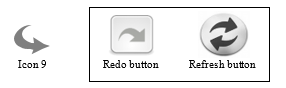 Figure 10: Confusion between Artweb.com ‘rotate left’ and common ‘redo/refresh’ icons
10.10. Icon 10 – Play animation button
Out of context, the icon scored 66.7% IRR in the test (see Appendix B) and is therefore classed as an ‘identifiable’ icon. Nine participants were ‘completely correct’ in their interpretation, with ten ‘partially correct’ and two ‘incorrect. One of the incorrect responses was because the participant left the answer blank.
In context, the IRR score for this icon (which is ‘toggled’ with Icon 11) increased slightly to 73.8% and stayed in the upper category, classed as ‘identifiable’ with 14 ‘completely correct’ and three ‘partially correct’ estimates, but the number of ‘incorrect’ responses interestingly increased from two to four.
A textual analysis of the accompanying responses suggested that most of the participants could translate inferences from other sign systems and media objects (e.g. audio or video players) to identify the purpose of the icon. As with Icon 2 (which also originated in the cassette players of the 1960s) an analysis of the free-form comments showed that most of the participants were familiar with its use in domestic audio equipment. In context, the scenario shown was a still image of a sculpture that could be rotated. Two participants gave a new but incorrect meaning to the icon when shown screenshots, confusing the icon’s action function with navigation (‘go to the right’ and ‘go to next picture’).
10.11. Icon 11 – Pause animation button
Out of context, Icon 11 scored 71.4% IRR in the test (see Appendix B) and is therefore clearly classed as an ‘identifiable’ icon. There were ten ‘completely correct’ and ten ‘partially correct’ responses. Perhaps surprisingly, the one ‘incorrect’ response had the opposite estimate of its meaning – to start.
In context, the IRR score of Icon 11 (intended to be ‘toggled’ with icon 10) rose appreciably to 90.5% – one of the highest scores in the test. There were 17 ‘completely correct’ responses and four ‘partially correct’. Clearly, placing the icon into context has radically changed the participant’s understanding of it.
As with Icon 10 and Icon 2, a textual analysis of the comments following Tests One and Two shows that the participants made similar inferences in evaluating the purpose of the icon. This is another icon that owes its existence to the early tape recorder, representing two tape rollers on a ‘reel to reel’ tape deck. It is commonly used in domestic sound and video equipment to pause a player temporarily until it is restarted by pressing the play button (i.e. Icon 10). This ‘universal’ icon’s features were unique and is unlikely to be confused with other icons in the test, although the one user who interpreted it with an ‘opposite’ meaning thought it was a ‘restart’ icon. In context, the participants showed a greater understanding of its meaning by associating it with Icon 10 through their familiarity with domestic equipment.
10.12. Icon 12 – ‘Slider’ to zoom in and out of image
Out of context, Icon 12 scored 40.5% IRR in the first test (see Appendix B) and is therefore clearly classed as ‘mediocre’. Seven participants were ‘completely correct’ in their interpretation of its meaning, three were ‘partially correct’ and 11 were ‘incorrect’.
In context, the IRR for the icon increased noticeably to 66.7% with eleven ‘completely correct’, six ‘partially correct’ and four ‘incorrect’ responses, placing it clearly in the ‘identifiable’ class. An analysis of the free-form responses to Test One suggests that this icon is ambiguous, as it was misinterpreted by nine participants as a ‘volume control sign’ with a slider to change the sound level. Three participants thought it was a ‘battery life or power level’ indicator rather than a ‘zoom slider’ due to its similarity to the icon used for this function on some popular devices (see Figure 11). In gaming, it is often used as an indication of a player’s energy or power level and in mobile devices it can indicate signal strength, making its use in this context confusing.
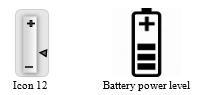 Figure 11: Confusion between Artweb.com ‘zoom control’ and common ‘battery power level’ icons
In context, Icon 12 appears in the right-hand tool bar when viewing a painting with the associated ‘magnifying glass’ (Icon 13). This may have clarified its purpose when seen ‘in context’.
10.13. Icon 13 – ‘Magnifying glass’ to pan and zoom image
Out of context, Icon 13 scored 60.0% IRR (see Appendix B) and is therefore narrowly classed as ‘identifiable’. The ability of the participants to interpret the meaning of this icon is sharply divided. Nine participants were ‘completely correct’ and seven were ‘partially’ correct in their interpretation. On the other hand, there were five ‘incorrect’ estimates, indicating that this a difficult symbol for some users to recognize decisively when out of context.
In context, the IRR score improved markedly to 71.4%, making it solidly ‘identifiable’ and showing that knowledge of its context caused the meaning of the icon to be much clearer to most participants. The increase was produced by 15 ‘completely correct’ and six ‘partially correct’ responses with one ‘incorrect’.
A textual analysis of the free-form entries suggests that this icon is confusing, as the ‘magnifying glass’ part of the sign is ‘solid’ rather than the ring-like or ‘transparent’ device used in other common packages (e.g. Photoshop®). Therefore, ‘out of context’ there were a variety of misconceptions about its meaning. Some of the users saw the icon as a key or a screwdriver symbol, indicating security settings. One saw it as a ‘stop sign’ and three (no doubt influenced by the common use of a ‘magnifying glass’ in search engines) saw it as a search function. ‘In context’, one Muslim participant misinterpreted it as a ‘Christian cross symbol’ as it was positioned near a painting of the interior of a cathedral. One participant thought it was a ‘search/find symbol’ but instead of looking for information in a search engine it was looking at specific details in the painting.
10.14. Icon 14 – Next artwork to the right
Out of context, Icon 14 scored 60.0% IRR (see Appendix B) and is therefore narrowly classed as ‘identifiable’. There were five ‘completely correct’ responses and 15 ‘partially correct’. Participants appeared to have confidence in their judgement, as there were no ‘don’t know’ responses. The only ‘incorrect’ respondent interpreted the sign as rotation, but in the opposite direction to its intended meaning.
In context, the IRR increased to 85.7% showing that it was clearly ‘identifiable’ by most participants when seen in its surroundings. There were now 16 ‘completely correct’ and four ‘partially correct’ interpretations and the respondent who gave the ‘opposite’ response ‘out of context’ now had the correct direction.
A textual analysis of the responses showed that ‘out of context’ the participant who gave the incorrect ‘opposite’ answer thought the icon’s meaning was to ‘go back’ instead of ‘go forward’, as the person is from a culture which writes from right to left and made the same mistake with Icon 8, thereby emphasising that cultural interpretations should be taken into consideration when designing interfaces. In context, it was shown that some of the participants did not understand the meaning of the icon fully as they stated the direction as ‘go right’ instead of the ‘next artwork on the right’. One participant who gave an ‘incorrect’ answer thought the icon’s meaning was to focus on the right-hand side of the painting itself.
10.15. Icon 15 – Rotate to the right (clockwise)
Out of context, Icon 15 scored 21.4% IRR (see Appendix B) and is therefore clearly classed as ‘vague’. There were four ‘completely correct’ answers and only one ‘partially correct’. An unusually large number of participants (16) gave ‘incorrect’ answers, out of which four gave ‘opposite’ meanings (i.e. rotation in an anticlockwise direction). Surprisingly, the respondents showed a high degree of confidence in their understanding of the icon as there were no ‘don’t know’ responses.
In context, this icon had an IRR of 7.1%, showing a notable decline. This was caused by the icon receiving only one ‘completely correct’ response when its context was known. There was again one ‘partially correct’ interpretation, but there were now 19 ‘incorrect’ responses and the number of ‘opposite’ directional interpretations (scored as ‘incorrect’) had increased to seven. Clearly, knowledge of the icon’s context had confused the users!
A textual analysis of the free-form interpretations showed that (as with its opposite Icon 9) many participants identified the purpose of the icon but mistook its direction of rotation ‘out of context’. Also, there was confusion with an ‘undo’ button, a ‘refresh’ button or a ‘return’ button, which use similar symbols (see Figure 12). In context, the position of the icon in a tool bar on the opposite side of the screen to what might have been expected probably created confusion as to the direction of its rotation (see also Icon 9).
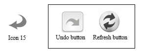 Figure 12: Confusion between Artweb.com ‘rotate right’ and common ‘undo/refresh’ icons
10.16. Icon 16 – Information on artwork or exhibit
Out of context, Icon 16 scored 57.1% IRR and was classed as ‘mediocre’ by a narrow margin. Three participants were ‘completely correct’ and 18 were ‘partially correct’. There were no ‘incorrect’ responses, indicating only a partial success for this ‘universal’ icon in communicating its meaning.
In context, like Icon 3 this icon increased its score by a wide margin, achieving 78.6% IRR, making it clearly ‘identifiable’. This was largely the result of an increase (to 12) in the number of ‘completely correct’ responses. There were nine ‘partially correct’ interpretations and again no ‘incorrect’ responses.
Textual analysis of the free-form responses showed that ‘out of context’, all the participants recognized that both Icon 3 (which is grey) and Icon 16 (which is blue) represent ‘information’ signs but their use tended to elude some of them. This typifies the definition of ‘mediocre’ icons – the users felt that they knew their meaning but could not work out what to use them for in this interface. ‘In context’ the IRR score increased considerably, suggesting that association with an artwork helped the participants to identify the purpose of the icon much more accurately. Interface designers should bear this in mind.
10.17. Icon 17 – ‘Email’ contact the exhibitor or gallery
Out of context, this icon scored 54.8% IRR (see Appendix B) and is therefore classed as ‘mediocre’, indicating that three participants were ‘completely correct’ and 17 were ‘partially correctly’ in their interpretation of its meaning. There was one ‘incorrect’ response.
In context, Icon 17 increased its IRR score to 69.0%, placing it solidly in the ‘identifiable’ category. The number of ‘completely correct’ answers increased to 11 and the number of ‘partially correct’ responses was now seven. Interestingly, the number of ‘incorrect’ responses increased to three as context apparently introduced new ambiguity.
Textual analysis of the free-form answers showed that ‘in context’ most participants identified the basic meaning of Icon 17 with the universal symbol for email. It also shows that some participants could not work out whether the icon was to open an email reader to send or receive an email message and were therefore unable to decide to whom the email was to be sent and about what. This appears to be a case of using a common icon for an unusual purpose, which shows that the design of an icon needs to be aligned with the user’s experience and familiarity with similar signs. In context, the email’s precise purpose of contacting the exhibitor or gallery about the exhibit became more apparent by its closeness to the exhibit and its association with other icons in the same tool bar that are used to directly to manipulate the exhibit. Although, with experience of its use in social media applications, some users thought it was a way of posting comments.
10.18. Icon 18 – Close window button
Out of context, Icon 18 scored 42.9% IRR (see Appendix B) and is clearly classed as ‘mediocre’. Seven participants identified the meaning of the icon completely correctly and four partially correctly. There were ten ‘incorrect’ responses from participants who attempted to guess the icon’s meaning.
In context, the icon’s IRR score almost doubled to 81.0%, moving it well up into the ‘identifiable’ class. This can be attributed to the increase in ‘completely correct’ responses to 15, while the ‘partially correct’ responses remained the same at four and two participants registered an ‘incorrect’ response, one assuming that it marked an observation point and the other a warning.
This is a clear indication that knowledge of context has enabled many participants to improve their understanding of the meaning of the icon. Textual analysis showed that initially ‘out of context’ there was a wider interpretation by participants with a number of different meanings for a type of warning sign such as a ‘no entry’, ‘stop sign’, ‘error sign’, ‘cancel sign’ or ‘gallery closed’ sign. This represented a mismatch with the participants’ expectations based on their experience of the symbol in other applications. In fact, the basic form of the icon (although not necessarily its colour) is commonly used to close pop-up windows in a variety of applications, including MS Word® (see Figure 13). An analysis of the free-form responses showed that ‘in context’ the icon’s position on the corner of a window ‘frame’ made its purpose clearer to the participants, as this is where they would normally expect to see a ‘close window’ button. This demonstrates the value of consistency, not just in the appearance of icons but in their position and their association with other parts of the interface.
 Figure 13: Similarity between ‘close pop-up window’ icons
(left; ‘Artweb.com’, right; MS Word ®)
10.19. Icon 19 – Navigation arrow button
Out of context, Icon 19 scored one of the highest results with a 78.6% IRR (see Appendix B) and is therefore clearly classed as ‘identifiable’. In all, 15 participants interpreted the meaning of the icon completely correctly and three were ‘partially correct’, while three were ‘incorrect’.
In context, the IRR score increased to 90.5%, with 18 participants giving a ‘completely correct’ response, two ‘partially correct’ and one ‘incorrect’, making the icon one of the most identifiable.
Textual analysis of the free-form responses shows that ‘in context’ some of the participants felt the sign to be like one used in Google Maps® and they therefore interpreted it as a map controller (i.e. for moving a map around a window) rather than a direction control icon (i.e. moving the user’s viewpoint). One participant confused this icon with a similar icon often used to enlarge an image or screen. This icon is also familiar to participants who have experience in playing games which use this type of 3-D navigation tool to move around screens. The context, however, ruled out any association with maps and its position on the screen indicated that it was a navigation tool to most participants.
10.20. Icon 20 – Fast jump to location
Out of context, Icon 20 performed relatively poorly, being placed in the ‘mediocre’ category with an IRR of 38.1% (see Appendix B). Two participants gave ‘completely correct’ responses and 12 were ‘partially correct’ with their estimates. There were seven ‘incorrect’ answers and out of these, one participant gave a ‘don’t know’ response rather than guessing.
In context, the icon moved up to the ‘identifiable’ category, although it only just met the criteria with an IRR score of 60%. This was largely because of an increase to eight in the number of ‘completely correct’ responses. There were nine ‘partially correct’ estimates and the ‘incorrect’ responses numbered four. Out of these, the number of ‘don’t know’ answers increased to two and one of these participants had a made a wild guess previously ‘out of context’, which they then discounted.
A textual analysis of the free-form responses showed that many participants mistook this icon ‘out of context’ for a ‘map pin’ marking a specific point rather than a navigation aid, based on its similarity to the marker used in Google Maps® and similar applications with which they were familiar. One interpretation given was as a sign for the start of a tutorial. In context, two participants thought it was a marker for the current location and did not know it was a navigation aid to fast jump to another location in the art gallery. Some of the participants stayed with their originally answers ‘out of context’, although their responses were more descriptive and related to the context. As the meaning is not clear in or out of context, it seems that the icon requires the user to gain experience with the interface, to learn its functionality.
10.21. Icon 21- Jump to next room
Out of context, Icon 21 scored 21.4% IRR (see Appendix B) and is in the ‘vague’ category. Only one participant gave a ‘completely correct’ answer, whilst seven gave ‘partially correct’ estimates. There were 13 ‘incorrect’ responses and out of those two were ‘not sure’ or had ‘no idea’, two gave no response and the rest gave a different meaning or a wild guess as to its purpose (e.g. an architectural feature).
In context, the icon’s IRR score rose significantly to 57.1%, moving it up a category to the upper end of the ‘mediocre’ class. There were now eight ‘completely correct’ and eight ‘partially correct’ responses, while five respondents gave ‘incorrect’ estimates of the icon’s meaning.
A textual analysis of the free-form answers showed that some participants mistook the icon for a military insignia ‘out of context’, as a similar icon appears in many computer games that they had played previously. In context, some participants took it for a sign pointing up to the next floor of the art gallery (e.g. a sign for a lift or elevator), rather than for ‘jumping’ into the next room on the same level. One participant thought it was an end-point in the gallery visit which could be saved, to allow them to return to the same point. This icon probably requires some prior familiarity through learning the interface to know its functionality.
11. Thematic Analysis 1 – findings ‘out of context’.
Questions 1 and 2. ‘Are any of the icons a) easier, b) harder to recognize out of context?’
The responses to this question suggest that knowledge of context does increase the IRR score but perhaps not as much as previous work [39] would suggest. In some cases, knowing the context made identification more problematic. Icons 9 was felt to be harder to recognize ‘in context’ by six respondents (28.6% of the sample) while Icon 15 was felt to be more difficult by five respondents (23.8%). These results show that context cannot be relied on to make an icon more understandable, as context can be misleading. With Icons 4, 6, 7, 9, 12, 13, 17 and 18 some respondents who thought that context made identification easier were in fact incorrect in their interpretation. However, knowing the context did enable more accurate recognition in many cases, as was expected. Icons 3, 6, 7, 12, 16, 17, 18 and 20 were felt to be easier to identify through familiarity, and the fact that they moved from the ‘mediocre’ to the ’identifiable’ class bears this out (See Table 19 and Appendix B).
Thematic Analysis 2 – findings ‘in context’.
Question 1. ‘Do any of the 21 icons change their meaning from what you expected ‘in context?’
The textual analysis showed that being seen ‘in context’ changed the meaning of all the icons except Icon 8. However, the difference between the ‘out of context’ and ’in context’ tests is lower than expected, in two measures. The first measure is the increase or decrease in IRR between the two tests (as shown in Appendix A). The second is the number of respondents seeing a change in the meaning of the icons when taken ‘in context’. Overall, the change is minor and the icon with the largest percentage of respondents is Icon 12 with 47.6% (10/21) believing that context changed the icon’s meaning. Only two icons were regarded as having changed their meaning by more than a third of the participants (i.e. Icons 12 and 21). As may be expected, Icon 21 had the largest increase in IRR (+40%).
Question 2. ‘Are you familiar with any of the icons in other contexts?’
Icon 1 was distinctive and was not confused with other icons. Only one respondent reported seeing something similar on another (un-named) virtual interface. Icon 2 was felt to be like a video, music or media player control by 13 respondents. Interestingly, three thought it was used on YouTube®, but they are not correct. Icon 3 was related to an information function by eight respondents, but none suspected its secondary meaning, which is to give general information about the site. One respondent thought that it was ‘greyed out’ because it was not active. As the icon cards were displayed in random order, some respondents may have already seen the ‘blue’ information icon, though none mentioned it. Icon 4 was perceived as a loading/buffering symbol or a brightness control by twelve respondents and as ‘settings’ (often represented by a ‘gear’ icon) by four. No-one suspected that it was intended to return the user to the start of the tour. Icon 5 was seen to be a common ‘help’ icon with confidence by five respondents, and one felt that it served the same function as a in Microsoft® applications. Two respondents offered the extra information that it offered help about the tour.
Icon 6 was felt to be a ‘full screen’ icon by five respondents and two offered the secondary information that it was like a YouTube® control (not correct). The same respondents felt that Icon 7 was a ‘shrink screen’ control and again mistakenly attributed it to YouTube®. Icon 8 was likened to the ‘go back’ icon on websites, etc. by eight respondents. Four identified it correctly as referring to the previous artwork. Icon 9 was felt to be a ‘redo’ button by four respondents and a rotation control by three more, although the direction confused them. Icon 10 was related with confidence to a media ‘play’ control by 10 respondents and YouTube® was cited correctly by three, showing the influence of popular social media software.
Icon 11 was identified as a ‘pause’ control by nine respondents and YouTube® was correctly cited in one case. Icon 12 caused confusion, with respondents seeing it as like icons as diverse as a Wii® controller and an icon from photograph viewing ‘apps’. Icon 13 was related to ‘map apps’ by two respondents and as a ‘zoom’ control by two more. Icon 14 is the opposite of Icon 8, and five respondents gave it the opposite meaning. Icon 15 (the opposite of Icon 9) was perceived correctly by one respondent as a rotation symbol. Icon 16 was understood as a common ‘information’ icon by eight respondents, but three of them were confused about whether it was general or specific information.
Icon 17 was viewed with confidence as an ‘email’ button by thirteen respondents, although no-one deduced its secondary meaning. Icon 18 also caused confusion, some respondents seeing it as a ‘no entry’ sign. Icon 19 was also seen to resemble icons used in several different common applications. Only two respondents saw it correctly as a navigation control who felt that it was like a control from Google Street View® or an X-box® icon. Icon 20 was recognized as a map pointer as used in Google Maps ® by ten respondents with confidence, but most failed to identify it as a ‘jump’ device. Icon 21 created the most confusion, as five respondents perceived similarities to other interfaces (e.g. Google Street View®) and one felt that it was like the ‘collapse’ control on a pull-down menu.
Question 3. ‘Does grouping icons in tool bars make their meaning clearer?
Seven participants (33.3% of the sample) felt that grouping the icons into tool bars had not made their meaning clearer. A typical response was, ‘The tool bars do not make any difference…you look (locate) and use the icon you require, not the tool bar’. For those respondents who did perceive a positive difference, four significant themes emerge from the analysis:
- Position – where a toolbar is placed on the screen (e.g. right or left) suggests navigation in either direction, while the center or top of the screen suggests a more general use;
- Difference – icons need to be clearly distinguishable from other icons in the same set;
- Proximity – the closeness of a toolbar to an item on the screen (e.g. a painting or a doorway) suggests the meaning of the icon and its intended purpose;
- Consistency – the icons in a tool bar should perform functions regularly so that they are learned and understood more easily (e.g. the main tool bar is used more frequently and consistently than the left or right tool bars);
- Association – links between groups of icons in a tool bar suggest their use and meaning, which may be transferred over from other applications using similar icons.
The Thematic Analysis shows that an understanding of the meaning of the icons in a tool bar relates strongly to their position in relation to other items on the screen. For the Main Tool Bar ten out of 15 respondents felt correctly that its position (at the top center of every screen) suggested that the icons had a general purpose. For the Left Tool Bar seven out of 12 respondents and the also seven out of 15 respondents for the Right Tool Bar were correct in feeling that the position of the respective tool bars indicated that they operated on the object being viewed (e.g. zoom in or out, rotate left or right, etc.). The other themes were less strongly indicated but with the Right Tool Bar, association (e.g. with other icons in the tool bar) indicated a specific application in five out of 14 responses. This tool bar contained both navigation and information icons and some respondents could not distinguish between them. This appears to reinforce research [40], which suggests that icons need to maintain ‘difference’. An icon needs to be clearly distinguished from other icons in the same tool bar and be close semantically to its own function while maintaining as great a semantic distance as possible from the other icons.
For the Main Tool Bar ‘consistency’ and ‘association’ were both cited as indications of meaning in two out of 15 responses, whereas ‘proximity’ and ‘association’ (e.g. with other icons in the tool bar) were cited in only two out of 12 responses in relation to the Left Tool Bar and in four out of 14 responses to the Right Tool Bar. One respondent offered the comment, ‘I think it’s a good idea to make the right-hand tool bar look like the left one (only [including] navigation icons) and move the other icons (information ones) in the right tool bar to the top [Main Tool Bar]’. An example of ‘association’ occurs in the response of one user, who associated Icon 16 ‘Information’ with Icon 17 ‘Send email’, which appear together on the right tool bar, assuming the ‘i’ symbol led to an address book while the ‘envelope’ referred to sending the email. Another suggestion was to remove Icon 6 and Icon 7 that vary the image size from the Right Tool Bar and place them on the painting itself, like Icon 18 that closes a window.
12. Discussion of findings from Test One and Test Two
From the results of this study it is possible to make certain observations. Icons that resemble their intended function more closely (i.e. have a close sematic distance) tended to have a higher IRR score both ‘out of context’ and ‘in context’. It can be concluded that this is because less prior learning or familiarity is needed for users to understand their meaning. As computer icons are not ‘standardized’ as are warning signs through the ISO [26-27] icon designers’ adaptation of the same or similar icons for different purposes can create misinterpretation.
Theory suggests that when planning an interface, icon designers have a conceptual model of the way in which the icons will be used [41] based on their training and experience. The users of the interface, on the other hand, will have a mental model of the icons’ meaning based on their knowledge, cultural back ground and familiarity [41]. The importance of matching these models is demonstrated by the confusion caused in the tests by ‘familiar’ icons whose functions differed from users’ expectations. The IRT ‘out of context’ (Test One) showed that 33.3% of the icons were clearly identifiable to users (see Table 9). Icon 4 was confused with a ‘gear cog’ for adjusting system settings. Icons 9 and 15 were too similar to icons used differently in other applications. Icon 21 had been encountered with touch screens for ‘swiping’, but not for navigating between displays, having an adverse effect on usability through a “lack of conformity with user expectations” [42].
13. Conclusions
The original pilot study suggested that there was a problem with icon recognition, even to expert, qualified computer users [1]. This prompted that further research needed to be done into the phenomenon. The research for this paper is therefore an extended study based on an expanded sample of 21 computer users with different levels of competence, ages, educational attainments and spheres of employment. It is felt that this sample represents typical users of a virtual art gallery.
The extended research project set out to evaluate a set of randomly-chosen icons that carry out the action, information and navigation functions in a virtual gallery interface. A combination of quantitative and qualitative techniques was employed to add depth to the data analysis, while avoiding the use of complex statistics. The study is therefore based on an established method of Icon Recognition Testing (IRT) examining 21 icons from a ‘real world’ virtual gallery. However, this study is original, as it combines tests in and out of context and draws a comparison between them. An additional innovation is the combination of qualitative textual and thematic analysis (Sections 10 and 11) to establish reasons for the users’ interpretation of the icons’ meaning. This adds considerably to the contribution of the research. The findings are useful to interface designers and academics alike, by offering advice and by prompting further research. Conclusions for virtual interface design are drawn from the results of the research under the following headings:
13.1. Familiarity helps – people get to know icons
The IT industry is a long way from adopting standards equivalent to those for warning and traffic signs. However, the study shows that familiarity can aid users in recognizing their meaning in different contexts. The consistent use of familiar icons for their expected function is therefore important. When an interface is used regularly (e.g. a word processing package) users gain familiarity with the icons’ function, even by its position, without having to decode its meaning. However, individuals tend to visit a virtual gallery relatively infrequently and are less likely to gain familiarity with the icons. The low IRR scores of icons that are ‘custom made’ for the ‘Artweb.com’ interface (e.g. Icons 4, 9 and 15) would appear to support this conclusion.
13.2. Abstraction is useful – but should be controlled
This paper begins by discussing concreteness and abstraction in icon design. The research shows that augmenting an icon with text (e.g. Icon 1) assisted the users in understanding its meaning. Therefore, adding more visual detail to the icons (i.e. making them more concrete) may reduce ambiguity. However, it may initially take longer for users to process mentally [16] and could interfere with their enjoyment and detract from the virtual experience. The balance between abstraction and concreteness should be an important consideration for interface designers.
13.3. Icons should be ‘audited’ regularly
The extended study prompts the recommendation that icon recognition testing should be carried out regularly as a part of an interface design ‘audit’ to ensure that the icons are continuing to fulfil their intended purpose. The study suggests that after such an audit, icons classed as ‘identifiable’ should be maintained in their present form. It is further suggested that icons classed as ‘mediocre’ could be modified economically to be more effective by making them more concrete or sufficiently different from icons used for other functions. However, icons classed as ‘vague’ should be redesigned completely or replaced, taking into account the recommendations offered in Sections 13.1. 13.2 and 13.3. It is suggested that some icons in this category may be replaced by familiar icons from other software packages that have passed ISO benchmark tests (e.g. MS Word®), subject to legal approval.
13.4. Interface designers need to understand user profiles
The results demonstrate that when designing icons for a virtual interface (in this case a virtual art gallery) it is important that the designer’s conceptual model closely matches the users’ mental model. Norman [41] explains that the interface designer does not communicate directly with the user, but through the ‘system image’, which is developed from the designers’ own conceptual views and understanding of the nature and purpose of the interface. The users subsequently form a mental model based on their own understanding and interpretation of the system image, influenced by their beliefs, experience and prior knowledge (i.e. their user profile). A match between the conceptual model, the system image and the user profile should result in an enhanced user experience, so virtual interface designers should capture user profiles to adapt the interface to the user’s requirements.
14. Limitations of the research
Importantly, this study has its limitations. The IRT focussed on evaluating icons with different functions taken from the same interface (i.e. Artweb.com). The study by Ferreira et al. [20] compared icons from different interfaces with the same function. In both Ferreira’s and this research, the tests were limited to identifying the icons’ meaning using paper-based tests. A more sophisticated and comprehensive icon recognition test could be done with technology that would record more information about the users’ intuitive responses and ‘thinking time’ (e.g. interactive MS PowerPoint with key logging). The tests could be extended so that the participants could compare different virtual interfaces.
15. Suggestions for future research
Many of the virtual gallery interfaces identified in the secondary research currently offer a ‘one size fits all’ approach to icon design. It is suggested that more needs to be known about the potential for user profiling in virtual interface design, perhaps using an ontology engineering approach. Methods of capturing this profile need to be non-invasive if the user experience is not to be compromised. There is the potential for exploring methods such gamification as a way of capturing users’ profiles and preferences. A variety of frameworks exist to enable designers to do this [43].
- D.E. Ashe, W.A. Eardley and B.D. Fletcher, “e-Tourism and Culture through Virtual Art Galleries: a Pilot Study of the Usability of an Interface” in 4th International Conference on Information Management (ICIM), Oxford, U.K. 2018. http://dx.doi.org/10.1109/INFOMAN.2018.8392834.
- Smithsonian Natural History Museum virtual tour. 2018. http://naturalhistory.si.edu/panoramas/.
- Louvre Online Tours. 2018. http://www.louvre.fr/en/visites-en-ligne.
- Virtual Tour of the Oxford University Museum of Natural History. 2018. http://www.chem.ox.ac.uk/oxfordtour/universitymuseum.
- Virtualfreesites. Virtual Tours of Museums: Exhibits and Points of Special Interest: Virtual Tours. 2018.
htpp://www.virtualfreesites.com/museums.html. - W.A. Eardley, D.E. Ashe and B.D. Fletcher, “An Ontology Engineering Approach to User Profiling for Virtual Tours of Museums and Galleries” Int. J Knowl. Eng., 2(2), 85-91, 2016.
http://dx.doi.org/10.18178/ijke.2016.2.2.058. - D.J. Mayhew, Principles and Guidelines in Software User Interface Design. New Jersey: Prentice Hall, Inc. 1992
- P.B. Anderson, A semiotic approach to programming. In: The computer as medium. Cambridge, England: Cambridge University Press, 16-67. 1994
- J. Ferreira, P. Barr & J. Noble, “The semiotics of user interface redesign” in Proceedings of the 6th Australian User Interface Conference (AUIC ’05), 40 (4) Sidney, Australia, 47-53. 2005.
- R. Yan, “Icon Design Study in Computer Interface.” Pro. Eng, 15, 3134-3138, 2011, http://dx.doi.org/10.1016/j.proeng.2011.08.588.
- H.I. Cheng and P.E. Patterson, “Iconic hyperlinks on e-commerce websites” J. Appl. Ergon, 38 (1), 65-69, 2007,
https://doi.org/10.1016/j.apergo.2006.01.007. - B. Merdenyan, O. Kocyigit, R. Bidar, O. Cikrikcili and Y.B. Salman, “Icon and User Interface Design for Mobile Banking Applications” in Proceedings of the 4th International Conference on Advances in Computing and Information Technology (ACITY ‘14), 4(2), 55-59, 2014, https://dx.doi.org/10.3850/978-981-07-8859-9_18.
- G. Bhutar, R. Poovaiah, D. Katre and S. Karmarkar, “Semiotic Analysis combined with Usability and Ergonomic Testing for Evaluation of Icons in Medical User Interface” in Proceedings of the 3rd International Conference on Human Computer Interaction (IndiaHCI ’11), Bangalore, India, 57-67. 2011. http://dl.acm.org/citation.cfm?id=2407804.
- P. Barr, J. Noble, and R. Biddle. “Icons R Icons” in Proceedings of the Fourth Australasian User Interface Conference on User Interfaces, 18 (AUIC ’03), Darlinghurst, Australia: Australian Computer Society, Inc., 25-32. 2003, https://dl.acm.org/citation.cfm?id=820093
- C. Gatsou, A. Politis and D. Zevgolis. The Importance of Mobile Interface Icons on User Interaction. [Online] Int. J. Comput. Sci. Appl., 9 (3), 92-107. 2012. http://www.tmrfindia.org/ijcsa/v9i37.pdf.
- L. Nadin. Interface design and evaluation – Semiotic implications. In: H.R. Hartson and D. Hix (Eds) Advances in human-computer interaction, 2. Norwood, NJ, USA: Ablex Publishing Corp.1988.
- R. Scalisi. “A semiotic communication model for interface design” in Proceedings of the 1st International Conference on Computational Semiotics for Games and New Media (COSIGN2001). Netherlands, Amsterdam. 10-12 Sept. 2001. http://www.cosignconference.org/conference/2001/
- S. Isherwood. “Graphics and Semantics: The Relationship between What Is Seen and What Is Meant in Icon Design” in Proceedings of the 8th International Conference on Engineering Psychology and Cognitive Ergonomics, Held as part of HCI International, San Diego, California, USA. July 2009. https://doi.org/10.1007/978-3-642-02728-4_21.
- R. Arnheim, Visual thinking. London: Faber. 1969.
- J. Ferreira, J., Noble and R. Biddle, “A case for iconic icons” in Proceedings of the 7th Australasian User Interface Conference (AUIC ’06), Hobart, Tasmania, Australia: Australian Computer Society, Inc., 50, 97-100. Jan. 2006. https://dl.acm.org/citation.cfm?id=1151771
- Y.B. Salman, H-I. Cheng and P.E Patterson. “Icon and user interface design for emergency medical information systems: A case study” Int. J. Med. Inf., 81(1). 29-35, 2012. http://doi.org/10.1016/j.ijmedinf.2011.08.005.
- S. Schröder and M. Ziefe, “Making a completely icon-based menu in mobile devices to become true: a user-centred design approach for its development” in Proceedings of the 10th International Conference on human computer interaction with mobile devices and services, Amsterdam, The Netherlands: ACM, 137–146, Sep. 2008. http://doi.org/10.1145/1409240.1409256.
- J. Nielsen and D. Sano, “SunWeb: User interface Design for Sun Microsystem’s Internal Web”. Comp. Nets. ISDN Sys, 28(1), 179-188., 1995. https://doi.org/10.1016/0169-7552(95)00109-7.
- J.J. Foster. Graphical Symbol: Test methods for judged comprehensibility and for comprehension. ISO Bulletin, 11-13, December 2001. http://hablamosjuntos.org/signage/PDF/graphicsymbols0112.pdf. 2001.
- S. Ghayas, S. Sulaiman, M. Khan and J. Jaafar. The effects of icon characteristics on users’ perception. In Advances in Visual Informatics. Switzerland. Springer International Publishing, 652-663. 2013.
- ISO. ISO 9186:2011. Graphical symbols – Test methods for judged comprehensibility and for comprehension. International Organization for Standardization. Geneva, Switzerland, 2001.
- ISO. ISO 3864:1984. Safety colours and safety signs. International Organization for Standardization. Geneva, Switzerland, 1984
- W.C. Howell and A. H. Fuchs, “Population stereotypy in code design”, J. Org. Behav. Hum. Perf., 3(3), 310–339, 1968,
https://doi.org/10.1016/0030-5073(68)90012-3. - E. Kaasinen, J. Luoma, M. Penttinen, T. Petäkoski-Hult and R. Södergård. Key Usability and Ethical Issues in the NAVI programme (KEN). 2001. http://citeseerx.ist.psu.edu/viewdoc/download?doi=10.1.1.121.4971&rep=rep1&type=pdf.
- B. Martin and F. Ringham, Key terms in semiotics. New York: Continuum International Publishing Group Ltd.,2005.
- P.R. Desai, P.N., Desai., K.D. Ajmera and K. Mehta, K., “A review paper on oculus rift – A virtual reality headset”. Int. J. of Eng. Trend. & Tech. (IJETT), 13 (4), 175-179, 2014.
https://doi.org/10.14445/22315381/IJETT-V13P237. - D. Biella, D., Sacher, B. Weyers, W. Luther and N. Baloian, “Metaphorical Design of Virtual Museums and Laboratories: First Insights” in International Conference on Ubiquitous Computing and Ambient Intelligence, 427-438. Springer, Cham, Dec. 2015.
- Statista.com. Museum attendance in England by age 2012-2017 UK survey. 2018. https://www.statista.com/statistics/418323/museum-galery-attendance-uk-england-by-age/.
- M.N. Islam and H. Bouwman, “Towards user-intuitive web interface design and evaluation: a semiotic framework” Int. J. Hum-Comput. St, 86, 121-137, 2016, https://doi.org/10.1016/j.ijhcs.2015.10.003.
- L. Zakowska, “The effect of environmental and design parameters on subjective road safety – a case study in Poland” Safety Sci, 19 (2-3). 227-234, 1995. https://doi.org/10.1016/0925-7535(94)00023-V.
- E. Duarte, F. Rebelo, J. Teles, and M.S. Wogalter, “Safety sign comprehension by students, adult workers and disabled persons with cerebral palsy” Safety Sci. 62, 175-186, 2014,
https://doi.org/10.1016/j.ssci.2013.08.007. - S. Rosenbaum and J. Bugental, “Measuring the Success of Visual Communication in User Interfaces” Soc Tech Commun’s Technical Communication, 45 (4). 517-528, Nov. 1998.
- ISO. ISO 3864:2016 International standard for safety colours and safety signs. International Organization for Standardization. Geneva, Switzerland, 2016.
- S. McDougall and M. Curry, “More than just a picture: Icon interpretation in context” in Proceedings of 1st International Workshop on Coping with Complexity. University of Bath, 73. September. 2004. http://www.academia.edu/download/3251711/Past_Designs_As_a_Way_of_Coping_With_Complexity.pdf#page=73
- J.M. Silvennoinen, T. Kujala and J.P. Jokinen, “Semantic distance as a critical factor in icon design for in-car infotainment systems”. Appl. Ergon., 65, 369-381, 2017. https://doi.org/10.1016/j.apergo.2017.07.014.
- D.A. Norman “Some observations on mental models” in D. Gentner and A. Stevens (Eds.) Mental Models. Hillsdale, N.J., Erlbaum Associates. 1983.
- D. Oswald, “Dynamic sense-making in use processes of digital products”. in 5th International Congress of the International Association of Societies of Design Research (ASDR), Tokyo. Aug. 2013. http://www.david-oswald.de/downloads/IASDR2013_oswald-interface-semiotics.pdf
No related articles were found.