W.A.S.T.E. R.E.D.U.C.E.: Waste Auditing Sensor Technology to Enhance the Reduction of Edible Discards in University Cafeterias & Eateries

Adv. Sci. Technol. Eng. Syst. J. 4(2), 45–64 (2019);
 DOI: 10.25046/aj040207
Food waste disposal and food availability are both problems in the world today. The ability to monitor food waste is currently limited by the use of manual data collection and sparsity of monitoring. Using sensors to automate the process of measuring and collecting data on food waste would allow constant monitoring and provide a better dataset for analysis. This data can also be used to create ambient displays geared educate a target audience and produce behavioral changes. Student cafeterias serve as the focal point for data collection within this study, presenting both an abundance of data and unique challenges. We have created, deployed, and tested an autonomous, real-time system to collect data on food waste which includes an ambient display tailored to effect behavioral change in students.
1. Introduction
This paper is an extension of the work presented in W.A.S.T.E. R.E.D.U.C.E. [1].
In the U.S., approximately 40% of the food we cultivate goes to waste; yet, 1 in 6 people suffers from inconsistent access to food [2]. The cost of this waste is $165 billion per year, plus a large portion of methane emissions from U.S. landfills. Reducing the amount we waste by just 15% would generate enough food to feed approximately 25 million people, which would reduce food shortage problems by almost 50%. It is imperative that we begin the task of educating society and encouraging changes in behavior.
Food waste studies are categorized based on where in the pipeline food is lost. Pre-consumer food waste is food that is discarded before reaching the end consumer; this includes food that is spoiled, dropped on the floor, or otherwise improperly handled. Postconsumer food waste consists of food that is prepared for and taken by a customer for consumption, but is eventually discarded; this would include leftover food on a customer’s plate [2].
Educational institutions house future leaders; they are a desirable target to begin affecting change in food waste behavior. Campus cafeterias are typically the primary providers of meals to students, faculty, staff, and other visitors on college campuses across the nation. This makes them an ideal location for sampling post-consumer waste to get an accurate representation of food waste on a campus. As such, our first case study occurs in the main cafeteria on the Boca Raton campus of Florida Atlantic University (FAU), which services all students who have meal plans, plus dropins. Three different displays are introduced in the case study; each display conveys the amount of food wasted in real-time. A second case study was realized with one of the aforementioned displays in the cafeteria at A.D. Henderson University School, a laboratory school located on FAU’s campus, which services elementary and middle school students. This location allows us to compare the effects of the display on different age ranges. We are also able to witness the effects of policies within different cafeterias that may aid (or hinder) food waste reduction.
Like many college cafeterias, FAU’s dining hall is designed to be a la carte, allowing customers to pick and choose which sides and entrees they would like,´ including the choice of mixing and matching from the menu options. By allowing customers to choose their dishes, one might expect that it would reduce waste (e.g., a customer could request only the fries from a burger-and-fries meal, which would eliminate wasting a burger). Yet, it is also possible that a customer may request a particular combination of dishes, be unsatisfied, and revisit the line for a more appetizing selection, leading the customer to waste the first plate. It is also possible that even if satisfied with the selection, the customer may still waste some of the food.
U.S. portion sizes have been shown to be as much as
700% larger than the U.S. Department of Agriculture (USDA) recommendation, and as much as 263% larger than the Food and Drug Administration (FDA) recommendation [4]. While most research cites this as a contributing factor to obesity, it may also be a contributing factor to wastefulness. Information calling attention to this fact may caution students to ask for smaller portions.
Food waste audits are implemented in cafeterias of many institutions to generate information on how much food is wasted in their cafeterias for similar reasons to those noted above. However, most of these institutions only collect data for a short span of time, do not necessarily provide resolutions for reducing the waste that is found, and the process is not automated. An overview of food audits performed by institutions comparable to FAU can be found in Section 2. The purpose of WASTE REDUCE is to provide: (i) sustainable and on-going measurements of food waste; and (ii) visual cues designed to decrease the amount each customer wastes by encouraging more thoughtful choices.
The implementation of such a system has several challenges, related to both the implementation of the network and the visual cues used to evoke behavioral change. Cafeterias are dynamic environments and thus require a network that is able to withstand and/or adapt to sudden changes. Network reliability is a critical component to keeping the system operational and requires the network to adapt to communication issues such as interference or obstruction. To truly be an autonomous system, we must also ensure cafeteria employees are not required to change their behavior to use the system. This requires a robust design that withstands mishandling and minor leaks from garbage bags. The sensors must be power efficient, both for ease of use and for reliability. The devices within the network must also be compact enough to fit within a trash can. Most importantly, the sensors must be able to provide accurate, real-time data to create real-time feedback for the visual cues. The visual cues, which are implemented as a series of displays, must be seen by the target audience and the audience must be able to connect the information presented with their own behavior for change to take place. In addition, a display must resonate with the target audience to evoke change. After addressing each of these challenges, we designed and evaluated the use of three different displays with the system. Two of these displays were proven to evoke behavioral change in the target audience and reduced the amount of waste generated.
We present the design and implementation of
Waste Auditing Sensor Technology to Enhance the Reduction of Edible Discards in University Cafeterias & Eateries (WASTE REDUCE), an automated method of measuring food waste and providing real-time feedback. We evaluate the system through a preliminary deployment and case studies. We also present the design and implementation of three ambient displays to provide visual cues to a targeted audience based on the real-time data provided through WASTE REDUCE. We evaluate the effectiveness of these displays on behavioral change through two case studies. [1].
Section 2 presents background and related work. Section 3 details our approach, including the hardware components, software implementation, and challenges for each component. Section 4 presents the results and evaluation of the case studies used to assess the effectiveness of the ambient display component of WASTE REDUCE and the associated displays. Section 5 concludes the work.
2. Background and Related Work
To better understand the design and implementation of each focus, we must first explore the background and related work concerning each area.
2.1. Campus Food Waste Auditing
Food waste is a major concern for society and many university cafeterias are engaging the issue through food waste audits. Food waste audits allow the cafeteria to collect sample data on how much food is being wasted in their dining halls and may or may not include campaigns to reduce this waste. Currently, these food waste audits are implemented manually. Highlighted below are methods and results from audits conducted by several universities around the country.
The University of California at Davis (UC-Davis) has an enrollment of approximately 35,000 students [5]. Using quarterly waste audits, UC-Davis saw a 30% decrease in food waste from 2012 to 2015. In the Fall of 2009, UC-Davis cafeterias saw an average of 3.6 oz (102.06 g) of waste per guest; this dropped to 1.6 oz (45.36 g) per guest by Spring of 2015. The primary goal of their food waste program is to have zero waste by 2020. A food waste audit is conducted in each of the university’s cafeterias during lunch hours over 3 consecutive days each quarter. Part of the audit includes a visual display of the amount of food wasted, which is created by asking students to divide their waste into edible (e.g., leftover breadsticks), inedible (e.g., banana peels), and other (e.g., napkins). The edible food is then placed on display for guests to view and discuss. Other solutions implemented by UC-Davis include allowing students to ask for smaller portions, distributing samples for taste-testing, and donating unused food through the Food Recovery Network [6, 7]. (FAU also uses the Food Recovery Network to donate leftover food.) Since these audits only occur briefly during the semester and during one meal time, they can only provide a snapshot of the amount of waste generated. This snapshot may not reflect the average amount of daily waste generated.
Georgia Institute of Technology (GT) has an enrollment of approximately 25,000 [8]. GT uses the LeanPath tracking system in their cafeteria to monitor and inform staff about food waste [9]. LeanPath is a commercial system that allows kitchen staff to record information on waste, such as food type, weight, and reason for disposal, each time something is thrown away. This system measures pre-consumer food waste, and provides detailed graphs and reports, estimates on cost, and email alerts for disposed amounts valued over a set threshold [10]. While the tool increased awareness among staff members, LeanPath requires extra effort from each staff member. To generate a report, LeanPath requires a staff member to weigh the food they are throwing away and provide additional information, such as his or her name, the type of food (e.g., dairy), what the food is (e.g., yogurt), reason for disposal (e.g., expired), and what type of container is being disposed (e.g., carton). This method has four main drawbacks: (i) it is an extra burden for staff who may have their hands occupied with food preparation; (ii) staff can easily forget or neglect to record items; (iii) it introduces a higher likelihood of human error; and (iv) it does not include post-consumer waste.
Michigan State University (MSU) has an enrollment of approximately 50,000 students [11]. MSU’s research on food waste focused on cafeteria food waste in addition to off-campus food waste. Researchers discovered that off-campus, the average amount of food wasted was approximately 1.54 lbs (0.7 kg) per week for a single person. Using the number of weeks students are in school, compounded by the number of students living off-campus, researchers scaled their findings to estimate a total of 3,669,120 lbs (1,664,284.8 kg) of food waste per year from off-campus housing. In addition, MSU found that approximately 14,131 lbs (6,409.7 kg) of food was wasted per day in their cafeterias, with over 9,500 lbs (4,309.1 kg) of this weight associated with post-consumer waste [12]. Solutions to help reduce waste were printed along with these findings in a brochure for students. Recommendations were also given to the students on how to handle waste, including information on composting, recycling, and local produce. In addition, MSU created a food waste program that implements composting, and a student organic farm to help students handle food waste [13].
Florida International University (FIU) serves approximately 45,000 students [14]. FIU conducted a general waste audit and found that on average, 25.6% of their waste, and 4.5% of their recyclables were from food waste. For the audit, researchers collected samples of general waste across campus, sorting it by type and location. Food waste was one of the top three contributors to waste in each of the locations, and the primary contributor in housing and auxiliary areas. However, only one of their fourteen proposed solutions to waste reduction focused on food waste [14]. There was no clear campaign defined in the report to inform students of the audit results or to reduce waste generated.
The University of Miami (UM) has an enrollment of approximately 17,000 students [15]. Like FAU, UM uses tray-less dining halls to reduce the amount of food students take to the table. UM also reduced the amount of solid waste it generates by using a bio-digester to convert pre-consumer food waste to liquid. While UM does have a composting program on its campus, it is not integrated with their food waste management program [16]. UM reports the total processed waste generated by the campus as part of their Green U website, but they do not specifically report food waste [17].
2.2. Data Analysis and Feedback
Extensive research has been conducted in data presentation and visualization. Behavioral change cannot be realized without effectively conveying data to the target audience–in this case, cafeteria customers. Effectively conveying data requires guarding against habituation, presenting the data in compliance with known human-computer interaction (HCI) standards, and creating a lasting impression that encourages retainment of the information.
Habituation is the “diminishing of an innate response to a frequently repeated stimulus” [18]. Habituation is frequently used in post traumatic stress recovery to desensitize patients to images or thoughts that trigger their discomfort [19]. Repetitive exposure to images trains the brain to normalize the discomfort and anxiety provoked by the image. This is the opposite of what is desired for this project. Cafeteria customers should get a renewed sense of urgency each time they view the feedback–large quantities of food waste should not be normalized. Varied presentations of data will be used to avoid habituation.
HCI research has generated a wealth of knowledge pertaining to engaging customers with information displayed via a monitor. Adhering to these principles is crucial in designing a display that is successful in capturing cafeteria customers’ attention. Lin et al. [20] outline eight criteria that should be taken into account for optimal engagement: stimulus-response compatibility, consistency, flexibility, learnability, minimal action, minimal memory load, perceptual limitation, and user guidance. Stimulus-response compatibility occurs when users have faster and more accurate responses for a set of attributes because the attributes naturally correspond. An example would be using red to highlight an error in the system versus using green; a user would naturally attribute red to a problem, whereas green would naturally lead the user to assume that everything was fine. Consistency, both within the system and across different systems improves usability. This goes hand-in-hand with compatibility; the use of consistency creates a natural correspondence among certain symbols, icons, layouts, etc. Flexibility enables a system to adapt to users’ needs. This can range from allowing a user to customize the interface (e.g., changing the color scheme) to adapting to unique environments automatically (e.g., website designs that work for PCs, tablets, and mobile phones). Learnability refers to the ease with which a person can learn to navigate an interface. The easier it is for a person to understand the format, the greater the user’s satisfaction. Minimal action echoes the principle of learnability in the sense that users prefer interfaces that are straightforward and require minimal effort to complete a desired task. Minimal memory load addresses the working memory load required of the user to use the interface. Users perform better under minimal working memory loads. Perceptual limitation addresses the short-comings of human perception, such as color resolution. Designs should group like elements and use spatial and color resolution to ensure all details can be understood. User guidance refers to implementing cues and documentation, which gives the user information on how to use the system. Implemented correctly, user guidance aids with learnabiltiy and enabling a minimal memory load.
Creating a lasting impression in customers requires the information to be presented in a manner that achieves impact. Heath and Heath [21] outline six principles meant to enhance the “stickiness” of an idea. They define a “sticky” idea as one that remains with people over time. The six principles, which they refer to as SUCCES, are simplicity, unexpectedness, concreteness, credibility, emotions, and stories. Simple ideas are easier to remember than complex ideas; the authors argue that to make an idea stick in someone’s mind, you have to reveal the core idea in simple terms. Unexpected information and surprises catch people off guard, which sparks curiosity and causes them to think about what they are being told. Concreteness refers to presenting clear ideas. Information that is abstract to the point of ambiguity is not likely to achieve impact. Credibility is needed to convince an audience that the information presented is accurate and reliable. Emotions have a way of controlling people when logic fails–in many cases invoking strong feelings of sympathy, regret, or anger. Heath and Heath give the example of persuading people to donate to specific people who are in need, which has a higher success rate than persuading people to donate to an anonymous group of people in need. Stories provide a plot and direction, which is often easier to remember than bulleted lists. Heath and Heath concede that each idea might not lend itself to every principle, but suggest that employing a number of these ideas will improve impact. We employ these techniques in the design of each display for WASTE REDUCE to ensure the magnitude of food wasted “sticks” in consumers minds to prompt a change in their behavior.
Stasko et al. [22] explore the technique of conveying information through art. The authors focus on ambient, peripheral displays. The displays are designed to smoothly adapt based on the underlying information being presented, while maintaining an aesthetically appealing appearance. Non-critical information, such as information on food waste, is usually the driving source of such displays. Critical information, such as a medical alert, is not ideal for these displays because the goal is to produce an informative, yet “calm,” tool. The aim is to reduce cognitive disruptions so that seeking out the information does not require the user to completely shift his or her train of thought. Maintaining the calmness of the display allows the display to move from a user’s periphery to focal attention, and then back to the periphery. Ambient displays began with the emergence of Dangling String [23], which conveyed information on how busy a network was by causing a dangling string to twitch each time bits of data were transmitted across the network.
Ariely [24] explores human behavior, specifically that of customers, in relation to information control. Information control refers to the ability of a user to control what information they receive. Research shows that there are both advantages and disadvantages to restricting users’ control over the information presented. A key advantage is that users are able to choose topics that interest them the most. The key disadvantage is that this increases cognitive burden since users must configure what information is presented. In Ariely’s studies, users who were able to choose the way in which information was presented learned the information better. Results suggest an improvement in users’ decision making skills when information control is used.
2.3. Wireless Sensor Networks
Wireless sensor networks are formed by several sensors connected via wireless communication protocols [25, 26]. These networks allow specific information to be collected and transmitted to a central location for monitoring or analysis. There are a wide variety of sensors available for use, each able to provide specific information about an environment. A representative example of a sensor is a load cell, which can be used to determine the weight of an object. Such sensors can be used independently or in conjunction with other sensors to determine pertinent information about the environment in which the sensors are deployed (such as the weight of objects placed in a container, or water quality in a river). When connected to a wireless communication device, the information can be transmitted within the network. Networks usually have a base station, which receives the data transmitted by the sensors in the network, and then stores the information in a central location, such as a server. Users can then access the data without needing to physically interact with the environment. This is ideal for monitoring information in unpleasant locations, such as a garbage can, and for long-term monitoring, where it is infeasible for a person to be continually present to collect the data.
The sensors and radio are connected and controlled by a microcontroller. The microcontroller serves as a centralized controller and uses software modules, commonly known as drivers, to control the sensors, radio, and other peripherals. The overall device is typically small, embedded in the environment being monitored, and battery powered. As such, power and memory are typically limited [27]. To maximize the longevity of the battery, software must be written to take advantage of low-power and sleep modes for sensors and microcontrollers. To satisfy the memory constraints software must also be concise. A few example devices that could exist in a sensor network include the RaspberryPi [28], Aurdino [29], and BeagleBone Black [30].
Connectivity is a primary concern with sensor networks. Data is typically transmitted through small wireless packets. Packets contain additional information for the destination device, such as the source of the data, and a checksum to verify that the message has not been corrupted. Communication protocols must be robust enough to handle interference and failures within a network. The quality of links within the network, which is a predictor of system performance, is often analyzed to debug or enhance communication within a network. Two common methods of defining network quality are Received Signal Strength Indication (RSSI) [31] and packet reception rate. RSSI provides a measurement of the strength of a received transmission. Packet reception rate conveys the percentage of packets successfully transmitted with respect to the total number of packets transmitted. The higher the percentage, the better the link quality. We use RSSI and packet reception rate to examine the quality of the links within WASTE REDUCE.
2.4. Data-Driven Visualization
WASTE REDUCE is concerned with affecting behavioral change through dynamic displays, driven by automated data collection.
Current methods for collecting food waste data and presenting information for social norming campaigns, as discussed previously, involve manual collection of data and the use of static advertising material. Manual collection of data not only introduces human error— what if someone forgets to weigh the waste before emptying it?—but is difficult to sustain, as witnessed in the audits discussed previously. Static advertising doesn’t account for changes in the data and risks habituation. Data collected over a short interval of time may or may not be indicative of normal behavior, and since data is only collected during the campaign, it is difficult to assess if the campaign was successful in raising awareness or reducing waste. This also makes it difficult to provide students with feedback about their progress in reducing waste. Campaigns are left with the option of either disseminating the same information until the next audit, which is likely to result in habituation, or place the responsibility of continuing the message on the students, who would need to remember and gauge their own behavior.
The cognitive burden of a target audience can be managed by presenting data to an audience in an appealing and informative manner. Since data-driven visualizations are controlled by data inputs, the display is more readily updated to reflect data changes or needs of the target audience. Data-driven displays can be used to analyze real-time data and change on the fly.
Plaue et al. [32] explore the efficacy of presenting information through peripheral displays through InfoCanvas. InfoCanvas is a form of information art in which the art is manipulated to communicate information. The authors chose 10 specific pieces of information, generally found on a home page, to present in a scene depicted by InfoCanvas. Each piece of information was mapped to an image within the picture, and the image changed based upon the information. For example, airfare prices were represented by a kite flying in the sky; when the kite is closer to the horizon, it signifies a low price, and when the kite is high in the sky, it signifies a higher price. Plaue et al. [32] compare users’ ability to remember the information using the abstract InfoCanvas versus a text-only display and a typical web interface (containing a mix of text and graphics). After allowing users to view a display for 8 seconds, users were given a recall test to assess how well the information was retained. For 7 of the 10 elements of information, InfoCanvas had the highest rate of recall. Users were also given a survey to rank the 3 displays based on ease of information recall, effectiveness of data presented, and visual appeal. Users rated InfoCanvas highest for both ease of information recall and visual appeal. Some users expressed a preference for the web portal display citing it to be “more professional,” “logical and precise,” while others expressed a preference for InfoCanvas. Those who preferred the web portal and those who preferred InfoCanvas mentioned the need for adaptation to the InfoCanvas display.
Dahley et al. [33] compare the use of ambient displays to the cues we pick up in nature. Drawing inspiration from nature, the authors created Water Lamp and Pinwheels. Water Lamp is inspired by the creation of ripples from raindrops. Using data to simulate raindrops, computer-controlled solenoids are used to create ripples in a tray filled with water. A light shines from beneath the tray, displaying the ripple effect through light and shadow on the ceiling above. Water Lamp can be driven from multiple sources of information, enabling the display to behave as an indicator of the weather outside or a white-noise effect. Pinwheels was created to convey information on air flow. Air flow data is represented using pulse width modulation to control a motor, which spins a pinwheel at a speed reflective of air flow. Both devices function as a display and a physical reminder of the associated data. Identifying a physical representation that would convey information on food waste is a difficult task and not likely to be intuitive to our audience; we limit our display to the virtual world.
Mankoff et al. [34] create BusMobile and Daylight Display to evaluate the effectiveness of ambient displays. Both displays were created to provide information to college students in a window-less lab. The displays were created after surveying the students on which information was of most interest to them. BusMobile uses information from the published local bus schedules and the current time to inform students how near or far a bus is to its scheduled stop. Each bus is represented by a “bus token,” which moves to the top of the display as it approaches the bus stop. Daylight Display was designed to inform students about outdoor lighting. A lamp was modified to brighten and dim according to the expected amount of light outside for the current time of day. Both displays use static data and will not be accurate if there is a deviation from the norm– e.g., a bus stuck in traffic, or a cloudy day when it becomes dark earlier than expected. Surveys from students revealed the Daylight Display was less effective than the BusMobile; many students assumed the lamp was broken and did not notice information being conveyed.
Heiner [35] et al. describe Information Percolator, a display created from tubes filled with water. Bubbles in the water are produced to behave as pixels, allowing the creation of an image across the tubes. One application for the device is a clock application. The clock application is designed to sync with a user’s calendar and change the display to notify the user of an event. Information Percolator can also display specific information, such as the availability of a co-worker or current stock market trends. Heiner [35] et al. present a new and interesting way to convey information; however, the effectiveness of this method was not explored.
Snapshot [36] was developed to introduce datadriven visualization techniques to the game of hockey. Snapshot marries current hockey analytics with visualization and is designed to give both teams and fans a clearer picture of patterns within the game. In hockey, teams may be concerned with where on the court shots are most frequently taken by their opponent. To visualize this data, Snapshot uses a monochromatic heat map of the rink, where variations in color are determined by opacity. The opacity of a particular location is set based on the frequency of shots in the region with respect to the number of shots taken overall and the size of the region. Snapshot also provides visualization of shot distance using a radial heat map. Shots are divided into bins based on distance and mapped to rings of distance around the goal; each ring is colored based on the number of shots that fall in that ring. To determine the effectiveness of such a technique, Snapshot was evaluated by 3 professional hockey analysts. Each analyst discovered something unique while using the tool. The first analyst was able to pick up on patterns in multiple rinks that were previously thought to exist only in a particular rink. The second analyst found patterns related to how teams shoot and score at home versus away. The final analyst used Snapshot to investigate “sweet spots” in the rink and found that his hypothesis of shooting from a goalie’s weak side did not yield more goals. All 3 analysts expressed interest in using the tool beyond the evaluation period to dig deeper into their theories. While Snapshot is not a real-time tool and is specific to hockey, it accomplishes our basic goal of conveying accurate data in a manner that stimulates interest.
Current solutions do not address the challenges associated with creating a network to monitor food waste data, nor do current ambient display techniques attempt to work in conjunction with a wireless sensor network to change behavior. The focus of ambient display research is on informing an audience rather than affecting the behavior of the audience. We present novel approaches to specific problems which were previously unaddressed.
3. Approach
We accomplish automated collection and analysis of food waste data through an accurate, robust, and efficient wireless sensor network. The method used to determine the amount of food wasted must be able to accurately detect small changes in weight for the system to provide a complete picture of waste accumulation over time. The system must be robust enough to maintain functionality despite unexpected events, such as mishandling of trash cans or network interference. Efficiency is necessary to minimize power consumption which will extend the lifetime of the battery and maintain functionality over long time periods. The device must also be compact enough to fit inside the trash cans used by the cafeteria.
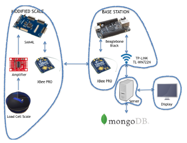 Figure 1: Food Waste Monitoring Architecture
3.1. Hardware
The system architecture, shown in Figure 1, consists of four main components: a modified scale (located within each trash can), a base station, a back-end server, and a front-end display.
3.1.1. Modified Scale
The modified scale was created using a 10kg widebar load cell [37], an HX711 [38] amplifier, an XBeePRO 900HP S3B [39] radio, and a SAM4L Xplained Pro [40] board. The SAM4L Xplained Pro is a prototyping board for Atmel’s SAM4L Cortex™-M4 based microcontroller. The load cell translates force exerted on the scale to an electrical signal, which is amplified by the HX711. This raw value is transmitted by the XBee radio to a base station. A PCB board was designed for the XBee-PRO and HX711 to plug into the SAM4L Xplained Pro extension header. This enabled a compact, 4” x 5” design conducive to the limited space within each trash can.
3.1.2. Base Station
The base station is driven by a BeagleBone Black [30], which is connected to an XBee-PRO 900HP S3B [39] radio and a TL-WN722N 150 Mbps high-gain WiFi dongle [41]. A Java program is used to receive packets transmitted from the radios on each device, determine which device sent each packet, convert the payload of the packet to pounds, and transmit the human-readable information to a server.
3.1.3. Server
Collected data is stored in MongoDB [42] so that it may be queried for later use. Since the server is protected by a firewall and cannot be accessed remotely, we adopted a RESTful design. The RESTful design allows access to the data through text strings which can be passed from the server to the front-end. We developed a server-side function, called using HTTP-GET requests. The function queries MongoDB based on parameters supplied by the front-end and returns a JSON string containing the data.
3.1.4. Design Challenges
Detailed discussion of design challenges discovered and overcome during the initial deployment can be found in the original publication [43]. These challenges included both situations in our control, such as the antenna strength of the radios or reliability of the communication protocol, and out of our control, such as the reliability of the WiFi network in the deployment location or how the devices are handled.
3.2. Software
3.2.1. Modified Scale, SAM4L Implementation
Figure 2 illustrates the flow for the implementation of the modified scale. First, the SAM4L and all connected sensors are initialized. After initialization, the same series of steps are repeated for each cycle. The microcontroller and radio are brought to their active states. A sample is then taken. Once the sample is taken, local time is attached to the sample. Next, a packet containing the sample and necessary timestamp information is transmitted to the base station. Local time on the scale at the time of sampling and at the time of transmission is kept; therefore, if the network is experiencing interference, and it takes multiple retries to successfully transmit the data, delays that occurred between the time of sampling and the successful transmission to the base station can be accounted for. The SAM4L marks local time via an asynchronous timer, driven by a 32.767kHz crystal. The timer updates a counter which defines the local time in number of ticks since boot. This information is used to convert from local time to wall clock time at the base station, achieving time synchronization. If no acknowledgment is received from the base station, it is assumed the transmission was unsuccessful, and the sample is placed in a queue to be retransmitted during the next cycle. If an acknowledgment is received, the transmission is considered successful and the devices are put into sleep mode for 60 seconds before restarting the cycle. Placing the radio and microcontroller to sleep between cycles reduces power consumption. This is crucial since it is undesirable to change the batteries frequently. An analysis of power consumption can be found in Section 3.3.
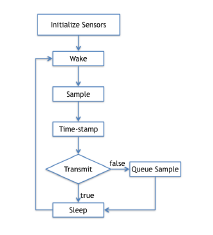 Figure 2: Modified Scale Implementation (SAM4L)
3.2.2. BeagleBone Implementation
Figure 3 depicts the flow of execution for the base station. First, the BeagleBone Black and XBee radio are initialized. Once initialized, the radio listens for packets from the modified scale. Once a packet is received, the local time from the modified scale is converted to wall clock time. Next, the base station transmits an acknowledgment to the scale to indicate receipt of the data. The scale then converts the sample from raw data to pounds. The final sample is then transmitted to the server over WiFi. If the sample cannot be successfully transmitted to the server, it is placed in a queue and the transmission is retried at a later time. After attempting the transmission, the radio once again listens for packets.
Time Conversion. Figure 4 depicts the process of timestamp conversion. The SAM4L marks local time using a counter driven by a 32.767kHz oscillator crystal. After a prescaler is applied, the effective increment of the clock is 1 millisecond. The counter is updated each time there is an overflow. From this, we know each counter increment represents 32,767 milliseconds. transmissionTime is approximately equivalent to the wall clock time at reception. Given this information, we can identify the local time at which the sample was taken (the difference between transmissionTime and sampleTime) and convert this into milliseconds elapsed. We can then add those milliseconds to the current wall clock time to estimate the wall clock equivalent of the sample time.
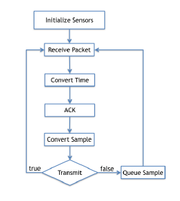 Figure 3: BeagleBone Black Implementation
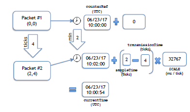 Figure 4: Time Conversion Flowchart
Raw Data Conversion. Equation 1 is used to convert raw data to pounds. The offset parameter is calculated by taking the average over 10 readings while nothing is placed on the scale. scale is calculated just prior to deployment using the calculated offset and an object of known weight. Averages over 10 readings are used[1], and the process is repeated with multiple objects of known weight to ensure the accuracy of the scale parameter.
knownWeight = (raw −of f set)/scale (1)
Tables 1 and 2 detail accuracy for each deployment.
Accuracy of the scale varied negligibly between deployments due to differences in hardware mounting. Table 1 shows the accuracy, in pounds, for the case study carried out at Atlantic Dining Hall (Case Study #1). Table 2 shows the accuracy, in pounds, for the case study carried out at A.D. Henderson University School (Case Study #2). The objects of known weight were a power drill and a cell phone. Different cell phones were used between the pilots at the two schools. For the objects of known weight, and the case when the scale is empty, the tables show the average weight measured by the scale in each trash can followed by percent
error. Percent error is calculated using Equation 2. As shown by the percent error, the scale is more accurate for heavier objects. This means we can be more confident as the amount of waste increases. We take this into consideration when identifying when the trash can was emptied; this is discussed in Section 3.4.1. percent error = (measured −actual)/actual (2)
3.3. Power Consumption
Power consumption is an important factor in most wireless sensor networks and especially in this network. Replacing the scale’s battery requires removing the top plate of the scale to gain access to the enclosure, all of which are located in the bottom of the trash can. We seek to maximize the lifetime of the battery by taking advantage of the sleep features of the XBee and SAM4L to minimize power consumption and limit inconvenience.
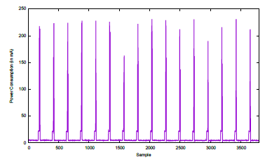 Figure 5 illustrates power consumption over time
(x-axis) in mA (y-axis) for 15 cycles. We observe that power consumption is generally consistent across cycles. There are three observable states within each cycle: sleep, sample, and transmit. The lowest power consumption occurs at approximately 5mA, while both the SAM4L and XBee are in their respective sleep modes. Next, the SAM4L wakes and takes a sample. This appears as a defined step and shows a consumption of approximately 21mA. At the end of the cycle, the radio is awakened, and the sample is transmitted. Power consumption is not consistent during this state in the cycle, but averages 107mA.
Figure 5: Power Consumption (in mA)
Table 1: Atlantic Dining Hall – Scale Accuracy (in lbs)
Table 2: A.D. Henderson University School – Scale Accuracy (in lbs)
|
The average power consumption for each state is shown for 10 cycles in Figure 6. The x-axis shows the cycle, and the y-axis shows power consumption in mA. This confirms the variability of power consumed during transmission. We can estimate the average power consumption during each cycle by scaling the average power consumption of each state according to its duration and summing the values. In our case, the cycle is broken down as follows: 86% sleep, 8% sampling, and 6% transmission. Figure 7 shows the average power consumption for the 10 cycles. Again, the x-axis shows the cycle, and the y-axis shows power consumption in mA. On average, the current draw is 12mA. Using a 6000mAh battery the scale can be powered continuously for just under a month.
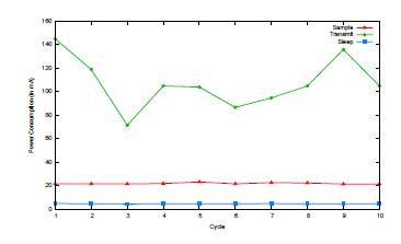 Figure 6: Average Power Consumption Per State
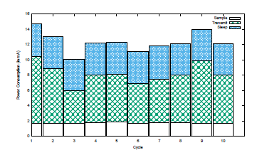 Figure 7: Power Consumption per Cycle by Active State
3.4. Front-End Display
Three front-end displays were designed to test whether ambient displays could be used to change behavior. The front-end displays are JavaScript-based web applications. Graphs were created using the open source Data-Driven Documents (D3) library [44]. The application fetches information from the server using an HTTP-GET request and uses the data to create displays.
3.4.1. Calculation of Total Waste
Figure 8 illustrates two ways to present the waste measured over time. The first is used to analyze the time periods when the most waste is generated and the second is shown in the display to inform of overall waste. The x-axis shows the time of day the sample was taken, and the y-axis shows the waste, in pounds. Since the modified scale reports the weight of waste currently in the trash can (Figure 8(a)), a method has to be devised to approximate the total waste over time (Figure 8(b)). Total waste should be the sum of the local maxima, which should occur just before the waste is emptied. However, there are two scenarios that must be taken into account: (i) the scale may never register as empty, and (ii) there may be a spike in the data from someone pressing down on the trash bag or bumping the trash can.
Based on the accuracy of the scale, discussed in Section 3.2.2, an empty scale should be defined as a measurement below 0.05 lbs. However, during peak hours, it was observed that students may crowd around the waste area and empty waste in the trash can immediately after it has been emptied. When this occurs, the scale never registers a zero value. To account for this, when calculating the total waste, we check if the current sample is significantly less than the previous sample to identify if the waste has been emptied. Significantly less is defined as a difference of 10 lbs or more based on observations from the preliminary data.
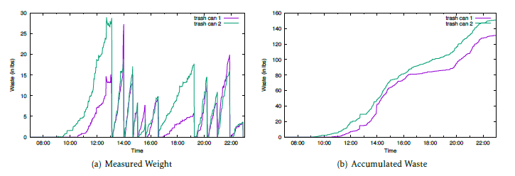 Figure 8: Finding the Total Waste
Figure 8(a) illustrates the second scenario involving an anomalous reading, just before 12:00 in both trash cans. Since this occurs in both cans, the anomaly is likely from someone lifting the trash bag to tie it just before emptying the waste. (If pressure were applied to cause the spike, the corresponding area would have a concave shape.) In this case, the maximum reading before the empty event is added to the total. (In the opposite case, we take the value after the local maxima.) When the algorithm checks if the current sample is less than the previous sample, it checks for this scenario as well. Between each empty event, we save the maximum observed sampled. This value is compared to the current sample. If the current sample is more than 1 pound less than the maximum observed sample, but not more than 10 lbs, the current sample is considered the real maximum. The previously observed maximum is then subtracted from the total waste and the current sample is added. The maximum observed sample is then set to the current sample. This method accommodates cases like the one shown in Figure 8(a), since the waste settles at its original weight before being emptied. The calculated accumulated waste for each trash can using this method is shown in Figure 8(b).
3.4.2. Display Setup
Figure 9 show the display setup for each location. Figure 9(a) [43] illustrates the setup inside Atlantic Dining Hall. This cafeteria has a single point of entry for students. Our display is mounted right as students enter, beside the pay stations. The display was placed here for ease of installation and maximum visibility. The optimal location for the display would likely be near the trash cans. This would allow students to make a direct connection to the information presented and the waste filling up the cans. The trash cans are not located near a power supply; therefore, it wasn’t feasible to place a monitor there. A battery powered tablet would have been the only option for that location. However, the tablet would be too small to capture attention and would require recharging each day. Excluding the space directly beside the trash cans, the entry point near the pay station has the maximum visibility for customers. Everyone who enters the cafeteria must pass this location, and many are forced to linger in the vicinity as they wait in line to pay, providing more time to view the display. The displays are updated every minute so students can view the increase in waste in real-time.
The display for Case Study #2, at A.D. Henderson University School, was closer to the trash cans, as shown in Figure 9(b). However, we were still unable to place the display directly behind the cans as desired. Instead, the display was located in the front of the room, directly opposite to the trash cans.
A total of three displays are evaluated in Case Study #1. There are several reasons to test multiple displays.
Each display focuses on one concept. Display 1 focuses on simplicity, Display 2 focuses on context, and Display 3 focuses on humanizing the issue. The variety of displays allows us to investigate if one method has the more impact than another. Ideally, if WASTE REDUCE were a permanent fixture in a cafeteria, multiple displays would be used in randomized rotation to avoid habituation.
All three displays use the same basic layout. The top of the screen displays the date and location. The left side of the display contains an image, which is altered by the data provided by WASTE REDUCE. The right side of the display consists of 3 graphs: (i) a gauge comparing the current day’s total food waste accumulation in comparison to the previous week’s maximum total food waste accumulation, (ii) a gauge comparing the current day’s total food waste accumulation in comparison to the previous week’s minimum total food waste accumulation, and (iii) a line graph showing accumulation over time for that day. This allows students to compare their progress in reducing waste. The gauges were updated for each display based on feedback from cafeteria employees about student confusion on what information the gauges represented and conveyed. The goal of conveying the max and min waste values for the week remains the same throughout each display. These differences are discussed in detail below. Below the two gauges is a line graph of time versus total weight in pounds. The total amount of waste, starting at breakfast, seen by each trash can is plotted on the graph; this graph is present for all displays.
For each display, we adapted 4 principles from Heath and Heath’s [21] SUCCES method. Table 3 identifies which principles were applied to each display.
Table 3: Application of SUCCES Principles
| Display 1 | Display 2 | Display 3 | |
| Simple | X | X | |
| Unexpected | X | X | |
| Concrete | X | X | |
| Credible | X | X | X |
| Emotional | X | X | |
| Stories | X |
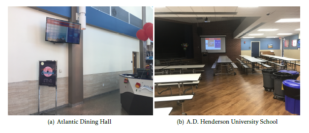 Figure 9: Displays
3.4.3. Display 1
An example of the first display is shown in Figure 10 [43]. This display is the most straight-forward. It was designed to illustrate the message of food waste reduction in the simplest terms. Since reducing the cognitive load is one of the goals of an ambient display, and there was no opportunity to introduce or explain the display to the target audience, a no-frills approach was deemed best for the initial display.
The main section shows an image of the beach, which becomes littered with trash bags in accordance with how much waste is generated. Preliminary data allowed us to estimate the average weight of the trash when emptied to be 20 lbs (9.07 kg). Therefore, for every 20 lbs wasted, a new trash bag is added to the beach scene in the display.
To the right of the main image is a sidebar of additional information. There are two gauges that show the amount of waste generated at present compared to the maximum and minimum observed waste over the previous week. The value shown is calculated by taking the current waste divided by the maximum and minimum, respectively. This allows us to present the current waste as a percentage of the highest and lowest waste observed the previous week. The gauges fill up according to percentage and the filled portion is animated to look like liquid.
3.4.4. Display 2
Figure 11 depicts a sample of the second display used for Case Study #1 and the only display used for Case Study #2. The display was designed to encourage customers to relate their waste to consumable food. Although this requires a slightly heavier cognitive burden than Display 1, since customers must connect the image of consumable food to wasted food, giving wasted food context in terms of consumable food is more likely to “stick” in consumer’s minds. This display capitalizes on 4 out of 6 (67%) of Heath and Heath’s [21] SUCCES method.
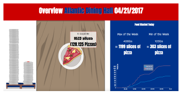 Figure 11: Display 2 for Case Study #1
Instead of using trash bags to depict how much was wasted, this display uses slices of pizza. Pizza was chosen as the food item to display because it is a common staple among college students.
The United States Department of Agriculture maintains a food composition database that provides the average weights of food items by serving size and brand [45]. Using this information, we determined the average weight of a slice of Papa John’s “Supreme Pizza” to be approximately 0.34 lbs (.15 kg). We use Papa John’s as the brand because the university has a contract with Papa John’s; it is the pizza typically served on campus. In the pizza slice graphic used for the display, the toppings present are similar to what is served on Papa John’s Supreme Pizza.
A minor change to update the header of the display to reflect the new location was made before redeploying for Case Study #2. Since A.D. Henderson University School was too long to comfortably fit on one line, we simply called the page “Food Waste Overview.”
Another change in the second display involved the gauges used for comparing weekly progress toward food waste reduction. The cafeteria staff expressed confusion, both among themselves and with the students, concerning what the original gauges were trying to convey. For clarification, the animated gauges were replaced with static text defining the maximum and minimum amount of waste generated for the week. These values were shown in both pounds and number of pizza slices.
3.4.5. Display 3
The main goal of Display 3 is to humanize the issue and remind customers that this issue is continuing in the background of our lives. Another goal for Display 3 is to avoid habituation. Although the other two displays update according to the data in real-time, the images will follow the same general pattern each day. This might cause students to lose interest in the display. Display 3 is guaranteed to have a different image each day, with the goal of preventing habituation and keeping customers interested in checking the display for new information.
Figure 12 depicts a sample of the third display for Case Study #1. There are two differences between this display and the previous displays. The focal image, featured to the left of the screen, depicts a story about 4 characters. The characters are designed to project diversity to ensure all customers feel included in the story. The story is driven by the amount of food wasted each day. Food waste for the day is compared to the average amount of food wasted over the previous week. When more food is wasted, the characters experience a bad day. When less food is wasted, the characters experience a positive day. As with the first display, trash bags appear in the scene to emphasize how much is currently being wasted.
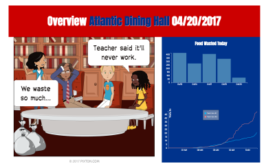 Figure 12: Display 3 for Case Study #1
Another change is in the depiction used to compare the maximum and minimum food wasted over the week. Since pizza slices were no longer being displayed, it no longer made sense to display weight in pizza slices as the maximum and minimum. Since the story follows the accumulation of waste each day, we thought a bar graph allowing customers to compare waste each day would be the most beneficial.
4. Case Studies
Two case studies were carried out to evaluate the efficacy of WASTE REDUCE to affect behavior change and reduce the amount of food wasted in a cafeteria setting. The first case study took place at a university cafeteria; it spanned 7 weeks and tested 3 displays. The second case study was carried out at a grade-school cafeteria over 2 weeks and tested 1 display. For each case study, we obtained a baseline of waste behavior during the first week.
4.1. Technical Difficulties
Although the system was thoroughly tested before beginning the case studies, there were still a few technical difficulties during the case studies. Otherwise, the data was collected over consecutive days and weeks.
4.1.1. Display 1
After the week of baseline data was collected, the cafeteria was closed a week for Spring Break. When the cafeteria reopened, there were technical difficulties the first two days and data could not be collected. This postponed the introduction of Display 1, but did not create a problem for the case study. Another technical difficulty occurred on the Monday during the second week the display was deployed (Week 3). The monitor that allows students to view the display experienced technical difficulties and was not visible until midafternoon for that day.
4.1.2. Display 3
Display 3 had one day of technical difficulties. The hotspot providing WiFi connectivity for the system malfunctioned several times during the Tuesday of the week this display was deployed (Week 6). The device could not maintain its connection to the cellular network; thus, the base station could not establish a WiFi connection. Data was not lost due to reboots of the device to troubleshoot and facilitate reconnection to the network.
4.2. Case Study #1
A case study was carried out in FAU’s main campus dining hall to determine the efficacy of WASTE REDUCE. The data presented in this section was collected over seven weeks. The first week (Week 1) serves as a baseline for comparing the effects of the ambient display, and thus, only the monitoring system was active during this week. During the second and third weeks (Week 2 and Week 3), the first ambient display was also present in the cafeteria. During the fourth and sixth weeks data was collected but no display was present. This was done to reduce lingering effects of the previous display when the next display was introduced. Display 2 was shown during the fifth week (Week 5), and Display 3 was shown during the final week (Week 7). Due to the cafeteria closing for Spring Break, there is actually one week gap between Week 1 and Week 2.
The campus cafeteria provided the number of meals sold each day during this time period. This information is used to normalize the data by determining waste per meal sold. The number of meals sold is the best estimate of how many people contributed to the waste. This allows better comparison of a day in which the cafeteria may have wasted 500 lbs while serving 5,000 people, versus a day when the cafeteria wasted 500 lbs, but only served 3,000 people. Since the number of meals sold per day is available only as a total, we can only normalize the total waste for the day, and not the real-time data throughout the day.
The cafeteria was closed the weekend before and after Spring Break; therefore, we could not establish a baseline for Saturday and Sunday. In addition, the cafeteria has restricted hours, a different meal service, and receives significantly less traffic during the weekends. Saturday and Sunday are not included in the analysis.
As traffic increases in the cafeteria, the number of trash cans used to contain waste varies, a factor that was unclear in the initial deployment. Only two instrumented cans were used during the case study; however, these cans were always present for student waste. More trash cans may have been present during various times within the study. Thus, all results represent a minimum bound on food wasted in the cafeteria.
4.2.1. Display 1
We will briefly summarize the results of Display 1 for the sake of comparison. Greater detail for this display can be found in the original publication [1].
To determine changes in waste behavior, we examined both total and normalized waste per day for the baseline week (Week 1) and the days the display was present (Week 2 and Week 3). Figure 13 illustrates these results. The x-axis shows the day of the week and the y-axis shows amount of waste (in pounds). For Figure 13(a), the waste is total waste for the day and for Figure 13(b), the waste is waste per meal.
The observation on Friday illustrates why comparing the total waste generated is not sufficient to determine behavioral change. In Figure 13(a), Friday is the only day in which total waste did not decrease after the introduction of the display. This divergence from the trend is because Friday of Week 1 was also the beginning of Spring Break; fewer people ate in the cafeteria that day, leading to less overall food waste. We normalize the day by diving the total waste observed by account the number of meals sold that day, shown in Figure 13(b). The normalized data confirms waste per meal decreased after the introduction of the display even on Friday.
We expected waste for Week 3, the second week the display was present, to continue to decrease or remain the same as Week 2 (the first week the display was present). Figure 13(b) shows a slight decrease for majority of the days in Week 3 compared to Week 2. The increase in waste on Monday of Week 3 compared to Monday of Week 2 is likely due to the technical difficulties experienced with the monitor that day as discussed previously.
Overall, These figures show a consistent decrease in waste per meal for each day the display was present. We calculated the mean over each week. To determine if the decrease in waste was significant, we applied a standard Z-Test to the normalized values. Calculation of the Z value is discussed in the original publication [1]. Using a Z-Table and the calculated Z-value for each week when the display was present, we are able to determine the p-value for each week and assess statistical significance. For Week 2 compared to Week 1, the p-value was determined to be .035; the results are significant at the .05 level. For Week 3 compared to Week 1, the p-value is .046; the results are also significant at the .05 level.
4.2.2. Display 2
The second display was deployed during Week 5 after a week without the display (Week 4). During Week 4 we collected data but did not include a display; this was done to reduce behavior effects from the previous display from overlapping with the new display. Week 5 introduced the new display.
Behavioral Results Figure 14 compares the waste generated during Week 5 with the waste generated during Weeks 1 and 4. In each graph, the x-axis shows the day of the week in which the data was collected. In Figures 14(a) and 14(c), the y-axis shows the overall amount of food wasted in pounds. In Figures 14(b) and 14(d), the y-axis shows food wasted (in pounds) per meal sold, to normalize the data. Compared to Week 4, when no display was present, customers actually wasted slightly more food–the opposite of the desired result. However, compared to the baseline before the first display was introduced, there was negligible change. Table 4 compares the impact of this display to the initial baseline (Week 1), the second week of the first display (Week 3), and the week just prior to deploying Display 2 (Week 4). None of these proved to be statistically significant for lowering waste.
There are two theories as to why this display was unsuccessful at lowering food waste. The first is the connotation of pizza, versus garbage. Garbage is undesirable; therefore, it is easy for customers to perceive the growing number of garbage bags on a screen as
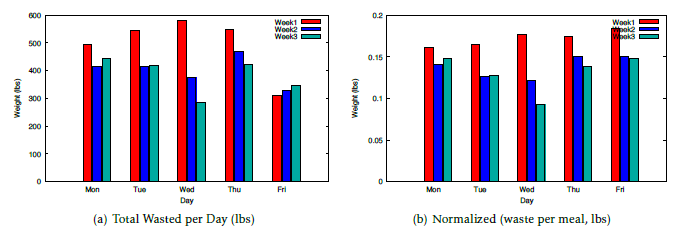 Figure 13: Food Waste With Respect To Display 1
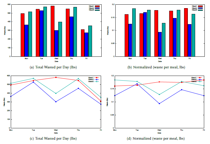 Figure 14: Food Waste With Respect To Display 2
Table 4: Comparing Display 2 (Week 5) to Weeks 1,3&4
| Week 1 | Week 3 | Week 4 | |
| Overall Mean (lbs) | 0.16939954 | 0.148733991 | 0.14913039 |
| Sample Mean (lbs) | 0.16640566 | 0.16640566 | 0.16640566 |
| Overall StdDev (lbs) | 0.01673104 | 0.028363066 | 0.03031837 |
| n (days) | 5 | 5 | 5 |
| Z | -0.40012464 | 1.393187366 | 1.27410199 |
| p-value | 0.3446 | .9177 | 0.8980 |
something negative. Pizza, on the other hand, is desirable (especially among college students). The image of pizza multiplying on the display may invoke positive feelings, rather than a sense of alarm. In future work, it would be interesting to test this concept with a less desirable food.
4.2.3 Display 3
The third display for Case Study #1 was evaluated over Weeks 6 and 7, directly following the evaluation of Display 2. During Week 6, there was no display present. As before, this was done to eliminate behavioral effects associated with the previous display from overlapping with the new display. Week 7 introduced the new display. The purpose of this display is to test the “story” component of the SUCCES concepts (discussed in Section 2.2) and humanize the issue.
Behavioral Results Figure 15 compares the waste generated during Weeks 1, 6, and 7. The y-axis in Figures 15(a) and 15(c) shows total waste in pounds, while the y-axis in Figures 15(b) and 15(d) shows waste per meal. For all plots, the x-axis shows the day of the week in which the sample was collected. Week 1 is the baseline week; data was collected this week without a display and before any of the displays were introduced. Week 6 was the week just before this display was introduced; no display was present during this week. As with the previous evaluations, this was done to eliminate lingering effects from the previous display. Week 7 was the week this display was present. In general, the most waste was generated during Week 1, before any of the displays were introduced. An outlier is seen in the data collected on Tuesday of Week 6. This value is much lower due to the technical difficulties experienced that day, not because of an actual reduction in waste. Aside from this outlier, both the total and normalized waste was lowest each day for Week 7.
Table 5 shows the information used to calculate the p-value when comparing the normalized waste each day from Week 7 to the baseline data (Week 1), the first display week (Week 3), and the gap week preceding the display (Week 6). Once again, overall mean is the average for the display week and the comparison week, sample mean is the average for Week 7, overall standard deviation is the standard deviation for the samples across both weeks being compared, and n is the number of days included in the sample. We see that a statistically significant decrease was observed between the baseline week (Week 1, before any displays were introduced) and the week of the display (Week 7), with p < .05. There was not a statistically significant improvement from the display shown during Week 3 (Display 1), nor from the week just before the display was implemented (Week 6, no display after the introduction of displays). When comparing Week 6, we calculated the results both with and without the outlier. Neither confirmed p < .05; the results listed in the table are those with the outlier excluded.
4.2.4. Significance at Atlantic Dining Hall
To assess the overall affect of using the displays to affect behavioral change and reduce waste, we compare the two displays that had a significant impact compared to the baseline data. Using three weeks of data, in which two of the weeks used the display, and one week did not, would skew the average of the data toward the waste generated while the displays were present. Therefore, we add to the comparison an additional baseline week from the preliminary deployment in which there was no display, no technical difficulties, and there was a similar packet reception rate. We call this Week 0.
A test of statistical significance was carried out across Week 0 (pre-display), Week 1 (pre-display), Week 3 (display from Case Study #1), and Week 7
(display from Case Study #3). The results of the test are shown in Table 6. Week 0 was too far in the past for the cafeteria to provide us with the exact number of meals sold each day. To normalize the data from that week, we took the average, maximum, and minimum number of customers over the seven weeks data was collected and used those values for normalization. In the table, we show the statistical significance results using the average, maximum, and minimum values for normalization. Assuming the number of customers during that week was near the average, we found that p = .0174. If we assume the number of meals sold that week was closer to the maximum observed during the case studies, p = .0244. Finally, if we assume the number of meals sold was closer to the minimum observed during the case studies, p = .0188. In all three scenarios p < .05. Therefore, we can say with confidence at the p < .05 level that our displays generated a reduction of waste compared to the baseline.
4.3. Case Study #2
Ideally, WASTE REDUCE would be able to affect behavior in a variety of age groups and settings. We carried out a second case study in the cafeteria at A.D. Henderson University School. The school serves meals for students from kindergarten to eighth grade; however, on most days, only kindergarten through third grade eat in the cafeteria. (Secondary seating is located outside; therefore on rainy days other grades may eat inside.) Once again, we collect one week of data in which the display is not present to establish a baseline, and then collect data for one week with the display present. For this case study, we used Display 2 from Case Study #1 to see if changes in age may alter the effectiveness of the display.
Although this display was unsuccessful in Atlantic Dining Hall, it was believed that of the displays evaluated, the students would relate to this display the most. Display 1 was unlikely to engage young students, who may not have a concept of environmental protection to connect the concept of food waste littering the beach. The storyline for Display 3 was not developed with young children in mind. Although the text and plot
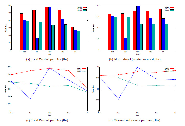 Figure 15: Food Waste With Respect To Display 3
Table 5: Comparing Display 3 (Week 7) to Weeks 1,3&6
| Week 1 | Week 3 | Week 6 | |
| Overall Mean (lbs) | 0.15233164 | 0.1316661 | 0.14480004 |
| Sample Mean (lbs) | 0.13226988 | 0.13226988 | 0.13226988 |
| Overall StdDev (lbs) | 0.026049314 | 0.02047648 | 0.02628205 |
| n (days) | 5 | 5 | 5 |
| Z | -1.722098 | 0.06593393 | -1.0660622 |
| p-value | 0.0427 | 0.5239 | 0.1446 |
Table 6: Comparing Waste (Pre-Display vs. Post-Display)
| Average | Maximum | Minimum | |
| Overall Mean (lbs) | 0.149672203 | 0.145258053 | 0.16064566 |
| Sample Mean (lbs) | 0.121939527 | 0.121939527 | 0.121939527 |
| Overall StdDev (lbs) | 0.032224476 | 0.028959416 | 0.04561033 |
| n (days) | 5 | 5 | 5 |
| Z | -2.108053109 | -1.972363293 | -2.0787016 |
| p-value | 0.0174 | .0244 | .0188 |
is fairly simple, it would likely be a challenge for students just learning to read. In addition, the storyline, which follows college or high-school aged students trying to complete a group project, is unlikely to appeal to such a young audience.
4.3.1. Scale Accuracy
Details concerning the accuracy of the scales are presented in Section 3.2.2, and a comparison of the observed versus expected weights of known objects for Case Study #2 is shown in Table 2. Trash Can #1 was found to be perfectly accurate at best, and .055 lbs at worst. Trash Can #2 was found to be accurate within .001 lbs best, and within .032 lbs at worst. This is sufficient to maintain high confidence in the readings from the scale.
4.3.2. Behavioral Significance
Figure 16 illustrates what is typically thrown away during the lunch hour at A.D. Henderson. Unlike Atlantic Dining Hall, there is a higher probability for food packaging, containers, and bottles to be disposed with the food. Also, A.D. Henderson uses disposable trays, which are thrown into the trash can with the food waste. In the figure, it can be observed that the trays, along with packaging containers are included in the waste. Although we were unable to estimate the weight of containers and bottles, we were able to estimate the weight of the trays. We measured the weight of an individual tray and discovered it weighed approximately 0.044 pounds (0.020 kg). Multiplying the number of students who purchased a meal each day by the weight of an individual tray allows us to estimate the total weight of tray waste and exclude it from the analysis.
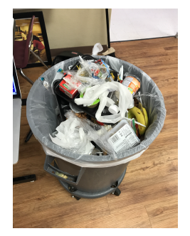 Figure 16: Observed Waste (A.D. Henderson)
There was no significant change in behavior for the students at A.D. Henderson. Table 7 summarizes the waste accumulated during the case study. The first 3 columns show the total waste, tray waste, and normalized waste, respectively, for the first week of the case study. During this week, no display was present. This is our baseline for comparison. The next 3 columns show the same information for the week the display was present. Since tray waste is unavoidable, this value was subtracted from each day’s total waste during the normalization process. Once again, we use the number of students who purchased a meal to estimate the tray waste, and then normalize the total waste to pounds per person. On average, the cafeteria generated 12.50 lbs (5.67 kg) of tray waste per day, and approximately 0.10 lbs (0.05 kg) of waste per person. When the display was present, the students wasted approximately 0.009 lbs more per person. This is not significant.
One thing that may have swayed the results was an incident that occurred during day 5 of the baseline week. On this day, the school was placed on a soft lock-down. During the lock-down, students were escorted to the cafeteria, where they picked up food, and were then escorted back to their classrooms to eat. All waste disposed by these students was deposited outside of the cafeteria. However, the number given for students purchasing meals that day includes both the students who ate in the cafeteria, and those who did not. This means that fewer trays and fewer students contributed to the 21.682 lbs of waste than we estimate. Based on this disturbance, it is likely that there was no change, or an insignificant decrease in behavior for the students.
There are several other differences between the case study at Atlantic Dining Hall and A.D. Henderson that may have affected these results. Everyone who dines at Atlantic Dining Hall eats a meal prepared by the dining hall. However, some of the students at A.D. Henderson bring their lunch from home. This creates three major differences: (i) packed lunches are likely the source of the food packaging containers, (ii) portion sizes for the food brought from home are not likely to be consistent, or to follow recommended guidelines, and (iii) these children are not included in the head count for meals sold.
Another difference is that the children at A.D. Henderson are required to take a full meal. This means they had less control over what they were given, and their ability to waste less. For example, during the case studies, students at Atlantic Dining Hall could view the display, decide they never finish their mashed potatoes, and begin requesting a smaller portion, or no portion at all to aid in reducing waste. Students at A.D. Henderson could not request smaller portions or decline portions of their meal. Therefore, students may have been impacted by the screen, but were powerless to change the outcome.
Age is another factor that may have played a role. Children are generally more inquisitive about changes in their surroundings and were visibly more curious about the changes as the equipment was being installed. However, children are also less likely to understand the significance of lowering food waste.
Table 7: Waste at A.D. Henderson University School (in lbs)
Table 8: Comparison of Food Waste by Grade
|
||||||||||||||||||||||||||||||||||||||||||||||||||||||||||||||||||||||||||||
When food is disposed at Atlantic Dining Hall, customers come and go intermittently. Due to the randomized nature of individuals entering and exiting the dining hall, the display is constantly updating, and customers can easily view their individual contribution to total waste. On the other hand, A.D. Henderson has set meal times for the students, and everyone disposes of their waste at the same time. A comparison of the daily waste curve for A.D. Henderson versus Atlantic Dining Hall can be seen in Figure 17. It can be observed that due to the organized nature of the meal times at A.D. Henderson, the graph follows a step pattern; waste increases rapidly as students dispose their waste at the end of their lunch, then flat-lines until the end of the next lunch. Since the display was located at the front of the room, and the trash cans were located at the rear, it is possible students only saw how much the classes before them wasted.
4.3.3. Breakdown By Grade
As noted previously, students at A.D. Henderson eat and dispose of their meals at set times. This allows us to more easily parse out data on food waste by grade. Lunch times and grades are provided in Table 8. Since the head count for meals provided does not include students who bring meals from home and is not broken up by grade level, the data presented is not normalized. Because the data is not normalized, we cannot make inferences across grade levels. For example, the kindergarten lunches produced the least amount of waste; however, they may also have the least number of students attending lunch. These numbers do, however, provide a better view of how the display affected each grade. As expected, there was little to no change for the kindergarten lunch. This age group was likely too young to understand the concept. The students from the second grade lunch appeared to waste about 2 lbs more, on average, after the display was implemented. The first and third grade students saw an average decrease in waste of approximately 2 lbs and 6 lbs, respectively. Although a decrease was viewed for these grades, when tested for statistical significance, it was found that for both groups, p > .05.
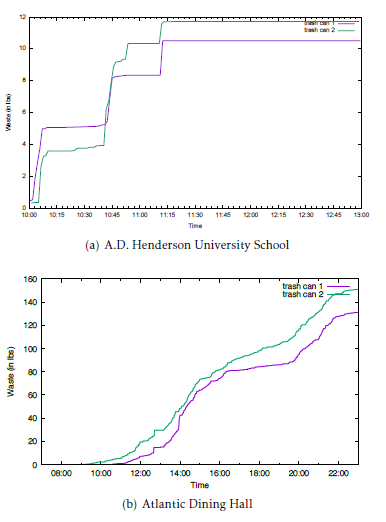 Figure 17: Pattern of Waste Over a Day
5. Conclusion
We have presented WASTE REDUCE, which is a wireless sensor network to provide real-time data on postconsumer food waste. We address software and hardware challenges, such as the communication protocol, wireless connection stability, and power consumption, to ensure WASTE REDUCE is accurate, robust, and sustainable. We also provide three ambient displays designed to evoke behavior change in customers to reduce food waste. We conducted two case studies to evaluate the efficacy of these displays to generate a change in behavior among cafeteria customers. Analysis of the data before and after the displays were introduced confirms behavioral change was affected for two of the three displays developed for the system.
6. Acknowledgments
This work was supported by the NSF grant CNS
- Shiree Hughes, Jiannan Zhai, and Jason O. Hallstrom. Waste auditing sensor technology to enhance the reduction of edible discards in university cafeterias & eateries. In 2018 IEEE International Conference on Smart Computing, SMARTCOMP 2018, Taormina, Sicily, Italy, June 18-20, 2018, pages 344–349, 2018.
- Dana Gunders. Wasted: How america is losing up to 40 percent of its food from farm to fork to landfill. Natural Resources Defense Council Issue Paper, August 2012. IP: 12-06-B.
- U.S. and World Population Clock. U.S. Department of Commerce, 2016. http://www.census.gov/popclock/.
- Lisa R. Young and Marion Nestle. The contribution of expanding portion sizes to the us obesity epidemic. American Journal of Public Health, 92(2):246–249, 2002.
- UC-Davis. UC Davis profile, March 2016. https: //www.ucdavis.edu/sites/default/files/upload/files/ uc-davis-student-profile.pdf.
- Samantha Lubow, Shaina Forsman, Steganie Scott, Linnea Whitney, Isaac O’Leary, and AmyWang. Love food, dont waste: Resident dining commons food waste report, 2015. http://dining. ucdavis.edu/documents/SP15WasteAuditReport.pdf.
- UC-Davis. Waste reduction and elimination, 2015. http: //dining.ucdavis.edu/sus-recycling.html.
- GT. Admissions & enrollment, 2016. http://factbook. gatech.edu/quick-facts/admissions-enrollment/.
- GT. Campus services fall 2012 semester report, January 2013. http://campusservices.gatech.edu/publications/ Documents/fallsemesterreport0113final.pdf.
- LeanPath. What is LeanPath?, 2015. http://www.leanpath. com/product-video/.
- MSU. Msu facts, 2016. https://msu.edu/about/thisismsu/ facts.html.
- Simon Anderson, Alex Parker, Lisa Schindler, Lindsay Stolkey, and KaiteWard. MSU:Wasted students? or wasted food. Michigan State University.
- Carla Iansiti, Allison Stawara, and Robbia Pipper. Food waste impacts msu, 2013. National Association of College & University Food Services 2013 Regional Conference. https://eatatstate.com/sites/default/files/pdf/ 2013%20NACUFS%20Regional%20Conference.pdf.
- FIU. Sustainability solutions opportunity assessment report. Waste Management Sustainability Services, May 2011. Florida International University. http://gogreen.fiu.edu/_assets/ documents/topics/Waste-Audit-Report.pdf.
- UM. Student enrollment fall 2015, 2016. http: //www.miami.edu/index.php/about_us/fast_facts/ student_enrollment_–_fall_2015/.
- UM. Sustainability interim report, 2014. Office of Sustainability. https://umshare.miami.edu/web/wda/ greenu/DOCUMENTS/Sustainability%20Interim%20Report% 202013-2014_UMWeb.pdf.
- UM. Green waste – food waste, 2016. Office of Sustainability. http://www.miami.edu/finance/index.php/green_ u/recycling/green_waste_-_food_waste/.
- Oxford English Dictionary. habitutation, n 1.1. https://en. oxforddictionaries.com/definition/habituation, 2016.
- Kevin Vaughan and Nicholas Tarrier. The use of image habituation training with post-traumatic stress disorders. The British Journal of Psychiatry, 161(5):658–664, 1992.
- Han X Lin, Yee-Yin Choong, and Gavriel Salvendy. A proposed index of usability: a method for comparing the relative usability of different software systems. Behaviour & information technology, 16(4-5):267–277, 1997.
- Chip Heath and Dan Heath. Made to Stick: Why Some Ideas Survive and Others Die. Random House, 2008.
- John Stasko, Todd Miller, Zachary Pousman, Christopher Plaue, and Osman Ullah. Personalized peripheral information awareness through information art. In International Conference on Ubiquitous Computing, pages 18–35. Springer, 2004.
- Mark Weiser and John Seely Brown. The coming age of calm technology. In Beyond calculation, pages 75–85. Springer, 1997.
- Dan Ariely. Controlling the information flow: Effects on consumers’ decision making and preferences. Journal of Consumer Research, 27(2):233, 2000.
- Franck L Lewis et al. Wireless sensor networks. Smart environments: technologies, protocols, and applications, pages 11–46, 2004.
- Ian F Akyildiz and Mehmet Can Vuran. Wireless sensor networks, volume 4. John Wiley & Sons, 2010.
- Ian F Akyildiz, Weilian Su, Yogesh Sankarasubramaniam, and Erdal Cayirci. Wireless sensor networks: a survey. Computer networks, 38(4):393–422, 2002.
- Raspberry Pi Foundation. Raspberry pi. https://www. raspberrypi.org/, 2017.
- Massimo Banzi, David Cuartielles, Tom Igoe, Gianluca Martino, David Mellis, et al. Arduino. https://www.arduino.cc/, 2005.
- Beagleboard.org. Beaglebone black. https://beagleboard. org/black, 2016.
- Niels Reijers, Gertjan Halkes, and Koen Langendoen. Link layer measurements in sensor networks. In Mobile Ad-hoc and Sensor Systems, 2004 IEEE International Conference on, pages 224–234. IEEE, 2004.
- Christopher Plaue, Todd Miller, and John Stasko. Is a picture worth a thousand words?: An evaluation of information awareness displays. In Proceedings of Graphics Interface 2004, GI ’04, pages 117–126, School of Computer Science, University of Waterloo, Waterloo, Ontario, Canada, 2004. Canadian Human-Computer Communications Society.
- Andrew Dahley, CraigWisneski, and Hiroshi Ishii. Water lamp and pinwheels: Ambient projection of digital information into architectural space. In CHI 98 Conference Summary on Human Factors in Computing Systems, CHI ’98, pages 269–270, New York, NY, USA, 1998. ACM.
- Jennifer Mankoff, Anind K. Dey, Gary Hsieh, Julie Kientz, Scott Lederer, and Morgan Ames. Heuristic evaluation of ambient displays. In Proceedings of the SIGCHI Conference on Human Factors in Computing Systems, CHI ’03, pages 169–176, New York, NY, USA, 2003. ACM.
- Jeremy M Heiner, Scott E Hudson, and Kenichiro Tanaka. The information percolator: ambient information display in a decorative object. In Proceedings of the 12th annual ACM symposium on User interface software and technology, pages 141–148. ACM, 1999.
- Hannah Pileggi, Charles D Stolper, J Michael Boyle, and John T Stasko. Snapshot: Visualization to propel ice hockey analytics. IEEE Transactions on Visualization and Computer Graphics, 18(12):2819–2828, 2012.
- HT Sensor Technology Co. Limited. Tal201 parallel beam load cell. http://www.htc-sensor.com/products/87.html, 2016.
- AVIA Semiconductor (Xiamen) Co. LTD. Hx711: 24-bit analog-to-digital converter (adc) for weigh scales. http:// www.aviaic.com/UpLoadFile/hx711_brief_en.pdf, 2016.
- Digi International Inc. Xbee-pro 900hp. https: //www.digi.com/products/xbee-rf-solutions/modules/ xbee-pro-900hp, 2016.
- Atmel Corporation. Sam4l xplained pro evaluation kit. http: //www.atmel.com/tools/ATSAM4L-XPRO.aspx, 2016.
- TP-Link Technologies Co. Ltd. 150mbps high gain wireless usb adapter: Tl-wn722n. http://www.tp-link.com/en/ products/details/cat-11_TL-WN722N.html, 2016.
- Inc. MongoDB. Mongodb. https://www.mongodb.com/, 2016.
- Author One, Author Two, and Author Three. Title of paper. In Conference, page Pages, Year.
- Mike Bostock. Data-driven documents. https://d3js.org/, 2015.
- Beltsville Human Nutrition Research Center. Usda food composition databases. United States Department of Agriculture. https://ndb.nal.usda.gov/ndb/, 2017.